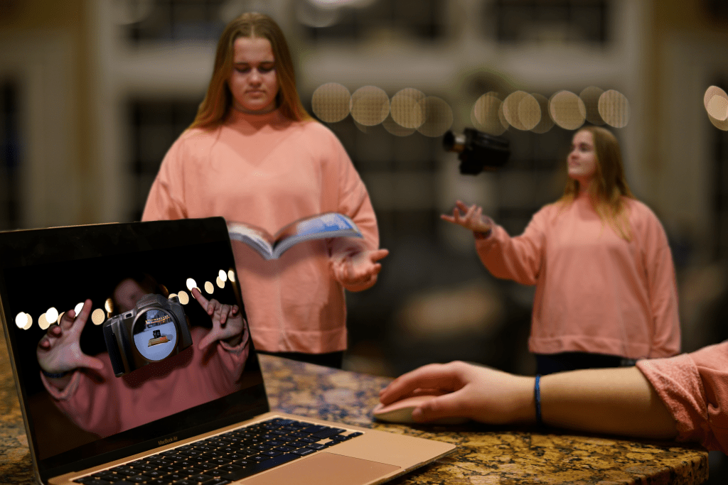
After studying a few Norman Rockwell paintings and seeing how he can tell full stories with just one picture that has a ton of detail, I wanted to try it out myself. I was challenged with taking 10 different/separate photos that I took and composite them together into one picture that told a story.
Since I’ve learning and study the concept of design and the steps that need to be taken to achieve a successful design, I decided to create the design process in a physical photo form, and more specifically the process that I went through in order to complete this project.
Within the photo you see the model reading, which in the “Graphic Design Solutions” book, author Robin Landa describes step 1 and 2 as the orientation and analysis phases. This includes research and writing. Then slightly farther back in the picture is the model again with a camera, showing the next step in the process which is conceptualizing and starting to complete step 4 which is actually designing. Finally in the foreground you see the model at her computer editing/designing the final project. This is the end of step 4, design and step 5 implementation.
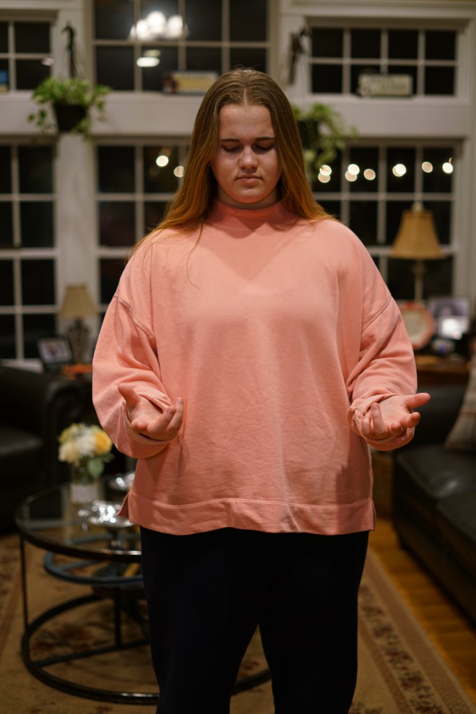
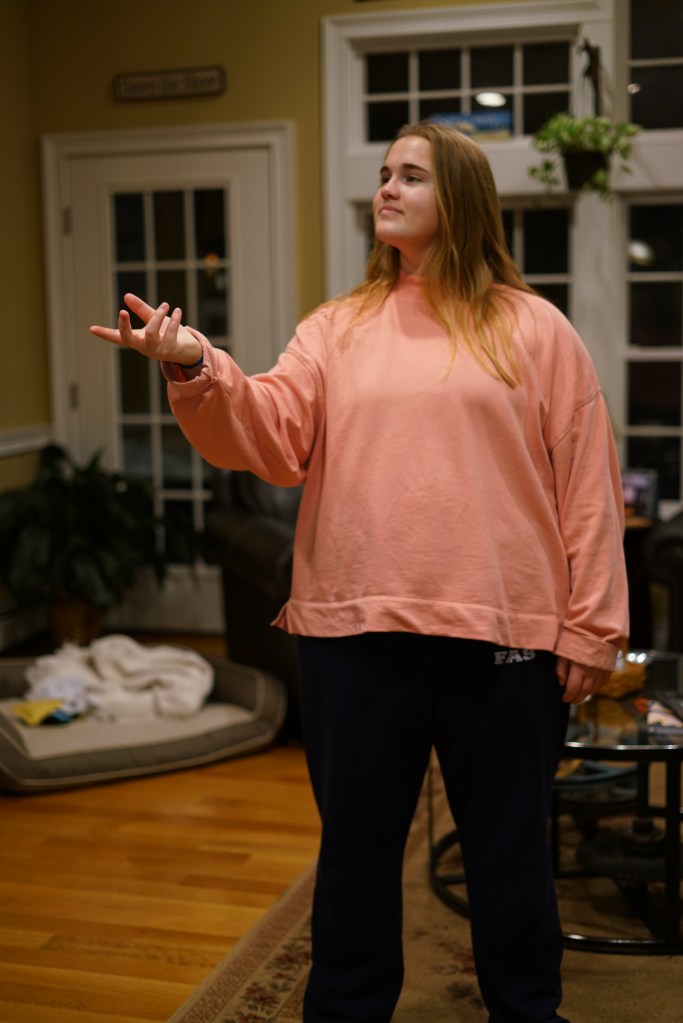
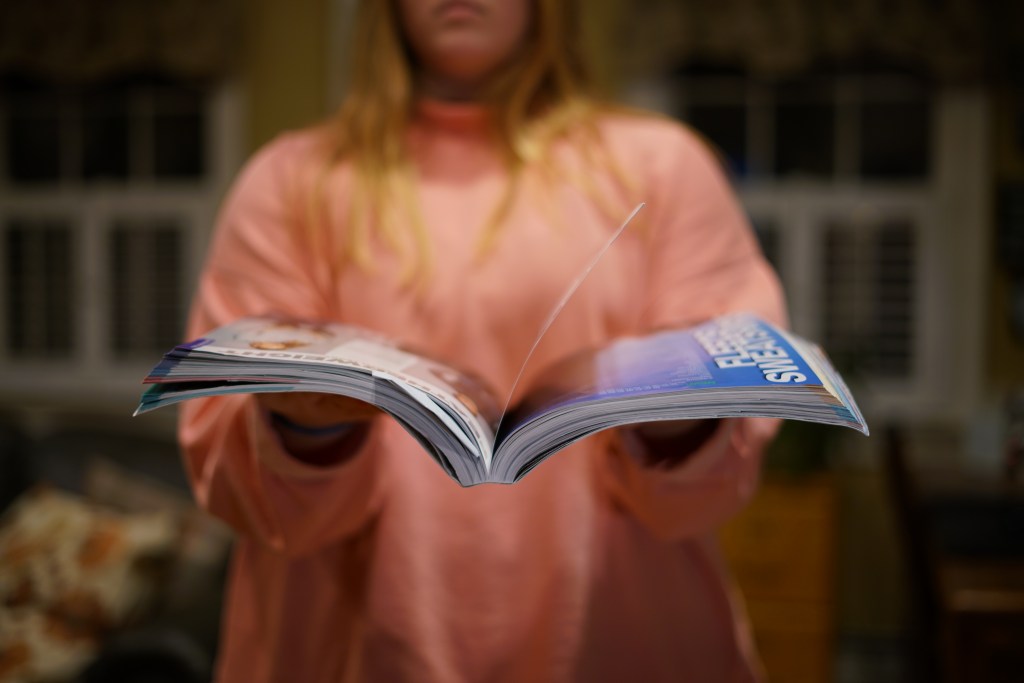
Here are the 10 different photo elements I took in order to combine together. (All of these photos were not taken at the same time)
In order to complete this photo I had to use certain fundamentals of composition. In the book “Graphic Design Solutions”, there is a section about “Illusion of Spacial Depth” using principles like contrast, layering, tilted planes and foreground, middle ground and background. I was able to design a photo that had depth and layers.
Contrast, which is used “to compare the dissimilarity of elements” (Landa), is depicted by putting my model in a bright pink. I knew that all the other elements in the photo were going to be darker shades of neutrals since that’s really the entire color palette of the house. By utilizing contrast, I was able to make the model and the small image the model captured on her computer stand against all the other elements.
Layering and the different plains/grounds in the picture are used to create a sense of 3D space in a 2D photo. In this photo the foreground is the largest and clearest part of the picture. The foreground itself also uses a titled plane to help the viewer “understand the longer side of the plane (the computer) to be closer in space and perceives the plane as receding. This titled place helps lead you into the middle ground and foreground which overlap and are slightly blurred to show that they are farther away from the center focus. By the time you get to the background it’s completely blurred out to suggest that all the other elements are very far away from it.
The final fundamental I kept in mind when designing this project was the illusion of volume. All the objects photographed were 3D object so that had shadows and highlights which helps to further allude to a #D space. “a progressive shift in tone or value, form dark to light or light to dark, can contribute to the illusion of spacial depth or motion” (Landa). In this photo the main source of lighting is coming from above ceiling lights, so it’s top lit. This met when composition other elements on top of the model I had to consider where I had to add artificial shadows in order to make layering believable and give the object the correct atmospheric perspective. If you look specifically at the textbook in the photo and the camera on the computer screen you’ll see the shadows underneath that show its real world affect on the model.
Creating art isn’t just the use of random lines and shapes of all different kinds of color and size on a random canvas and calling it a day. There’s thought that goes into every little detail. What’s the focal point? What are my leading lines? What do I want in my background that will help spotlight my foreground? All these questions and more come into play not only when creating art, but designing graphics, framing up a shot for film or photography. Composition is key.
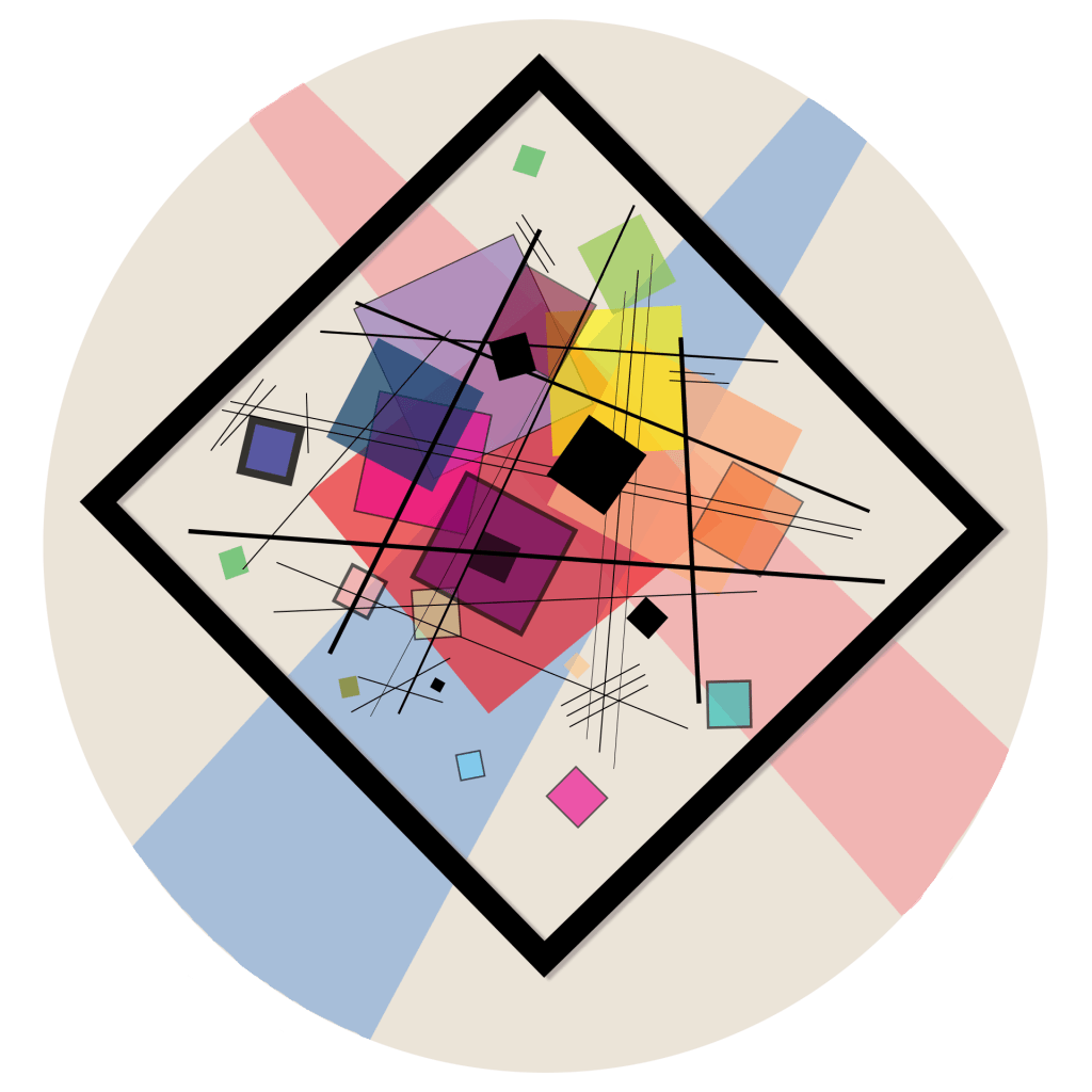
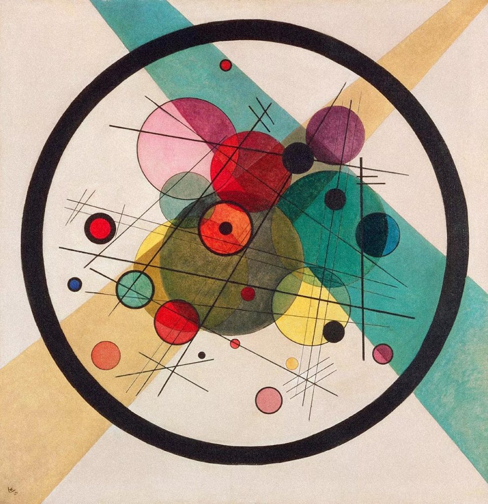
In Wassily Kandinsky’s geometric abstract oil painting “Circles in a Circle” created in 1923 is a prime example of deeper thought and meaning going into the design of something verses just having a bunch of shapes tossed on a canvas.
Kandinsky himself was fascinated by the circle and began a deep study into the shape starting with this painting. He wrote to friend about the painting saying. “it is the first picture of mine to bring the theme of circles to the foreground.”
When I first looked at the painting 3 glaring things stood out to me. Everything (due to the way the oil paints were used I’m presuming) was slightly translucent. You could see thought the circles which effect the other circle it over lapped with. This gave it a sense of depth. After following all the lines and circles around the page I came to find that the bright orange circle in the middle with the small black circle inside of it became the final focal point your eyes eventually just end there.
Another thing I noticed when thinking about how I was going to recreate it was that the large black lined circle that encompassed all the other circles acted as a secondary canvas. As Mark Boulton explained in his article titled “Whitespace“, using passive white space to help create a space to breath in the design is important. “Some might argue that passive whitespace is the unconsidered space present within a composition. I disagree: if you don’t consider all your whitespace, that’s just bad design. Passive whitespace creates breathing room and balance. It’s important.”(Boulton) In this painting I feel that Kandinsky helps separate his white space and creates a plain for just the smaller circles to work in. If that larger circle wasn’t present the canvas would feel very empty and the other circles wouldn’t feel like they were anchored down to anything.
The final thing that I took notice of before I began to create my own was that the big circle and all the smaller circles in side of it were not coming from the dead center of the canvas. All the circles are slightly higher up on the square canvas and these gives the feeling that the circle are slightly floating. And the two rectangular bars behind it act almost as spotlights on the smaller circles because they aren’t uniformed sized rectangles and they run off the page, reminding me a lot of light beams.
With these thoughts in mind I began to think about how I was going to continue this piece with similarities but also making it different enough to call it a separate piece and not a recreation. I went into Photoshop and using the different shape tools, color options and opacities I started making something.
Then I thought about Programming Design Systems’s Article about Basic Shapes and Relationships and how a rectangular/square canvas has no sense of direction in just points you to the middle, but if you rotate the square slightly all of a sudden it takes on a more fun and playful look. So I decided to run with the playful abstract look and went with squares. But I also thought about Kandinsky’s deliberate choice to put all the circles on a square canvas which makes the circles feel smaller and lighter. “The circle is smooth, and appears smaller than the rectangle, even though they have equal dimensions.” (Programming Design Systems)
In my design I went with the opposite feel. I made a circle canvas with rotated squares inside. This gives more of a trapped feel since the square appears bigger with its sharpe edges trying to pierce the circle smooth edge of the canvas.
I also went in a different direction with color choices. his were more muted and dark I chose to keep mine more pastel and lighter and seeing that his spotlight rectangles were blue and yellow which lead to more green circles, I made mine red and blue which lead to me creating more purple and pink squares.
Overall, I think this was very interesting to take a very famous and highly executed abstract painting and find ways to create something with many similarities and differences while thinking about composition and the importance of depth, dominance and focal point in a design.
I can finally say that the videos are finished! I’ve uploaded them to Youtube with their completed thumbnails and polished video descriptions. This final week was definitely a push to finish. The projects at work picked up due to the upcoming holidays and felt most of my time slipping away that I wanted to use to finish the videos. Despite that, I was able to finish adding the stock photos and videos, which proved harder then I originally anticipated because I wanted the b-roll to cut along with the narration. This met finding even more stock footage and searching the internet for very specific references.
After finishing and exporting the videos, there are definitely things that I would love to go back and change, but being that this was my first attempt at creating multiple videos at the same time with the type of animations and research that this one had, I’m not disappointed in it. Looking back I also wasn’t able to go truly in depth into each topic that I talked about because I had covered such an expansive length of time. So further down the line I’d love to return to this series and create different videos that talk about each bands impact separately. For example, I only just briefly mention K-pop at the end of the 3rd video, but that genre is such a massive industry and is truly beginning to make a huge impact in American markets. I also never got to cover the awards and honors that these bands have received over time and all the lasting changes they made to music.
Overall, while it may sound cliche, this project taught me a lot about what I find fun to make and what entertains me. Using adobe procreate and after effects together for the first time was fun and I think the illustrated animations that I created are my favorite parts. I also think it was fun and resourceful to make a fake boy band host desk like you see on late night talk shows for this, but I would have liked to actually see more of face through out the videos to make it even more conversational. I also tried the audio wave form for the first time in after effects and while effect is cool, I do wish I had been able to Zoom or Skype with them that way the audience could actually see their facial expressions. If I got the opportunity to continue the series I would love to reach out to other people who maybe worked in the music industry or to a few people who can’t stand boy bands and get their opposing opinions.
I would also possibly explore the opportunity of making this into a podcast. I enjoy talking about the subject and I know many other people do as well, but having my face one camera and constantly trying to edit a captivating video can be taxing. Thanks to this project I now have a nice condenser mic, and I have become even more comfortable in Adobe Audition. Having just an audio track also means I can focus more on meaningful sound bites and finding really good music samples to edit into the narration.
In the end, even though I could continue working on this project for a few more weeks I had to upload it and in the bottom of my youtube description I included links to other great videos that are similar to mine that give even more great info.
I think these videos are great examples of what I would love to create further down, as I learn to get better with lighting, audio, animation, and speaking. The biggest down falls in my project are me talking too fast trying to cram in way too much info, imperfect animations, some scratchy audio and virtually no lighting because I don’t have any at home other than just some normal house lamps.
Once I had the videos uploaded and I added a youtube profile picture and banner image, I moved over to creating a project page on my website. I of course wanted to keep my project on brand with the videos and other blog posts so all it is in various shades of pink and keeps between 3 very specific fonts which are, “Simply”, “Quicksand”, and “Poppins Light”. Through out the project page I highlight the different steps it took to complete the project and the challenges I faced and new techniques I learned. This course and this project are unlike anything else I’ve ever taken/done before so I’m happy to have finished and at lest accomplished something new. I don’t believe the work is perfect, but I don’t think it’s unwatchable either… so that’s a plus.
It’s down to the wire, on this project I have one week left and have almost completed all of it. This past week I finished designing and animating all of my graphics and added into each of their corresponding projects. I also finished cutting down each 40 minute interview into the best few minutes of each and for two of the interviews I had to add them into After Effects and create audio waves to keep the audio interviews visual and interesting. I have worked quite a lot in After Effects but this was something that I hadn’t done yet so I used a youtube video to guide me through the process. I personally like Flat Pack FX Youtube page when it comes too easy to follow After Effects tutorials. He pauses often throughout the video to give viewers time to catch up and he goes above and beyond to not only complete the task but to also refine what you made and add extra flourishes to make it look really nice. For example in the specific video I used he not only showed how to make an audio wave respond to your audio file, but to also make a constantly flowing wave in the background to make a more aesthetically pleasing and dynamic composition.
After finishing the interviews and animations, which took most of the week due to the high amount of illustrating that had to be done before animating, I moved onto finding royalty free boy band music and editing it into each episode. In order to keep the episode similar and tie them together like a real series, each episode has the same intro and outro music. Then for the background music of each episode I wanted to pick instrumental versions of songs done by the specific bands I was talking about in that episode. From there I took all the names of the music owners and created individual episode descriptions for Youtube. Back in undergrad when I was the Executive Producer of one of the Q30 television shows I had to write show writes up for Youtube for each episode, but I felt that this type of series called for a more structured and informational description. So I looked up the best practices for youtube descriptions and came across a popular blog on Hootsuite, “How to Write the Best YouTube Descriptions: Tips and Examples”. The blog talked about the importance of key words and making sure you repeat them and keep them uniform within each description that is posted. The blog also suggested that you use hyperlinks and stay human and conversational to entice people to click further and learn more about your topic. For my descriptions I included hyperlinks to the pages that U download music from and will be including links to some of the best boy band sources so viewers can learn even more.
The final thing I have to finish is adding the last bit of stock picture and videos and then I can export and upload to YouTube. I am also going to take one of the illustrations I designed for each episode and use it as a header image for my whole Youtube page.
On a completely different note, even though it’s been a few weeks since I’ve done research on the topic of boy bands a huge breakthrough occurred for one of the boy bands that I’m covering in this project so I felt I needed to look deeper into the news. It was said this past Tuesday that BTS just had a law made for them in Korea that allows them to defer their mandatory military sentence from age 28 to age 30. This is great news for the band because their oldest member turned 28 the day after and originally was going to have to apply for military duties and possibly leave the band, but now can choose to wait 2 more years and keep the success of the band going.
This news comes right after the band broke another record for having both their single and album debut at number one at the same time. When I first started this project I knew I already had a lot of knowledge about all eras of boy bands but the one that I felt least prepared to talk about was K-pop and throughout the process of this project I have learned so much about them and really learned to appreciate just how different yet incredible they are. The hours upon hours of hard work that goes into just one of their performances is incredible.
Overall, I’m excited to finish and upload the project so people can actually watch the video and I’m hoping I can get some really constructive and good feedback.
To see out how long each task I completed this week took, check out the week 6 Production Journal.
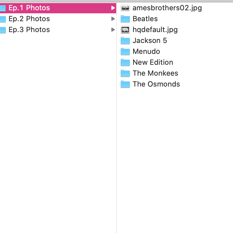
These past 2 weeks have really been a great progress time for the series and for me as a creative person with in the project. I was able to fully record my narration and get a handle on the length of each video. Then I went in and designed my 3 separate thumbnails which helped me finally come up with an idea for the intro and outro animations to each video. From there I collected tones of stock photos and videos of each band that I mention and organized into labeled folders so that I can also credit where I got everything correctly in each video. Now with only 2 weeks left all I need to do is finish a few simple graphic animations for each episode and assemble the graphics and stock photos and footage over the already edited and placed narration.
Looking back at my project management plan in Asana I’m still completely on track the only difference is instead of working on each video separately and finishing one before I start the next I decided to start all 3 at the same time, so I can do the same thing 3 times in a row and then move on to the next step. For example I trimmed my intros/outros and synched my audio for each video one after another and now I’m completely done with that task and can move onto adding B-roll.
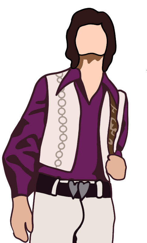
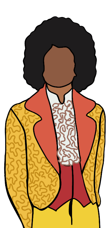
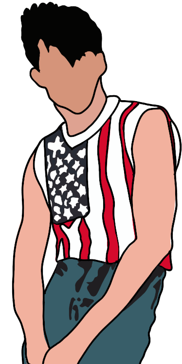
The biggest issue I was facing after I finished all of my production and was moving into post – production was the over all look of each video. I knew I was going to have animated graphics through out the video, I knew I was going to have an animated opening and an animated close and I knew I was going to have three thumbnails also designed by me. Plus I already had designed a logo so I wanted to continue with that theme. So I did a little more research on the importance of color branding and keeping things unified. “Visual perception is the primary sense humans have for exploring and making sense of their environment. Colors trigger a diverse set of responses within the cerebral cortex of the brain and throughout the central nervous system.” (Dawson). With this in mind, I decided to keep running with the pink theme and the abstract illustrated look of all the characters. This way you get a sense of the change in look and over all appearance of boy bands over the decades and not the change in specific faces.
On a side note, I know through out the videos I talk about boy bands not just being made for girls and that they were specifically targeted to be for girls and by branding everything I’m making pink I’m going against all of that, but in reality pink has a fun light hearted connotation. “If you have a pink logo, there’s a good chance that women are your target audience… in any other industry, you are probably trying to convey the message that your company is lively and fun.” (WebFX) And that’s what I want my audience to feel when they find my videos and watch them.
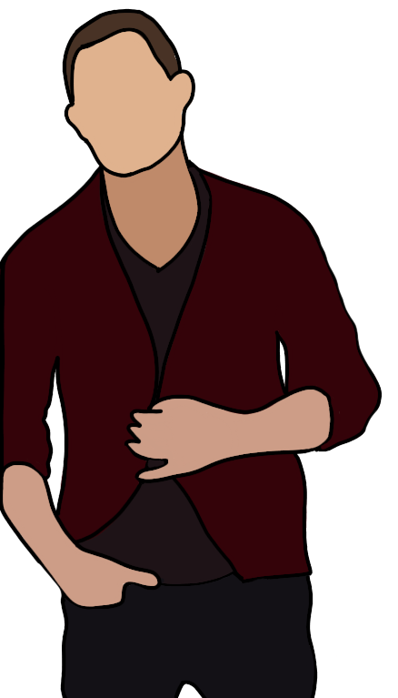
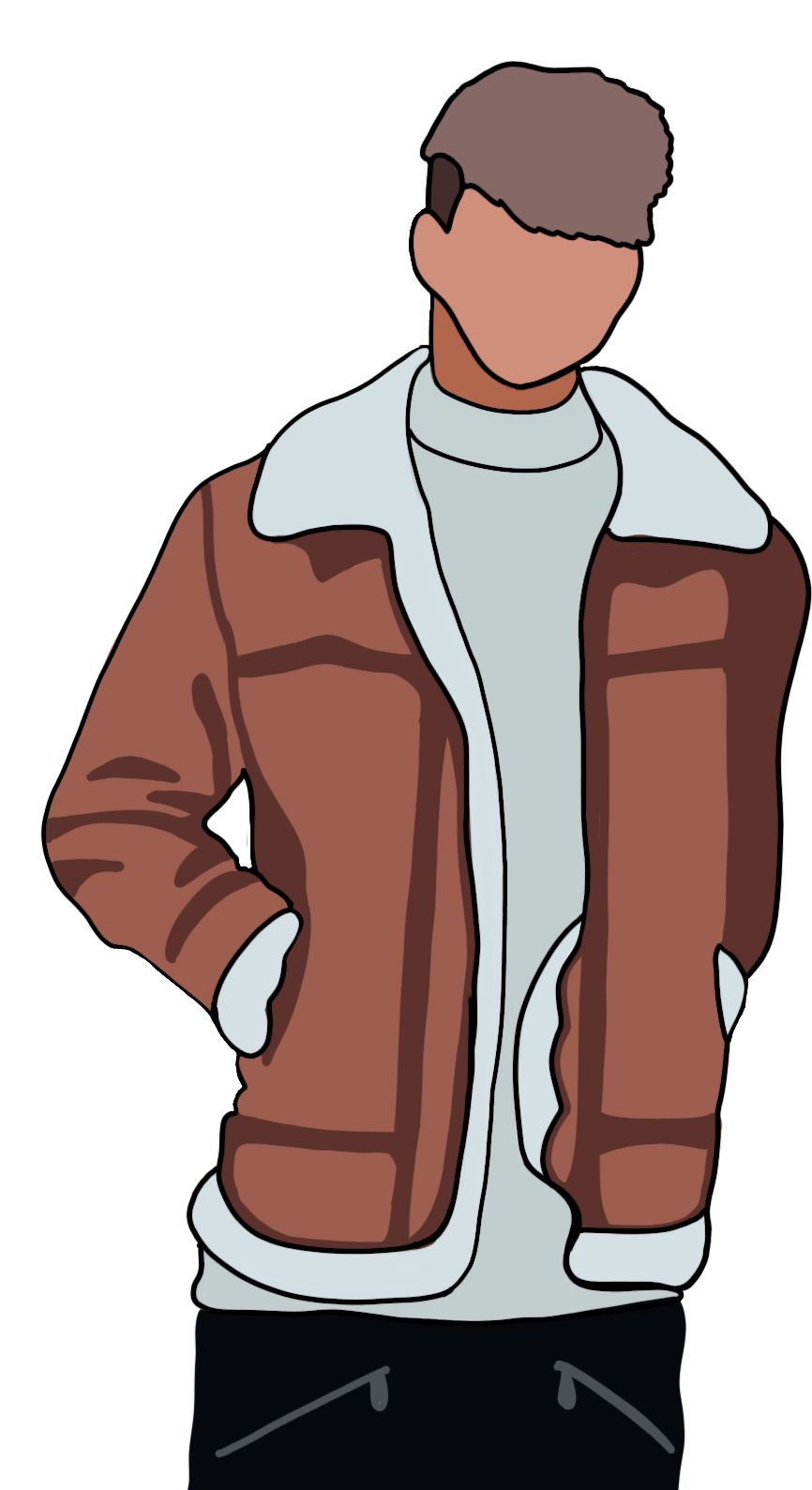
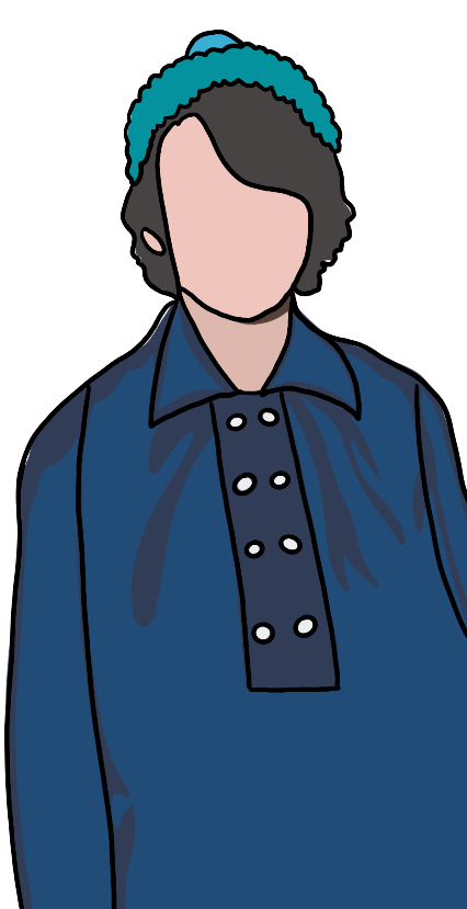
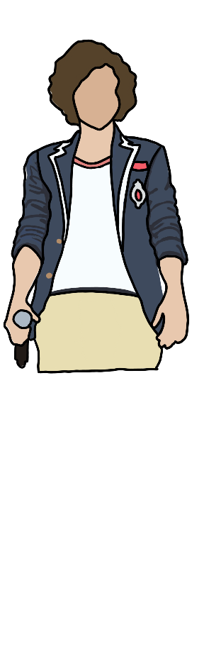
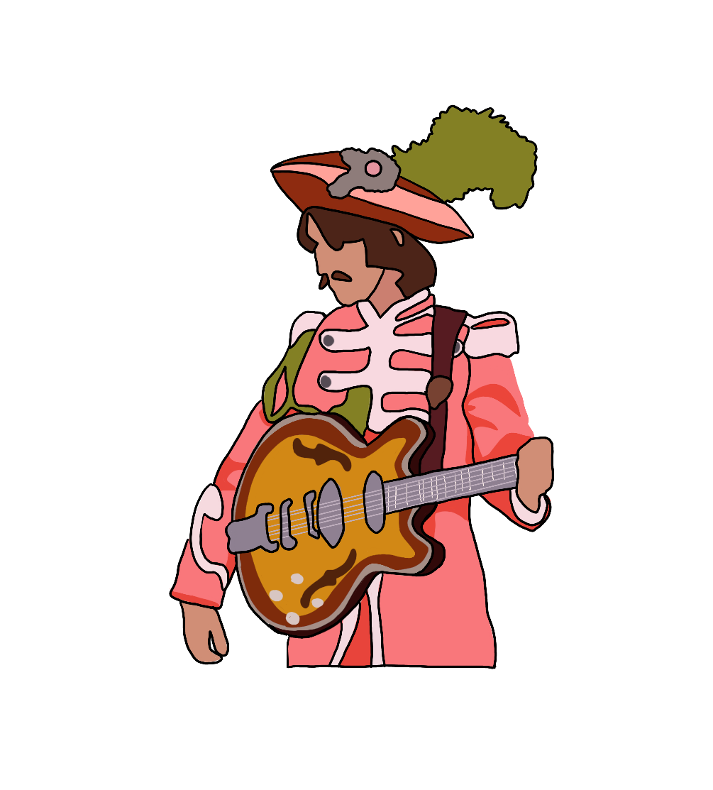
When I first started the logo, I had only made 5 boy band figure illustrations, but because I wanted to do row of the top 5 or 6 band members for each video I ended up have to make 16 different illustrations. Using adobe procreate on my Ipad I was easily able to draw all 17 characters and then import them into photo shop where I designed each thumbnail.
From there the inspiration struck me on how I was going to make my animated open, which was to go into Adobe After Effects and utilize these same 16 characters again and have them pop into screen along with the logo and the episode title.
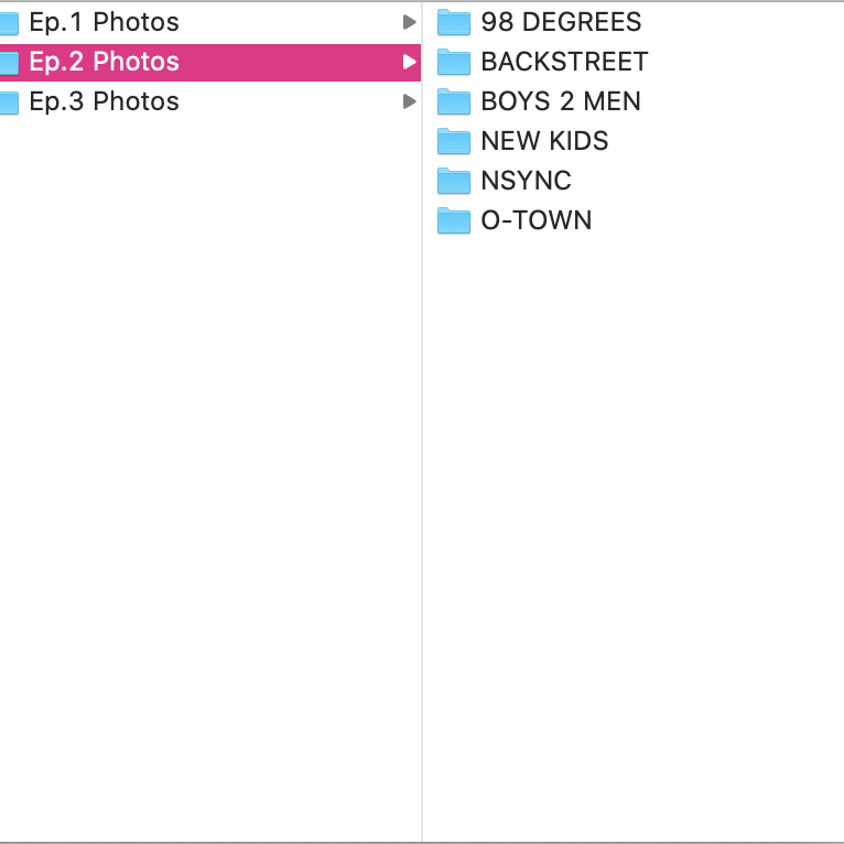
The final major thing that I did this week, was hunting down stock footage and photos of these bands over the years. I knew that whatever photos and video I ended up using I was going to have to credit the source correctly and wasn’t going to be able to use any of the sound off these videos for more than a few seconds. So with that also in mind I pulled stock from only trusted sources like the band’s direct label, Billboard and Getty. This way I know that I wasn’t using some weird photo from a non-trusted source.
Looking forward to the final 2 weeks, I’m going to continue to design and animated the last few graphics that I have through out the videos, with the same type of color, illustration and animation techniques in order keep things cohesive and on brand. Then I’ll just be adding the stock music, photos and videos to the parts of the narration that need them and before you know it, I’ll be exporting the videos and posting them. So keep a look out because they’ll be up soon.
Check out my Production Journal for weeks 5 and 6 below to see how long each specific task and step I completed took.
Week 4 for this project brought interesting challenges even more interesting solutions. My goal for week 4 was to get all of pre-production finished, conduct the interviews that I had scheduled and film my intro and outro segments for each episode on camera.
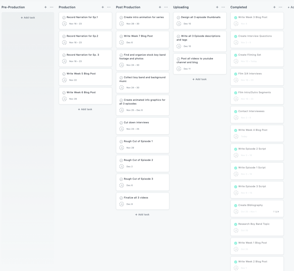
My project management board, showing that all tasks in pre-production have been completed and moved from the category.
I knew when first planning this project out in Asana that post – production was going to be a lot of work because their was a lot of animations and graphic creation so my goal has been to get pre – production and production done on the earlier side so I leave myself ample time to edit. At this rate I am on track to completely finish production in the next day or so and then I’ll jump right into post. The last thing in production that I wasn’t able to complete this past week was recording my narration tracks. I was called into work way more hours then I thought I was going to be so I wasn’t left with as much time as I wanted, but this upcoming week has a lot more free time in so I’m excited to get another big chunk of the project completed.
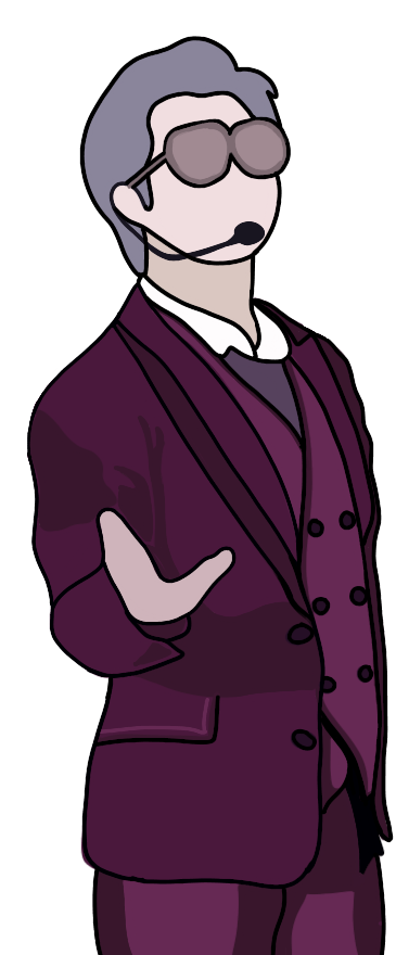
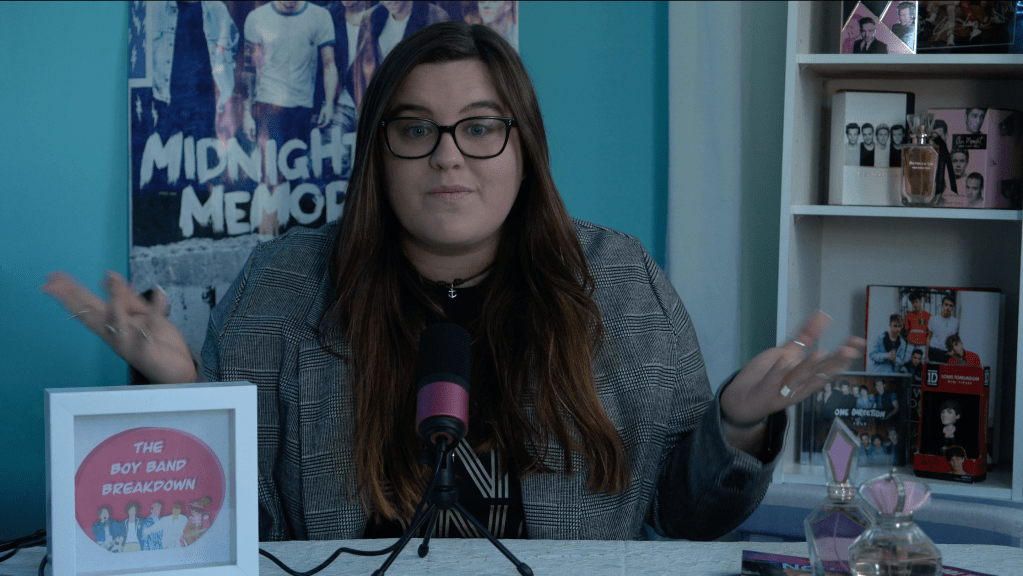
Another issue I encountered this week was when I was thinking about how I wanted my on camera intros and outros to look. I wanted to give that like news anchor look, as if I was actually on a real set to film it. The whole topic of the 3 part series is silly and fun so I wanted my persona to have a lot of fun to. But even after I came up with what I wanted it to look like I still had to actually figure out a way to create it.
In the end this was that the set looked like.
The first issue was space. Most rooms in my house are filled with furniture that can’t really be moved, so the only available room to use was my sister’s since she has the most room and the least furniture. I then had to style a fold up table to look like a cute desk, then I dragged my desk chair over to her room and put up an old boy band poster I had and put the shows logo into a frame and thought great I’m all ready to go. So I set uo the camera and mic, and used my sister’s LED lights natural window light to make sure there were no ugly shadows, but when I looked through the view finder on the camera it still looked blank. So I got to searching for things and in the deepest darkest part of my closet I found all of my sister and mine old boy band merchandise. I took my bed side table shelf, propped it up on two storage boxes and decorated it took look nice. Added a couple more pieces to the desk and was content.
Then I needed an outfit, I realized I still owned one boy band shirt that would still fit, my Jonas Brothers one from last November’s tour and threw on my favorite blazer. Finally I was ready to start recording. And that’s when I hit the next challenge. I knew I was going to be alone to film, so I figured I would let my audio and video run for as long as it took for me to get a full take of each section, but what I didn’t realize was that I was going to need a teleprompter in order to remember everything I had written. So this resulted in me using my iPad and propping it up right under the camera lens using an old wooden table and 4 of my sister’s text books. With that all set, I was ready to go. It took a whole but after a few hours I had recorded each section for all 3 episodes.
Here is a sneak peek at what the unedited RAW footage looks like for the intros and outros.
Now you might be thinking that’s all the issues for this week, well you’d be wrong. Each interview I had this week created it’s own little struggle. My first one was over Zoom and I wanted to make sure since I might be in the interview because Zoom records both screens that I look the same as I did for the intros and outros so I had to get in the same outfit and because my room faces my bed and I thought that was widely inappropriate I had to user my sisters again. Then my second interviewee was only able to do a phone interview so I used a Zoom recorder from work to record the phone audio as clear as it can. This also made me realize that I’ll have to shift the way I make the interview interesting during the video. The final interview was in person, so I set my camera and mic and conducted a normal interview.
Overall, this week was crazy, but also kind of fun just trying to solve problems in the moment, with out having to buy anything new or having to push things back. It made me further understand why pre-planning is super important and that even when you do plan things are always going to change on the spot.
If you want to check out all the tasks I completed this week and how long each one took click on my production journal below.
It’s week 3 of this project and I dove head first into planning, scheduling, more research and officially writing out the episodes. The process is always one of the hardest for me. My mind has a thousand ideas all flowing at the same time, but actually putting my fingers to the keyboard or pen to paper is becomes a challenge when the ideas are never in chronological order. The EasyBib blog describes exactly what I feel before I sit down for almost every writing assignment. “Students often find that organizing their thoughts can be one of the toughest parts of the writing process. They can find the information, jot down ideas, and even take good notes, but they struggle to arrange their thoughts into a cohesive structure that helps them communicate their ideas.” (Harding)
With that in mind, I decided to write the two most important things in each script down first… the intro and the outro. I knew from the beginning I wanted each episode to be high energy and so my language is very upbeat and conversational. Nothing sounds stiff or overly scripted. Plus, I can already picture myself sitting at my anchor desk on the little boy band breakdown set that I create starting next week.
After completing each intro and outro for each episode, I went on and continued to write the entire script for the 3rd episode. My personal favorite video is going to be the third one because the boy bands that I talk about are the ones that I’m actually huge fans of. So this script was the easiest to write about.
Because I struggle to write my 800 ideas in a single stream script I always start each project with a rough written out order of things and ideas. The list is always hand written because I need to physically see myself cross things out and draw arrows around things to connect ideas and add additional sub thoughts.
After planning each episode and getting all the scripts at least started I shifted tasks and worked on the interview aspect of each episode. I contact my episode 2 and 3 interviewees, Kevin and Shannon, they were both kind enough to say yes and I have them scheduled for interviews for next week. My episode 1 interviewee is actually my mother. There is no one else I know who is a bigger fan of the Monkees. I then went and created unique questions for each interview and have a list of constant questions that I’m going to ask each interview to see their differing opinions.
I also have an extra set of questions for an extra interview for episode 3 if I think I need it with a 15 year-old and 16 year-old. I’m holding off on conducting the interview in the first place because both girls are very uncomfortable on camera and talking in completed sentences so I don’t think it will add anything significant. But right now after writing out the episode and planning all the visuals it looks like I’ll have plenty of content.
I was able to check off another 4 tasks and move them over to the completed task section and I’m currently still working right on schedule with my task manager.
Planning ahead for next week is extremely important right now. In order to stay ahead of my plan that I created on Asana, I’m going to finish writing the first two episode scripts, interview my 3 interviewees and film my intro and outros for all 3 episodes. This way by the end of next week I’ll have all the pre-production and almost all of the production done, which will give me ample time to collect and organize all the stock and footage and photos I need and plan out how I’m going to create all the graphics I’ll need for each episode.
The final two things I did this week were, I went to Amazon and did my research to find a good condenser to use for my intro and outros and to use for my episode 1 interview since it will be in person and the rhode mic on top of my camera isn’t the best. After looking around for about 20 minutes, I went with one of Amazon’s top rated and best selling mics, Fifine mic that connects to both mac and windows. It has a great sound quality and is easily manipulatable in Adobe Audition. I also made the choice to get it in pink to match the entire aesthetic of the show.
I also create my first production journal documenting what I needed to get done this week verses what I actually got done. The journal also documents how long each task took and keeps me honest about dedicating enough to this project. If you want to check out this weeks production journals click the document below.
Once you have a project idea picked out and a creative direction planned, typically you want to jump right in. Creative minded people usually want to jump head in and start creating things, but very often don’t have a well thought out plan and that’s when things tend to get off track.
“Apparently, people who are disorganized and messy aren’t necessarily less productive or lazy. They’re just bold and more spontaneous. Actually, messy people are more imaginative.” (William) This spontaneity can get worn down though overtime so having a plan to flesh out when things need to get done and when the hard core research and business work needs to get done so the fun spontaneous creative can get started it always good.
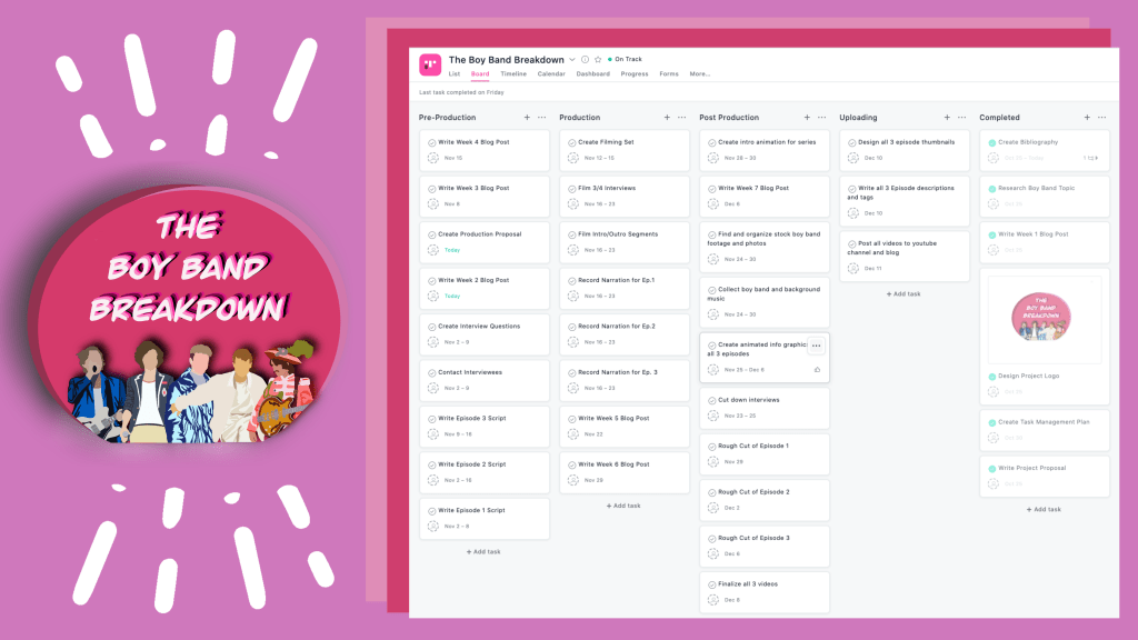
For “The Boy Band Breakdown” project it has multiple moving parts and separate stages that need to be completed on time in order to have 3 professional quality videos. In order to achieve this, this past week I created a project management plan on Asana. Asana is one of many project management platforms, other include Trello,Slack,Wrike,Clickup and more.
In my project board I chose to break the project down into 4 main sections and also a have completed column that I can move completed tasks to so that the other sections don’t get cluttered with green check marks and then I miss an unfinished task.
In the past I’ve used almost every other project management platform that I listed earlier and after doing multiple different projects on each one and working for different companies using different ones I found Trello to be the simplest and most user friendly, but then I came across Asana and it had very similar features the one difference I saw was that after creating my columns and lists I could also see all my tasks in a calendar view. This is something very important to me because I am a very visual learner and having a visual showing when tasks need to be completed and what tasks over lap is very important.
My calendar breakdown for the whole project.
Personally for me the biggest broken down section is Pre-Production because it has the most amount of writing and organizing and business level tasks and that can be very grueling for me at times. I love designing and filming and editing and can get very frustrated with the planning stages of things. So knowing this about myself I strategically made my project management plan have smaller more attainable task in pre-production so that I could get that gratification by checking boxes off.
Another huge thing for my project plan that probably differs from many other video project plans is that I have a separate uploading section instead of keeping it with in the production section. This is because when I’m editing the different episodes together I want to only be focused on that episodes visuals and audio and not thing about the thumbnail and youtube description. So to keep me from getting sidetracked and try to edit and create too many things all at once. I wanted to plan the dates out so that the videos will be completely done and exported before I make and the thumbnails and descriptions.
Many other project management plans have sections like mine and then create bigger tasks to go under them and then create checklists and subtasks inside of them. For me, I know that I personally wouldn’t like or even remember to click on each task and read down a checklist so instead I made mine to just have a bunch of separate task under each section and then with in some of the tasks I left myself desperation notes so that I remember any specifics that I might need to do. For examples in my contact interviewees task I listed some of the people I should reach out to so I don’t forget when I go to complete the task.
When reading about creative people and how we love to dive into a project I came a across a very interesting quote that I felt summed everything I was feeling up pretty well. “I’ve met two kinds of artists in my life: the creative who jumps head first into water and the creative who dips her toes in the well.” (Brummer) Often I find myself wanting to be the artist that jumps head first into a project and a few times I have been that person, but with out fail I always get stuck some where along the process. Other times I’m so disorganized in my head and I feel like I have no jumping off point to start the project. But with by stopping and taking some time to actually come up with a fully fleshed out production plan and create a project management board I feel more reassured about starting and actually completing this project.
If you want to check out my entire project production plan click the file below.
Ever since I was little I have been fascinated with music. It has gotten me through some of the worst moments in my life and has been right by my side for some of the best. When I was younger I studied the drums, the piano and went to vocal lessons. To this day I still enjoy singing and currently I work as a videographer and editor for a recording studio. So each day I’m lucky enough to be surrounded by music.
As I’ve grown up I’ve listened to all genres of music. My grandmother was into classical and Broadway music and that’s how I got into theater. My mother was into classic rock and my dad country. And after years of growing and cultivating my own opinions I feel in love with a very particular genre… boy bands.
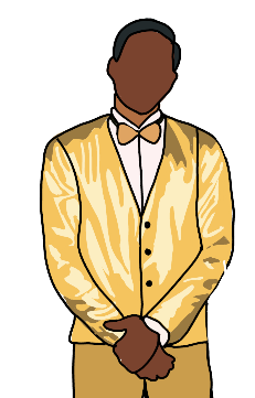
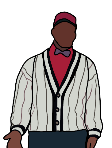
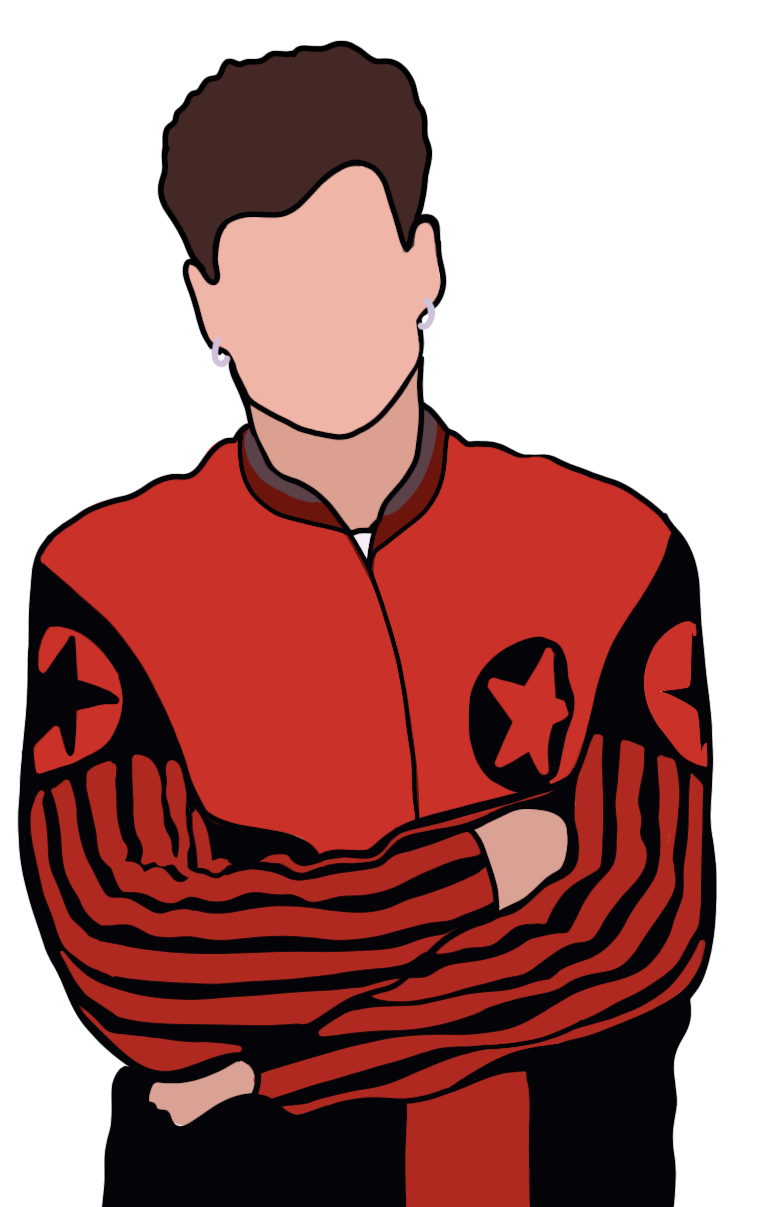
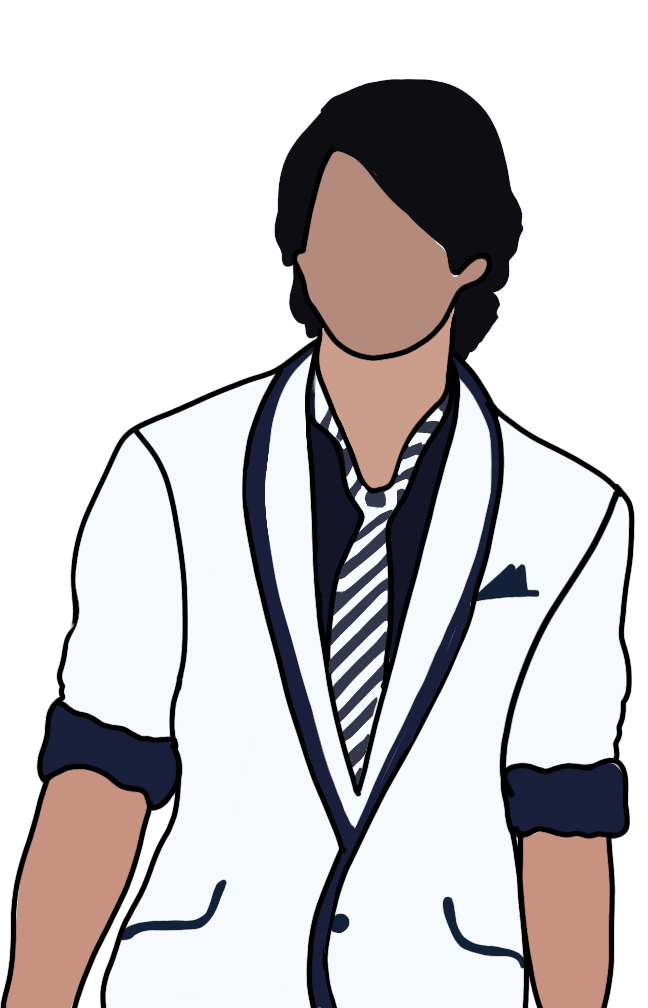
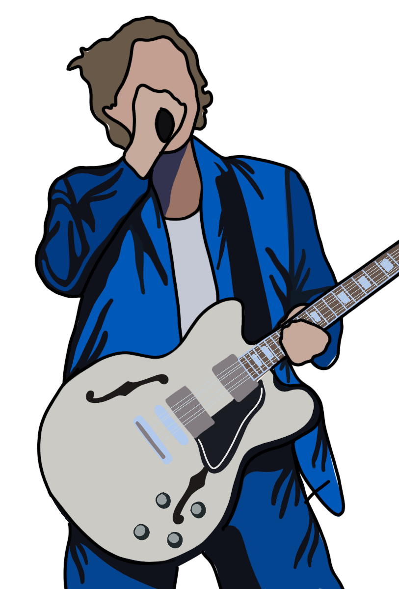
For me boy bands and the fanaticism that goes with them has been around my whole life. First it was the Jonas Brothers when I was like 8 and then Big Time Rush came on to the scene with their TV show, (like The Monkees) in 2009 and then it really hit. In 2010 on the X Factor UK a British boy band was assembled and I literally feel in love. This boy band was One Direction. Since then I have been to multiple of their tours, pre-ordered every album, had their t-shirts, posters, perfumes, saw their movie and will forever know every lyric to every song. This band also helped me find another one of my favorite bands 5 Seconds of Summer who were their openers on two of their tours. It’s been a fun 10 years of listening to this kind of music, but I’ve always wondered why do me and so many other girls have such a guttural reaction to these boy bands and how come the boy bands that I love today are nothing like the old ones?
That’s what I want to answer in my 3 part YouTube series where I take a deep look into the emotional psychology behind boy band fans and how the definition of boy bands has evolved over the years including the way their marketed, their sound and the controversy. I’ll be asking people who grew up loving bands from each of these decades to give me their opinion and asking people where they draw the line as to who is a boy band and who isn’t.
Over the years the word boy band has had a certain stigma attached to it. The word can discredit the band and make it seem like they have minimal talent and are only marketed for young girls who want to cry about love. And while at times that can be true, it shouldn’t be a blanket statement. Boy bands are complex and each member in the band can bring something different to the table and that becomes extremely evident when the bands inevitably break up. Certain members go solo with completely different musical sonics or career paths. For example, Justin Timberlake (NSYNC), Harry Styles (One Direction) and Donny Wahlberg ( New Kids On the Block).
I want to create a fun Youtube series that all genders can enjoy and learn something from. By using well organized research and well crafter visuals I believe it’s completely possible. I want to not only push myself on a researching in depth, but also want to push myself as a storyteller and artist. I want to create compelling episodes that entertain from beginning to end and I want each episode to contain animated visuals that I’ve never tried before.
I’m looking forward to the next few weeks as I begin to make this idea a reality and continue to create. It’s going to be a lot of work, but I’m passionate and excited about the subject and I think it’s going to end up being something that no ones ever really watched before.
In order to jump right in and start the process, I created a proposal for the YouTube series that highlights the main parts of the project and the equipment and materials needed to make it a reality. I also made an organized bibliography with the research I have done so far. Both documents are linked below. Check them out if you’re interested in my project and want to learn more.
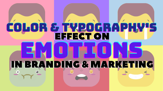
People say the word color and you think of art or the rainbow. People say the word typography and you think of books and newspapers, but did you ever think that both words could have a profound effect on your emotions? And did you know that advertisers and marketing companies have been using those two things to manipulate the way you feel about all of their products for years. “They know certain colors, tints, hues, and shades evoke emotion and move people to action. This effect is both subtle and powerful… Through their choice of color in logos, packaging, signage, and advertising, brands can influence consumers to buy on impulse, or choose their product or service over a competitor’s” (DashBurst).
The use of color choice and type design is not a new and profound art, it’s been used for years in storytelling. Creators have specifically highlighted a certain color in a TV show or film to help convey a specific theme or consciously choose to italicize or bold a specific word to highlight it on a poster or infographic, but the same storytelling goes into a companies website, logo, packaging and even overall product design. The company needs to tell their story in the best way possible so people will buy it. Today’s society knows the traditional story arc. It starts with the character introduction, then the problem, the climax, and ends with the solution. To put that into marketing terminology. The character introduction is you the consumer, the problem is an issue you’re having in your everyday life. The climax is your final straw with the problem and you deciding to do some research on how to fix it and the resolution is the company showing you through their marketing that their product is the one that will solve your problem and surpass your expectations. When looking at the principles of good storytelling, you want something with a high sensory level to make your consumers/audiences feel what you’re showing/selling. “When you’re soliciting support for your organization, you need to inspire your audience! Sometimes we avoid using imagery that makes us feel sad or uncomfortable. However, disrupting the norm with something that overwhelms the senses can trigger an emotional response. Your audience will be more ready to engage and take action when you invite them into your reality with powerful, emotional visual storytelling” (Lien). Manipulating certain colors and types in the correct way will trigger these specific responses and get people to believe in your company’s story.
Color
In today’s tech savvy and consumer conscious society people catch on to marketing and branding trends very easily. We’re constantly inundated by sponsored ads popping up on websites and campaigns filling up our feed on all of social media platforms. So brand ambassadors and marketing specialists have had to get creative and more subtle with their advertisements, and that’s where using color psychology comes in. “Color gives your brand the ability to express different moods. It has the power to express a brand’s attributes and values and, according to studies, to increase brand recognition by up to 80%. (Think about Coca-Cola’s tomato red when considering whether this statistic holds true). When used effectively, your brand color palette should evoke an emotion that reflects your brand identity.” (Canva). With these tools behind them, companies can design a well curated and thought out brand book with their logo and font types, that uses very specific color combinations to push people into buying their product without saying outright to buy their product. “Once we immerse ourselves in a story, the action of looking at something becomes an experience. And an experience leads to an emotional connection… The consumer decision-making process is based on that emotional connection. And if you sell a product or a service, understanding how to create emotional connections that drive purchase decisions is crucial for your business” (Zen).
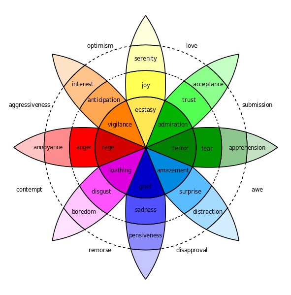
Plutchick’s Wheel of Emotions
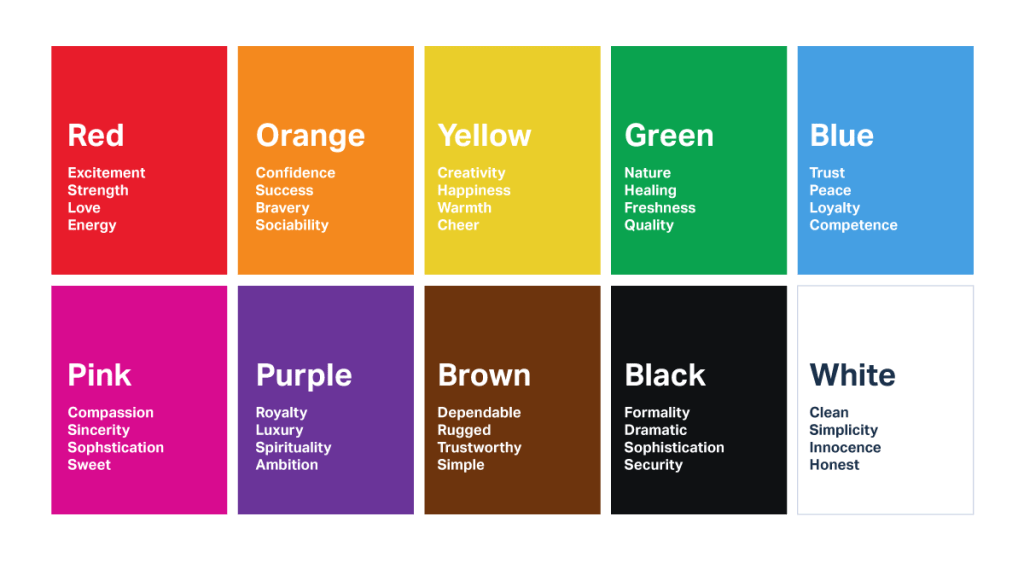
Psychologist Robert Plutchick created a psycho-evolutionary idea in which he defined that we have 8 basic emotions and we feel those emotions in different intensities. These 8 basic emotions are, anger, disgust, fear, sadness, anticipation, joy, surprise and trust. Overtime advertisers and artists took his wheel of emotions and used it as a starting point for their creations. The Interaction Design Foundation said, “The wheel can be used by designers to examine the complexities of emotion and to act as a “colour palette” for emotional design – with the idea being that blending different emotions will create different levels of emotional response and intensities of that response.” As people did this more and more certain colors have been used a repeated amount of times in the same industry that they are now permanently associated with it, like red and yellow in the food industry. For more color and industry connections the following chart made by Graf1x, describes each color association in great detail.
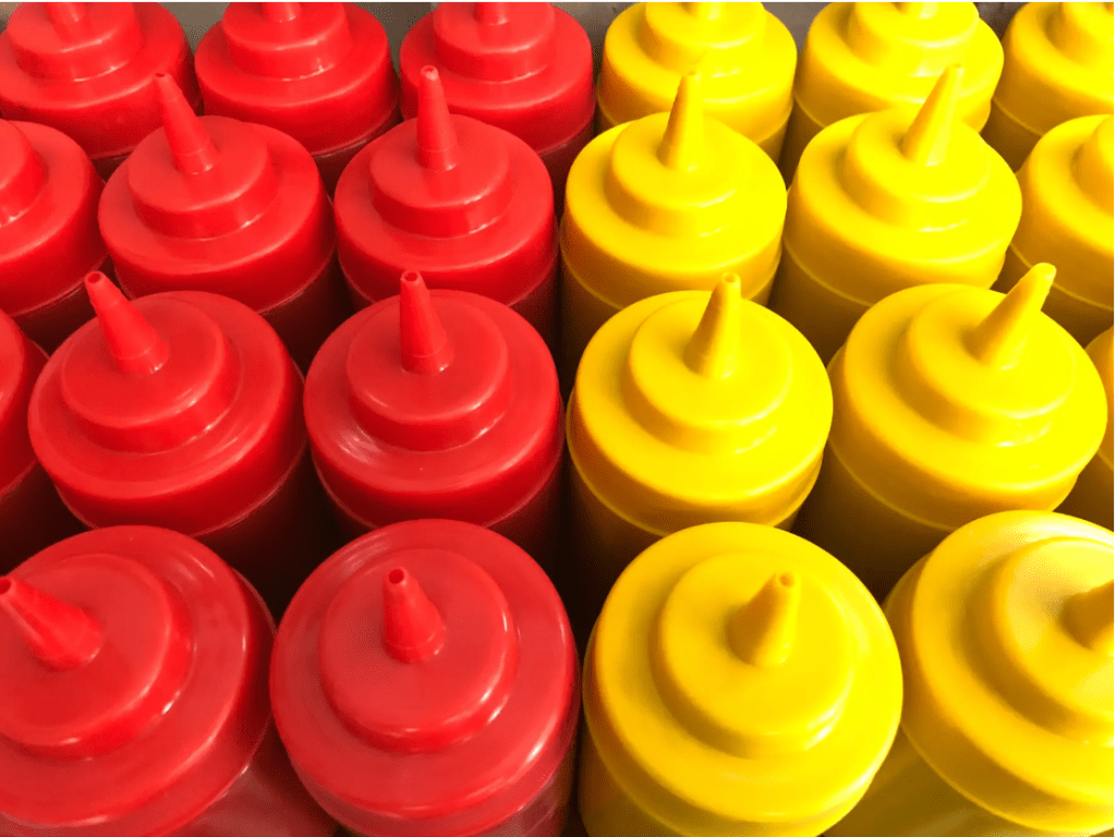
Diving deeper into the food industry, if you take a step back and really think about the most well known food brands, what do you come up with? McDonalds, Wendy’s, Burger King, Chick-fil-a, Coca Cola, Fanta, Tyson, Kelloggs, Nestle, Campbell’s and so many more. But do you see the similarity within all of them? Each one of these companies’ logos or company color has some sort of yellow, red and even orange in it and that’s not a coincidence.
“According to color psychology, yellow has long been associated with feelings of contentment, happiness, competence, and comfort. One simple color is responsible for that sense of nostalgia and friendliness you feel whenever you pass by those golden arches” (Urie). Yellow is typically associated with happiness and joy so it only makes sense that food companies want you to feel good about eating their food. But why add red? “Red is another color that is frequently paired with yellow in fast food company logos to instill desire. Red illustrates desire, power, and love. It’s why whenever Valentine’s Day rolls around, everything gets blanketed in a layer of rose red and why, when paired with yellow, you might suddenly start salivating for a cup of perfectly cooked golden french fries” (Urie). Red is also typically associated with power, energy and stimuli just like the color orange. Both colors can be seen strewn across numerous energy drinks and sodas. This is to trick your brain into thinking you should buy their product to drink when you need a good pick me up.
Another couple of colors used very often either together or separate and associated with very similar industries are green and blue. Green is typically known for safety, environmental replenishment and stability, while blue is known for calmness, trust and responsibility. According to Adobe’s market engagement blog, “Blue is the most popular color choice for the top brands. It is thought to put people at ease, as it reminds them of the sky and the ocean. Blue is also associated with trust, security, and confidence which make a great combination for the brands that want these elements in their message. Blue seems to be the winning color, as it shows up in 33% of the top 100 brands” (Solar). These characteristics are why both colors are used with most of the biggest companies in banking, technology, aerospace, real estate and non-profit, which are all types of companies that you want to trust before you hand over your money and invest in them. Examples of these big companies would be Unilever, Land Rover, Animal Planet, GE, Intel, IBM and BP. When you look at Unilever’s big blue “U” logo, you want to be put at ease knowing that you’re buying safe and trustworthy cleaning products, food, shampoo and more for your family.
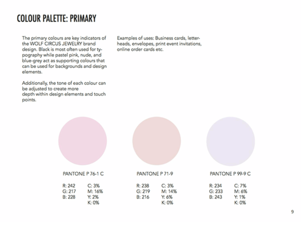
Here is an example of a page from a companies branding guide that shows exactly what colors to use and when.
On the complete opposite side of the most popular brand color, are the colors that aren’t typically used as the main color at all, but rather used adjacent to, as a secondary color. “Color palettes that feature multiple colors often dedicate specific colors to specific types of marketing content. While the first two colors of your color palette might govern your logo, for example, the next two colors might support your website and blog design.” (Cook). These supporting colors are typically your neutrals, like black, white, brown and beige. Each color has its own specific emotional association, black and elegance, white and simplicity, brown/beige and comfort, but they can also all help take on whatever color they are partnered with. “On its own, beige is dull… however, it will take on the characteristics of the colors around it, making it an interesting design tool. For these reasons, beige is almost always a secondary or background color.” (Cao). Examples of this are companies like Starbucks, who use green and brown to give you the feeling of safety and comfort when drinking their coffee. Another example would be Netflix, its famous red and white logo symbolizes both fun, energetic entertainment with the red, but also the easy simplicity of the product with the white. Just sign up and watch whatever you want whenever you want!
The final type of color use that most people would have an emotional response to, are the very special and stand out colors, like pink and purple. Both colors are associated with such specific things in western culture like love, romance, youth, royalty and the female gender. Hence why very American companies like Justice, Barbie, Hallmark, Lifetime and Wonka are such stick out companies because they use such an unexpected color in our minds’ eyes. But these colors are also very interesting because in many cultures around the world they don’t mean the same thing. “Colors have a variety of associations within North American culture alone, and can mean something radically different to Japanese or Middle Eastern readers, where color meanings are frequently much more specific and defined” (Moss). As stated before in North America purple is synonymous with wealth and royalty but in Asian and Latin countries it’s associated with death and mourning, two very different things. And pink while typically paired with femininity in North America. In Korea it’s associated with trust, and in Latin America it’s associated with architecture since many of their buildings are painted pink. When designers and branding officers are creating their company’s identity they have to think of these things depending on if their company is global or if it only focuses on one specific region. “The perception and application of color is strongly influenced by one’s innate physiological and psychological predisposition, personal experiences, age, gender, personality, income, ethnographic and demographic factors that makes its application effective within the domain of marketing all the more cumbersome and challenging.” (Singh, Srivastava).
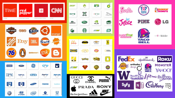
An array of big name company logos and broken down into the main colors. Note the similarity between many of the companies in each color.
Color isn’t the only thing companies can use in their brand identity to manipulate consumers’ emotions and push them to buy their products. But color is definitely the most profound one, as it creates the biggest stimuli for the brain to process. In the Journal of the Academy of Marketing Science they describe the profound responses the human brain has to colors, “A two dimensional framework in terms of color has also been established, where one dimension is purported to stimulate arousal, producing physiological responses such as increased brain activity and heart rate, while the other stimulates evaluative responses, which induce attitude change” (Labrecque, Milne). It depicts the fact that color not only affects an emotional change in attitude but also behaviour. So going back to the original and most well known color combination, when we see those yellow and red arches at McDonalds the colors not only make our attitude change into happiness and hunger but also changes our stomach’s behaviour and triggers it to start grumbling.
Typography
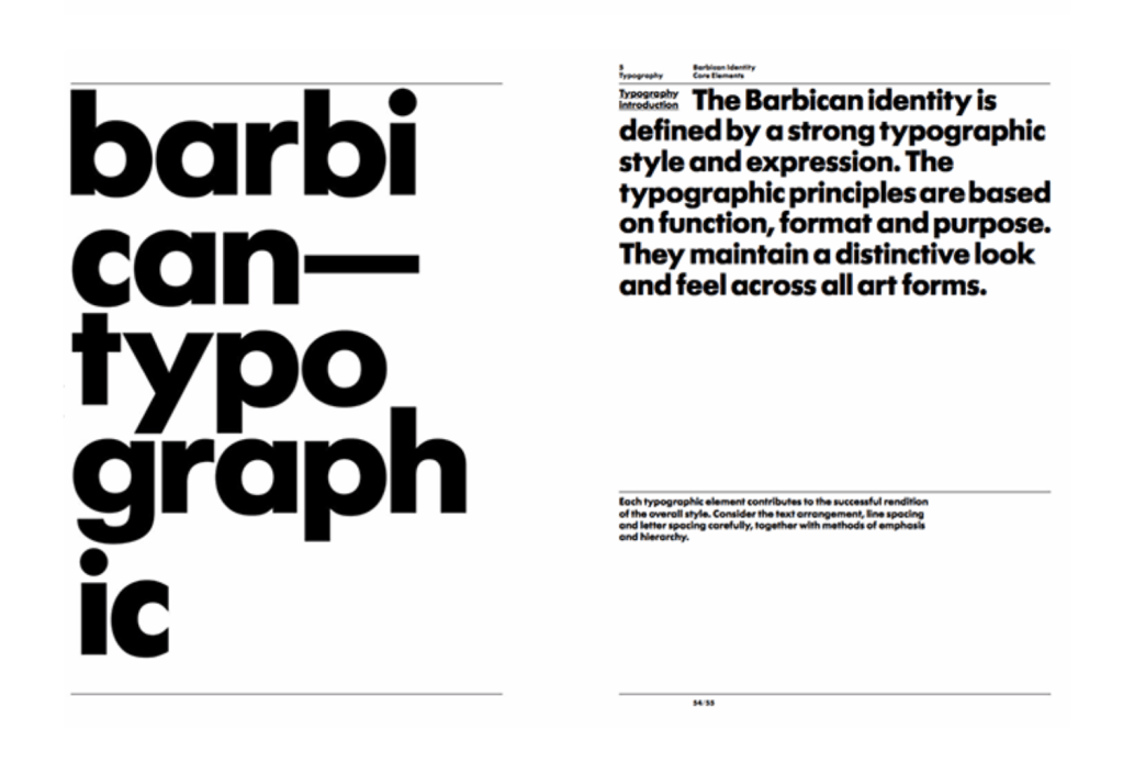
Here is a page from another company’s branding guide that shows exactly what type of font to use and why they use it.
Pushing off from color, another major design tool used by most advertisers in a companies brand identity is the company’s typography. When designing a website, magazine or any other marketing material the company’s name in its own unique font will be the first thing your consumers read. So you want it to stand out and give consumers the exact feel of your brand in seconds while still being easy on the eyes to read. “It’s important to try and steer clear of default fonts so that you can separate your business from the rest and help to create a strong and unique font that showcases your brand’s values and personality” (Drzewiecka).
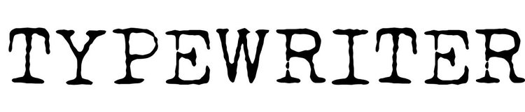
There are many types of fonts that are universally known and each type brings with it a certain feeling and emotional response. A serif font, brings a traditional and classic feeling and can make the initial look of your company seem high end, elegant and authoritative. A san serif font is clean and modern. It gives your product a contemporary feeling and can show your consumers that your brand is forward thinking and creative. A more specific and special font is the well known typewriter font. It’s quirky and can give your company a vintage and rustic feel. The font would be great for a company selling handmade products, but at the same time you have to be careful when marketing it, because it can at times have a very outdated look. Finally, a script font can give your brand a pop of life and energy. Script is so customary and specialized that your company can make its very own and can give consumers that feeling of fun yet elegance. One thing that designers have to watch when picking this as the font type for the brand is to make sure it’s not too thin and tight together, otherwise it does become very hard to read.
“The font for headings should be the largest and expressive of the persona of the brand. If you want to use a script, uppercase, or title font then the heading is the place as these typefaces aren’t easy to read in small or dense copy” (Canva). This is why companies have multiple fonts in a brand identity. The flashiest and biggest one leads, while the more reversed serifs or sans serifs make up the subtitle and body texts.
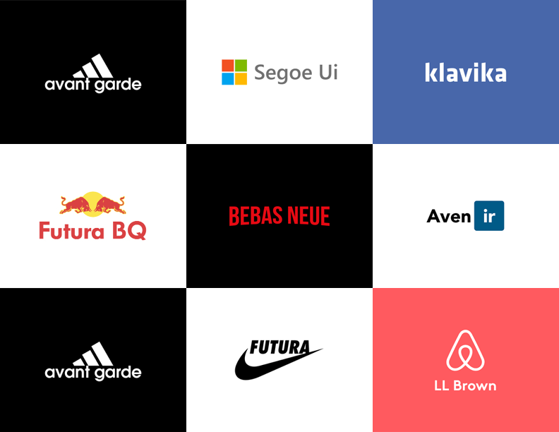
These are 9 of the most well known logos and what their fonts are in reality. All of them use very simple serif and san serif fonts.
It’s very important that an easy to read font is leading your business and accents your company’s color and imagery choices. Your website and possibly even packaging should all be uniformed. If you’re going for a powerful in your face brand, then red with a serif font is the way to go. Red is known for its influence in energy and power and a serif font eludes to tradition and authority. “The brand name reinforces the meanings of the package’s visual codes, such as for the French table wine brand called “Vieux Papes/Old Popes.” In this case, the brand name obviously interacts with the brand’s blackletter typeface to suggest “seniority” and “tradition”” (Celhay, Remaud).
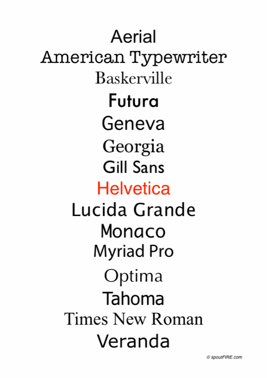
Here is a list of the most known and easily readable fonts.
On the other hand many companies want to think so far out of the box on their font choices that they pick fonts that are so hard for consumers to read they become frustrated and turn away from the product. Typography that includes extra characters added to letters or something too thin, just an outline font or even a font that is extremely bold with a secondary pattern inside of it, in most cases, is too overwhelming and makes the company look childish and naive to consumer needs. This makes the consumer thought process, “how could I possibly trust their product if I can’t trust their branding choices?” It’s also been studied and proven many times that easier and more well known fonts are read at a faster rate than newer type faces. In a study done by the Faculty of Psychology at the Ruhr-University Bochum, 12 participants were given words to read in the well known font “Arial”and the unknown font “Timeline” and they found that the, “response times yielded no significant main effects or interactions for the factor emotion, but a significant font effect, based on faster processing of words presented in Arial compared to Timeline… small visual changes like inclusion or exclusion of serifs to a font are known to affect word recognition performance.” (Kuchinke, Krause, Fritsch, Briesemeister). The test revealed that while the font type didn’t have a profound effect on the emotion of each candidate, it didn’t affect the rate at which they read and understood each word.
Conclusion
In the end, manipulating color and typography isn’t a sure fire way to get everyone to purchase your product, but it does help. “Research conducted by the secretariat of the Seoul International Color Expo found that 93 percent of buyers focus on visual appearance. And close to 85 percent claim color is a primary reason when they make a purchase!” (DashBurst). Overtime psychologists and marketing gurus have studied long and hard the effects of color and type on not only human emotions, but animal and other species emotions and have found many similarities between all of us, but there is still so much to investigate. Scientists can say that blue makes you feel calm or sad depending on your environment, but haven’t exactly figured out why.
Nonetheless, the next time that you’re looking at a products packaging, website or just even the logo, think about the color and the typeface, what does it make you feel? Do you think it’s what the company wants you to feel? Does it make you want to buy the product more or less? Expert advertisers aren’t going away any time soon, and with each advancement in technology they’re getting smarter and smarter, and the consumer needs to keep up. Understanding that such simple things like color and typography can be manipulated to change your emotions can help you make better and more informed decisions on certain products.
Bibliography:
Kuchinke, Lars, et al. “A Familiar Font Drives Early Emotional Effects in Word Recognition.” Science Direct , Elsevier, 7 Aug. 2014, www-sciencedirect-com.libraryproxy.quinnipiac.edu/science/article/pii/S0093934X14001163. (Peer Reviewed)
Cao, Jerry. “Web Design Color Theory: How to Create the Right Emotions with Color in Web Design.” The Next Web, 11 June 2018, thenextweb.com/dd/2015/04/07/how-to-create-the-right-emotions-with-color-in-web-design/. (Module 2)
Celhay, Franck, and Hervé Remaud. “What Does Your Wine Label Mean to Consumers? A Semiotic Investigation of Bordeaux Wine Visual Codes.” Science Direct , Elsevier, 20 Oct. 2017, www-sciencedirect-com.libraryproxy.quinnipiac.edu/science/article/pii/S0950329317302598. (Peer Reviewed)
Labrecque, Lauren, and George Milne . “Exciting Red and Competent Blue: the Importance of Color in Marketing.” Journal of the Academy of Marketing Science, Quinnipiac University , 2012, search-proquest-com.libraryproxy.quinnipiac.edu/docview/1030089315?accountid=13381&pq-origsite=summon. (Peer Reviewed)
Lien, Jade. “Worth 1,000 Words: The 4 Principles of Visual Storytelling.” Action Graphics, 4 Mar. 2020, actiongraphicsnj.com/blog/4-principles-visual-storytelling/. (Module 1)
Published: Jun 19, 2014 Last Updated: Jun 2. “How to Use the Psychology of Colors When Marketing.” Small Business Trends, 2 June 2020, smallbiztrends.com/2014/06/psychology-of-colors.html. (Internet Source)
Singh, Nayanika, and S K Srivastava. “Impact of Colors on the Psychology of Marketing — A Comprehensive over View.” Management and Labour Studies , Xavier School of Management , 1 May 2011, journals-sagepub-com.libraryproxy.quinnipiac.edu/doi/abs/10.1177/0258042X1103600206. (Peer Reviewed)
Solar , Matt. “What Brand Colors Can Reveal About Your Business: Marketo.” Marketo Marketing Blog – Best Practices and Thought Leadership, Marketo, 23 May 2018, blog.marketo.com/2018/05/brand-colors-can-reveal-business.html. (Internet Source)
Team, Visuable. “What Your Typeface Says About Your Brand.” Visuable®️ Personal Branding Agency in Bristol | London | UK, Visuable®️ Personal Branding Agency in Bristol | London | UK, 17 May 2018, visuable.co/blog-visuable/what-your-typeface-says-about-your-brand. (Internet Source)