
Introduction
People say the word color and you think of art or the rainbow. People say the word typography and you think of books and newspapers, but did you ever think that both words could have a profound effect on your emotions? And did you know that advertisers and marketing companies have been using those two things to manipulate the way you feel about all of their products for years. “They know certain colors, tints, hues, and shades evoke emotion and move people to action. This effect is both subtle and powerful… Through their choice of color in logos, packaging, signage, and advertising, brands can influence consumers to buy on impulse, or choose their product or service over a competitor’s” (DashBurst).
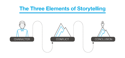
The use of color choice and type design is not a new and profound art, it’s been used for years in storytelling. Creators have specifically highlighted a certain color in a TV show or film to help convey a specific theme or consciously choose to italicize or bold a specific word to highlight it on a poster or infographic, but the same storytelling goes into a companies website, logo, packaging and even overall product design. The company needs to tell their story in the best way possible so people will buy it. Today’s society knows the traditional story arc. It starts with the character introduction, then the problem, the climax, and ends with the solution. To put that into marketing terminology. The character introduction is you the consumer, the problem is an issue you’re having in your everyday life. The climax is your final straw with the problem and you deciding to do some research on how to fix it and the resolution is the company showing you through their marketing that their product is the one that will solve your problem and surpass your expectations. When looking at the principles of good storytelling, you want something with a high sensory level to make your consumers/audiences feel what you’re showing/selling. “When you’re soliciting support for your organization, you need to inspire your audience! Sometimes we avoid using imagery that makes us feel sad or uncomfortable. However, disrupting the norm with something that overwhelms the senses can trigger an emotional response. Your audience will be more ready to engage and take action when you invite them into your reality with powerful, emotional visual storytelling” (Lien). Manipulating certain colors and types in the correct way will trigger these specific responses and get people to believe in your company’s story.
Color
In today’s tech savvy and consumer conscious society people catch on to marketing and branding trends very easily. We’re constantly inundated by sponsored ads popping up on websites and campaigns filling up our feed on all of social media platforms. So brand ambassadors and marketing specialists have had to get creative and more subtle with their advertisements, and that’s where using color psychology comes in. “Color gives your brand the ability to express different moods. It has the power to express a brand’s attributes and values and, according to studies, to increase brand recognition by up to 80%. (Think about Coca-Cola’s tomato red when considering whether this statistic holds true). When used effectively, your brand color palette should evoke an emotion that reflects your brand identity.” (Canva). With these tools behind them, companies can design a well curated and thought out brand book with their logo and font types, that uses very specific color combinations to push people into buying their product without saying outright to buy their product. “Once we immerse ourselves in a story, the action of looking at something becomes an experience. And an experience leads to an emotional connection… The consumer decision-making process is based on that emotional connection. And if you sell a product or a service, understanding how to create emotional connections that drive purchase decisions is crucial for your business” (Zen).
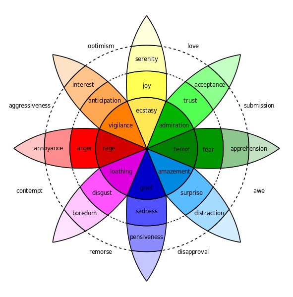
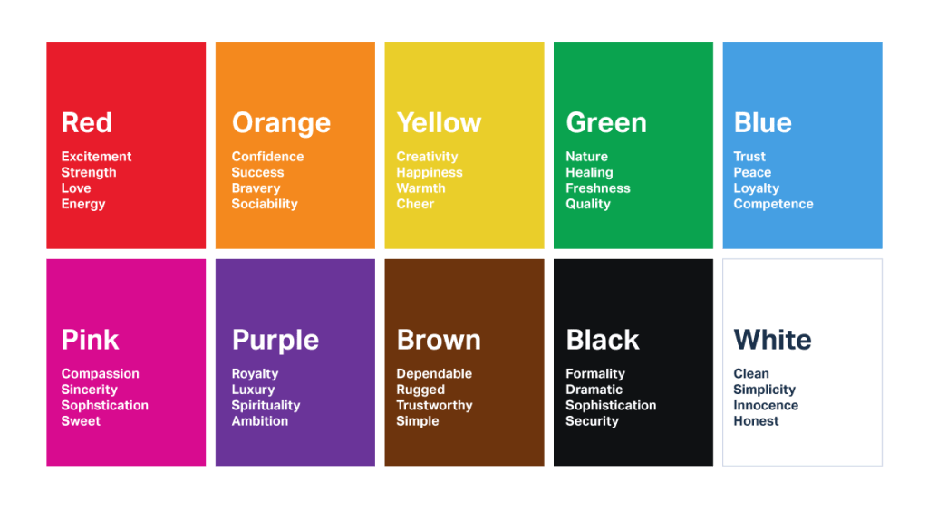
Psychologist Robert Plutchick created a psycho-evolutionary idea in which he defined that we have 8 basic emotions and we feel those emotions in different intensities. These 8 basic emotions are, anger, disgust, fear, sadness, anticipation, joy, surprise and trust. Overtime advertisers and artists took his wheel of emotions and used it as a starting point for their creations. The Interaction Design Foundation said, “The wheel can be used by designers to examine the complexities of emotion and to act as a “colour palette” for emotional design – with the idea being that blending different emotions will create different levels of emotional response and intensities of that response.” As people did this more and more certain colors have been used a repeated amount of times in the same industry that they are now permanently associated with it, like red and yellow in the food industry. For more color and industry connections the following chart made by Graf1x, describes each color association in great detail.

Diving deeper into the food industry, if you take a step back and really think about the most well known food brands, what do you come up with? McDonalds, Wendy’s, Burger King, Chick-fil-a, Coca Cola, Fanta, Tyson, Kelloggs, Nestle, Campbell’s and so many more. But do you see the similarity within all of them? Each one of these companies’ logos or company color has some sort of yellow, red and even orange in it and that’s not a coincidence.
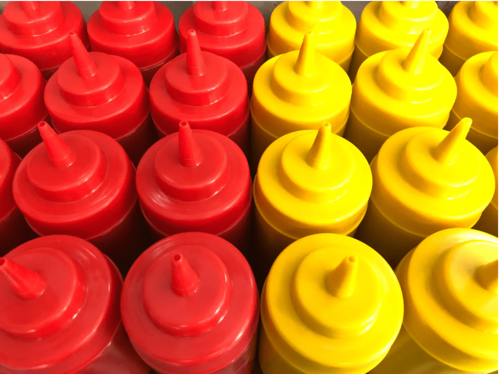
“According to color psychology, yellow has long been associated with feelings of contentment, happiness, competence, and comfort. One simple color is responsible for that sense of nostalgia and friendliness you feel whenever you pass by those golden arches” (Urie). Yellow is typically associated with happiness and joy so it only makes sense that food companies want you to feel good about eating their food. But why add red? “Red is another color that is frequently paired with yellow in fast food company logos to instill desire. Red illustrates desire, power, and love. It’s why whenever Valentine’s Day rolls around, everything gets blanketed in a layer of rose red and why, when paired with yellow, you might suddenly start salivating for a cup of perfectly cooked golden french fries” (Urie). Red is also typically associated with power, energy and stimuli just like the color orange. Both colors can be seen strewn across numerous energy drinks and sodas. This is to trick your brain into thinking you should buy their product to drink when you need a good pick me up.
Another couple of colors used very often either together or separate and associated with very similar industries are green and blue. Green is typically known for safety, environmental replenishment and stability, while blue is known for calmness, trust and responsibility. According to Adobe’s market engagement blog, “Blue is the most popular color choice for the top brands. It is thought to put people at ease, as it reminds them of the sky and the ocean. Blue is also associated with trust, security, and confidence which make a great combination for the brands that want these elements in their message. Blue seems to be the winning color, as it shows up in 33% of the top 100 brands” (Solar). These characteristics are why both colors are used with most of the biggest companies in banking, technology, aerospace, real estate and non-profit, which are all types of companies that you want to trust before you hand over your money and invest in them. Examples of these big companies would be Unilever, Land Rover, Animal Planet, GE, Intel, IBM and BP. When you look at Unilever’s big blue “U” logo, you want to be put at ease knowing that you’re buying safe and trustworthy cleaning products, food, shampoo and more for your family.
On the complete opposite side of the most popular brand color, are the colors that aren’t typically used as the main color at all, but rather used adjacent to, as a secondary color. “Color palettes that feature multiple colors often dedicate specific colors to specific types of marketing content. While the first two colors of your color palette might govern your logo, for example, the next two colors might support your website and blog design.” (Cook). These supporting colors are typically your neutrals, like black, white, brown and beige. Each color has its own specific emotional association, black and elegance, white and simplicity, brown/beige and comfort, but they can also all help take on whatever color they are partnered with. “On its own, beige is dull… however, it will take on the characteristics of the colors around it, making it an interesting design tool. For these reasons, beige is almost always a secondary or background color.” (Cao). Examples of this are companies like Starbucks, who use green and brown to give you the feeling of safety and comfort when drinking their coffee. Another example would be Netflix, its famous red and white logo symbolizes both fun, energetic entertainment with the red, but also the easy simplicity of the product with the white. Just sign up and watch whatever you want whenever you want!
The final type of color use that most people would have an emotional response to, are the very special and stand out colors, like pink and purple. Both colors are associated with such specific things in western culture like love, romance, youth, royalty and the female gender. Hence why very American companies like Justice, Barbie, Hallmark, Lifetime and Wonka are such stick out companies because they use such an unexpected color in our minds’ eyes. But these colors are also very interesting because in many cultures around the world they don’t mean the same thing. “Colors have a variety of associations within North American culture alone, and can mean something radically different to Japanese or Middle Eastern readers, where color meanings are frequently much more specific and defined” (Moss). As stated before in North America purple is synonymous with wealth and royalty but in Asian and Latin countries it’s associated with death and mourning, two very different things. And pink while typically paired with femininity in North America. In Korea it’s associated with trust, and in Latin America it’s associated with architecture since many of their buildings are painted pink. When designers and branding officers are creating their company’s identity they have to think of these things depending on if their company is global or if it only focuses on one specific region. “The perception and application of color is strongly influenced by one’s innate physiological and psychological predisposition, personal experiences, age, gender, personality, income, ethnographic and demographic factors that makes its application effective within the domain of marketing all the more cumbersome and challenging.” (Singh, Srivastava).
Color isn’t the only thing companies can use in their brand identity to manipulate consumers’ emotions and push them to buy their products. But color is definitely the most profound one, as it creates the biggest stimuli for the brain to process. In the Journal of the Academy of Marketing Science they describe the profound responses the human brain has to colors, “A two dimensional framework in terms of color has also been established, where one dimension is purported to stimulate arousal, producing physiological responses such as increased brain activity and heart rate, while the other stimulates evaluative responses, which induce attitude change” (Labrecque, Milne). It depicts the fact that color not only affects an emotional change in attitude but also behaviour. So going back to the original and most well known color combination, when we see those yellow and red arches at McDonalds the colors not only make our attitude change into happiness and hunger but also changes our stomach’s behaviour and triggers it to start grumbling.
Typography
Pushing off from color, another major design tool used by most advertisers in a companies brand identity is the company’s typography. When designing a website, magazine or any other marketing material the company’s name in its own unique font will be the first thing your consumers read. So you want it to stand out and give consumers the exact feel of your brand in seconds while still being easy on the eyes to read. “It’s important to try and steer clear of default fonts so that you can separate your business from the rest and help to create a strong and unique font that showcases your brand’s values and personality” (Drzewiecka).
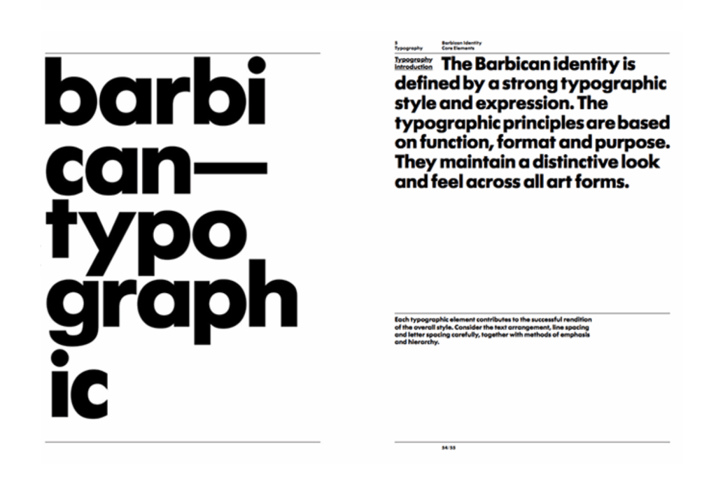
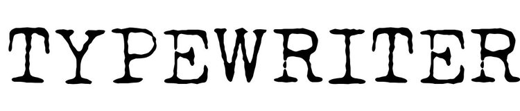
There are many types of fonts that are universally known and each type brings with it a certain feeling and emotional response. A serif font, brings a traditional and classic feeling and can make the initial look of your company seem high end, elegant and authoritative. A san serif font is clean and modern. It gives your product a contemporary feeling and can show your consumers that your brand is forward thinking and creative. A more specific and special font is the well known typewriter font. It’s quirky and can give your company a vintage and rustic feel. The font would be great for a company selling handmade products, but at the same time you have to be careful when marketing it, because it can at times have a very outdated look. Finally, a script font can give your brand a pop of life and energy. Script is so customary and specialized that your company can make its very own and can give consumers that feeling of fun yet elegance. One thing that designers have to watch when picking this as the font type for the brand is to make sure it’s not too thin and tight together, otherwise it does become very hard to read.


“The font for headings should be the largest and expressive of the persona of the brand. If you want to use a script, uppercase, or title font then the heading is the place as these typefaces aren’t easy to read in small or dense copy” (Canva). This is why companies have multiple fonts in a brand identity. The flashiest and biggest one leads, while the more reversed serifs or sans serifs make up the subtitle and body texts.
It’s very important that an easy to read font is leading your business and accents your company’s color and imagery choices. Your website and possibly even packaging should all be uniformed. If you’re going for a powerful in your face brand, then red with a serif font is the way to go. Red is known for its influence in energy and power and a serif font eludes to tradition and authority. “The brand name reinforces the meanings of the package’s visual codes, such as for the French table wine brand called “Vieux Papes/Old Popes.” In this case, the brand name obviously interacts with the brand’s blackletter typeface to suggest “seniority” and “tradition”” (Celhay, Remaud).
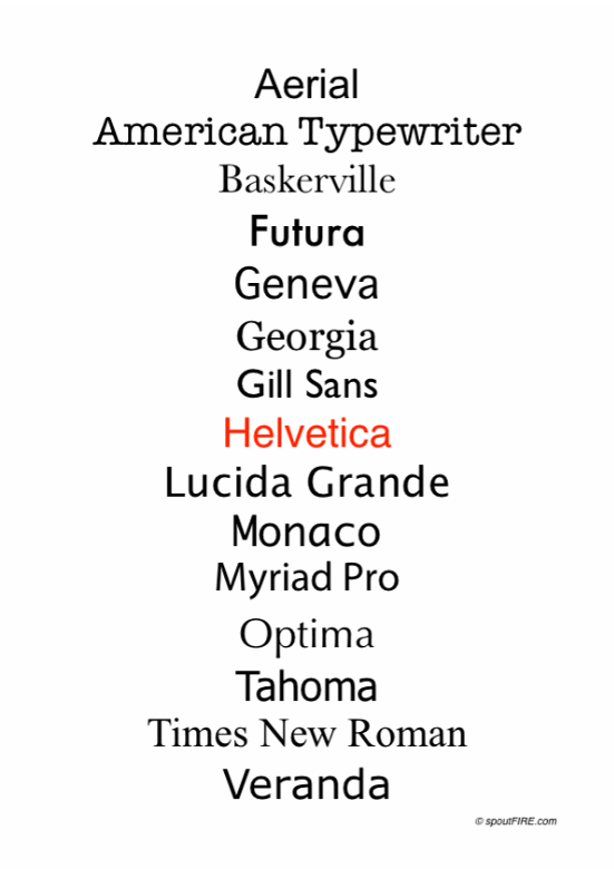
On the other hand many companies want to think so far out of the box on their font choices that they pick fonts that are so hard for consumers to read they become frustrated and turn away from the product. Typography that includes extra characters added to letters or something too thin, just an outline font or even a font that is extremely bold with a secondary pattern inside of it, in most cases, is too overwhelming and makes the company look childish and naive to consumer needs. This makes the consumer thought process, “how could I possibly trust their product if I can’t trust their branding choices?” It’s also been studied and proven many times that easier and more well known fonts are read at a faster rate than newer type faces. In a study done by the Faculty of Psychology at the Ruhr-University Bochum, 12 participants were given words to read in the well known font “Arial”and the unknown font “Timeline” and they found that the, “response times yielded no significant main effects or interactions for the factor emotion, but a significant font effect, based on faster processing of words presented in Arial compared to Timeline… small visual changes like inclusion or exclusion of serifs to a font are known to affect word recognition performance.” (Kuchinke, Krause, Fritsch, Briesemeister). The test revealed that while the font type didn’t have a profound effect on the emotion of each candidate, it didn’t affect the rate at which they read and understood each word.
Conclusion
In the end, manipulating color and typography isn’t a sure fire way to get everyone to purchase your product, but it does help. “Research conducted by the secretariat of the Seoul International Color Expo found that 93 percent of buyers focus on visual appearance. And close to 85 percent claim color is a primary reason when they make a purchase!” (DashBurst). Overtime psychologists and marketing gurus have studied long and hard the effects of color and type on not only human emotions, but animal and other species emotions and have found many similarities between all of us, but there is still so much to investigate. Scientists can say that blue makes you feel calm or sad depending on your environment, but haven’t exactly figured out why.
Nonetheless, the next time that you’re looking at a products packaging, website or just even the logo, think about the color and the typeface, what does it make you feel? Do you think it’s what the company wants you to feel? Does it make you want to buy the product more or less? Expert advertisers aren’t going away any time soon, and with each advancement in technology they’re getting smarter and smarter, and the consumer needs to keep up. Understanding that such simple things like color and typography can be manipulated to change your emotions can help you make better and more informed decisions on certain products.
Bibliography:
Kuchinke, Lars, et al. “A Familiar Font Drives Early Emotional Effects in Word Recognition.” Science Direct , Elsevier, 7 Aug. 2014, www-sciencedirect-com.libraryproxy.quinnipiac.edu/science/article/pii/S0093934X14001163. (Peer Reviewed)
Cao, Jerry. “Web Design Color Theory: How to Create the Right Emotions with Color in Web Design.” The Next Web, 11 June 2018, thenextweb.com/dd/2015/04/07/how-to-create-the-right-emotions-with-color-in-web-design/. (Module 2)
Celhay, Franck, and Hervé Remaud. “What Does Your Wine Label Mean to Consumers? A Semiotic Investigation of Bordeaux Wine Visual Codes.” Science Direct , Elsevier, 20 Oct. 2017, www-sciencedirect-com.libraryproxy.quinnipiac.edu/science/article/pii/S0950329317302598. (Peer Reviewed)
Cook, Karla. “21 Brand Style Guide Examples for Visual Inspiration.” HubSpot Blog, blog.hubspot.com/marketing/examples-brand-style-guides. (Module 5)
“How to Build Your Brand Identity .” Canva.com, http://www.canva.com/learn/brand-identity/. (Module 5)
Labrecque, Lauren, and George Milne . “Exciting Red and Competent Blue: the Importance of Color in Marketing.” Journal of the Academy of Marketing Science, Quinnipiac University , 2012, search-proquest-com.libraryproxy.quinnipiac.edu/docview/1030089315?accountid=13381&pq-origsite=summon. (Peer Reviewed)
Lien, Jade. “Worth 1,000 Words: The 4 Principles of Visual Storytelling.” Action Graphics, 4 Mar. 2020, actiongraphicsnj.com/blog/4-principles-visual-storytelling/. (Module 1)
Mcleod, Saul. “Visual Perception Theory.” Visual Perception | Simply Psychology, http://www.simplypsychology.org/perception-theories.html. (Module 2)
Moss, Ben. “Color and Cultural Design Considerations.” Webdesigner Depot RSS, http://www.webdesignerdepot.com/2012/06/color-and-cultural-design-considerations/. (Internet Source)
Published: Jun 19, 2014 Last Updated: Jun 2. “How to Use the Psychology of Colors When Marketing.” Small Business Trends, 2 June 2020, smallbiztrends.com/2014/06/psychology-of-colors.html. (Internet Source)
“Putting Some Emotion into Your Design – Plutchik’s Wheel of Emotions.” The Interaction Design Foundation, http://www.interaction-design.org/literature/article/putting-some-emotion-into-your-design-plutchik-s-wheel-of-emotions. (Module 2)
Singh, Nayanika, and S K Srivastava. “Impact of Colors on the Psychology of Marketing — A Comprehensive over View.” Management and Labour Studies , Xavier School of Management , 1 May 2011, journals-sagepub-com.libraryproxy.quinnipiac.edu/doi/abs/10.1177/0258042X1103600206. (Peer Reviewed)
Solar , Matt. “What Brand Colors Can Reveal About Your Business: Marketo.” Marketo Marketing Blog – Best Practices and Thought Leadership, Marketo, 23 May 2018, blog.marketo.com/2018/05/brand-colors-can-reveal-business.html. (Internet Source)
Team, Visuable. “What Your Typeface Says About Your Brand.” Visuable®️ Personal Branding Agency in Bristol | London | UK, Visuable®️ Personal Branding Agency in Bristol | London | UK, 17 May 2018, visuable.co/blog-visuable/what-your-typeface-says-about-your-brand. (Internet Source)
Urie, Chris. “There’s a Sneaky Reason Why You Always See Red and Yellow on Fast Food Logos.” Insider, Insider, 10 Sept. 2018, http://www.insider.com/fast-food-colors-make-you-hungry-2018-9. (Internet Source)
Zen, Pola. “5 Storytelling Secrets For Creating Images That Connect.” Yotpo, 3 Feb. 2020, http://www.yotpo.com/blog/5-visual-storytelling-secrets-to-improve-your-marketing-images/. (Module 5)
