There are many ways in today’s day and age that people can manipulate and doctor images/visuals to make them seem different from what they originally intended. Photographers and editors can composite more than one image together to make it look like something different happened in the photo than what happened in real life. Things such as, more people can be added to a visual to make it look more populated, people’s hair and skin can be made to look completely different or absolutely perfection-ate, but to me the worst deadly skin, is slimming or edited someones body image in any way.
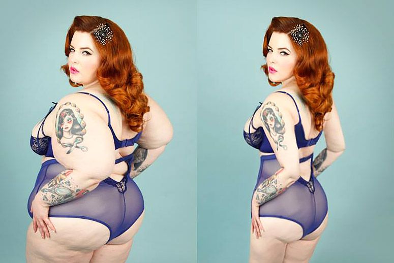
It’s been done many times before, where a famous, usually female, actress, musician or model has a photo or video taken of her and then it gets posted looking completely different. Usually it’s a thinner waist, thinner arms and thinner face structure. It’s also the reason why so many young girls today have such a poor idea of what “the perfect body” should look like. In CNET’s Pictures That Lie, gallery they showed multiple examples of magazine covers and article headers that had slimmed or digitally replaced the body of a women, including Katie Couric and Oprah.
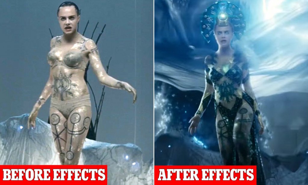
Cara Delevigne, is one of the most sought after beauty models and yet DC chose to slim her body even further using effects when she filmed for the movie “Suicide Squad”.
On the other hand, one step in a good direction was when Getty banned images of any models that have ever been digitally altered. “The company has made a concerted effort to change the way women and other marginalized communities are represented in media and advertising” over the past few years” (Enochs).
It was well known to people that Getty didn’t change their policy out of the goodness of their hearts, but instead because France had created a law that did not allow any digitally altered photos to be used in french publication and Getty wanted to make sure their photos would still be used, but it still helped.
In recent years, less and less blatant alteration has been shared publicly but it still happens. Cara Delevigne in 2015 was digitally slimmed in the “Suicide Squad” film and Meghan Trainer was digitally slimmed in her own music video “Me Too” with out her consent. The whole idea of changing someones body image is just wrong and it’s entirely non-ethical. You are painting the wrong picture of the person or people being displayed and you are painting the wrong idea of body positivity.
The final section of the book “Animated Storytelling” by Liz Blazer talks about the very important part of creating which is sharing what you created. This is a relaiivly short section but the points she makes in it are very important.
Once you’ve finished your animation, you need to package it up and make it nice and presentable. Some of her suggestions being, have a title screen, a long and a still image from the animation to go with it. You also want to have a nice and tight description of the project that ranges anywhere from 2 to 3 sentences. And her final suggestion is to create a director bio, that way people get to know you more as the creator and possibly learn of other projects you’ve completed and know the story of your film so you can answer any ones questions about it at a moments notice.
Blazer also talks about the importance of networking and not just online networking using social platforms, but in person networking as well. Going to conferences and festivals and talking to other people in the industry can lead to collaborations and huge opportunities that you wouldn’t receive anywhere else. Blazer knew she was an odd person but she used her quirkiness to her advantage and it helped her write the animated storytelling book.
Overall, you can follow every step in this book and create a wonderful animated film, but if you don’t do the work to polish the whole package and get yourself out there then no one will ever see it and it won’t matter. Personally, I found chapter 10, show and tell to be the most important one.
My Inspiration:
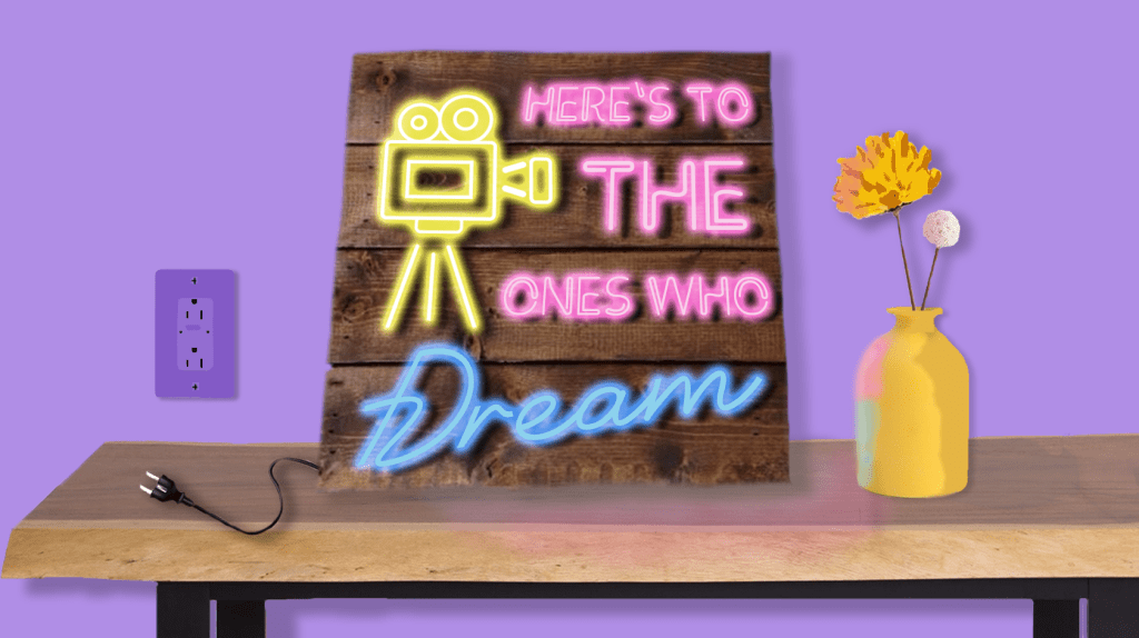
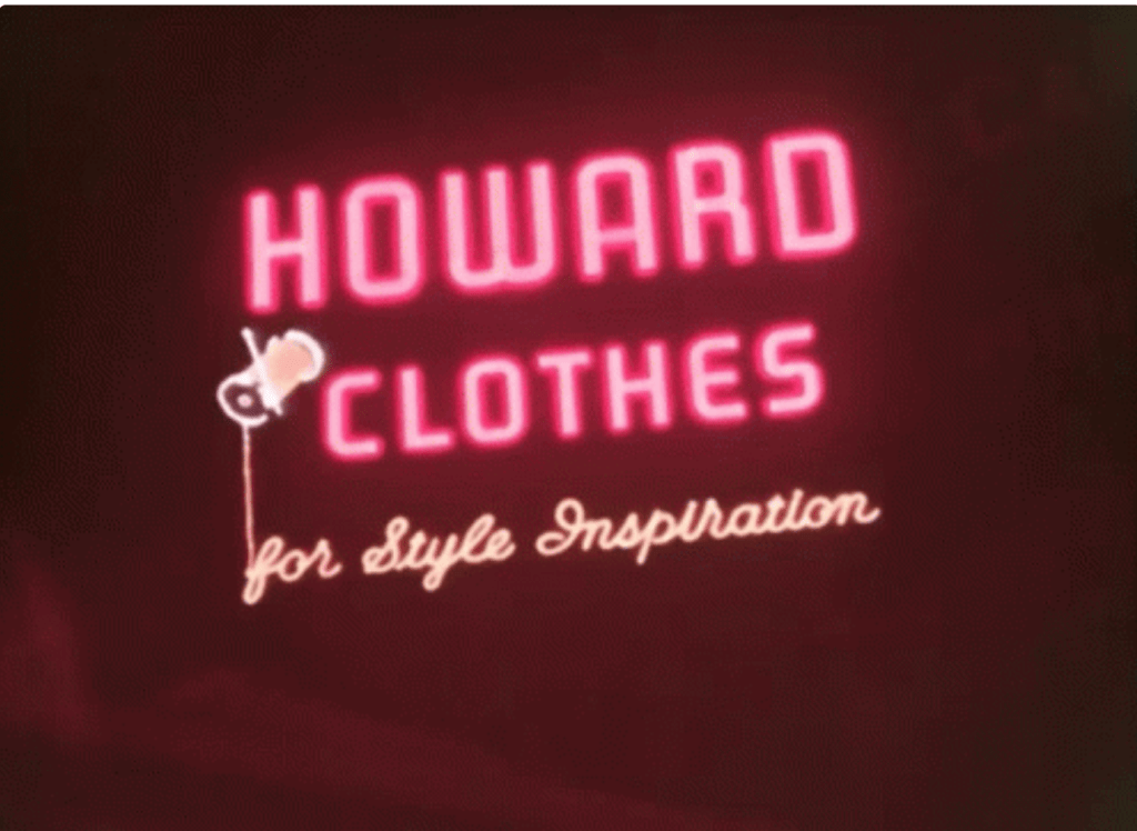
To me this this is sick. I love the way the light only reflects to certain places on the brick and the way the sign flickers in the beginning. This was definitely what I was trying to emulate with my project.
This particular animation also has a separate video that more of a how to when it comes to the puppet pin tool. And I used how they made her tail swing back and forth for when I was animating the plug into the wall.
If you click the link under the photo you’ll see the actual animation that is done with the neon sign. I just thought it was cool that the sign did more than just light up and I brought that thinking into the project with me, when i came to adding light reflections and the flowers and everything else.
My Final Animated Sign Board:
So for my final project, I saw that one option was an animated sign and I thought this would be cool. I had seen them a few times on my social media and wanted to try and make it myself.
So I started in photoshop and built the entire graphic, using shapes and painting shadows on things and then using the text tool to project the sign. After that I brought it over to After Effects and first used the puppet pin tool to move the electrical cord into the wall. (I used a hidden shape layer to make it kind of look like the prongs go into the wall.) Then I used the flicker color effect on each text layers outer glow and messed with the opacity. I also made a double layer of both the table and the vase so that when the sign is off there is no reflection and when the sign turns on the reflections appear.
The overall project was a lot of fun and cool to see who much stuff I have learned to do over the course of the class. Most of this stuff was just trail and error and moving a bunch of keyframes around until i got it to look like what I wanted. Then once I had the animation down. i found some cool neon sign sound effects and found a copyright free instrumental version of the song that goes along with the quote on the sign and added it all together. It’s a cute little video that loop perfectly and I really enjoyed making it and over all really enjoyed this class and honestly looked forward to creating something new and interesting each week.
I am not a scientist or a geographer or a doctor. So, when people try to explain to me complex diseases, geographical issues or just a chemical equation I tend to get confused. But through the use of visuals, well known symbols and carefully picked color choices I can begin to understand complex topics in an easier way.
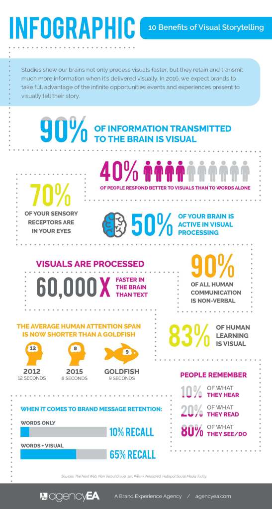
One climate issue that is very near to my heart, but also highly complex is the rapid rising of sea levels. I live in a beach town and the thought that if global warming continues and the glaciers keep melting that my down could be engulfed in water faster than people thought is frightening. At the same time, even after reading a bunch of articles on the topic I don’t always feel like I have a full grip on the situation and that’s when I turn to the visuals. A Brand Experience Agency depicted the way we learn more visually by showing that over “90% of the information sent to our brains is visual” and that “your brain processes visual images 60,000 faster than it does text.” So it just makes sense that in an effort to communicate their findings easier to the public the science community relies heavily on well constructed visuals.
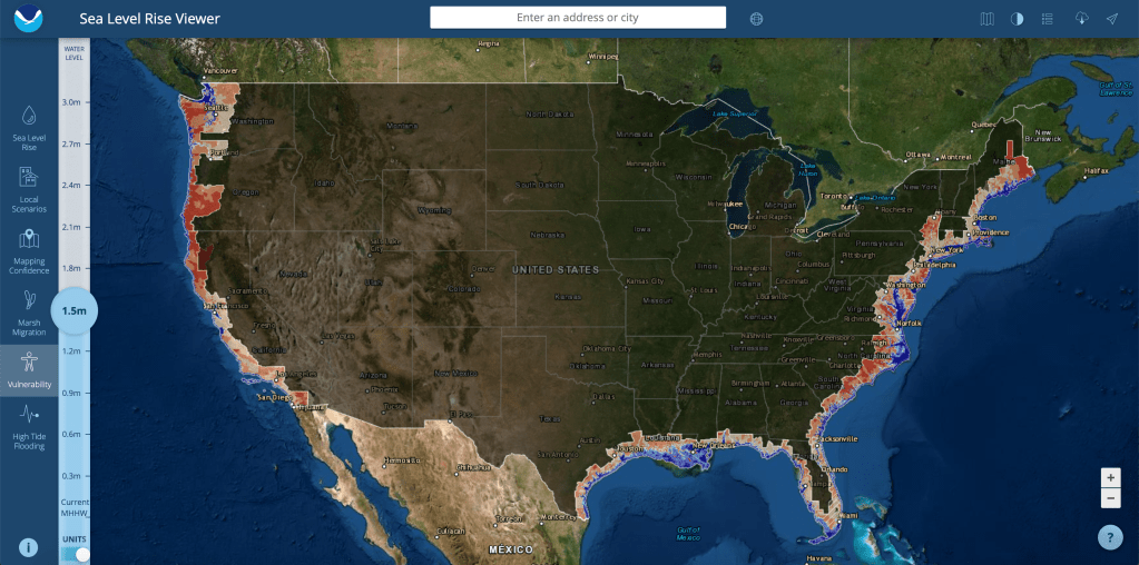
The first graphic is from the Office of Coastal Management and this is a screen grab of their sea level rise viewer and more specifically this map shows exactly what parts of the US are vulnerable as the sea level continues to rise. The Integration and Application Network describes a different practical visual element for scientific communication and one of those of course being maps. “Maps that contain the minimal extraneous information while providing geographical reference points, location insets, scale and orientation information, can be effective. The use of geographical information systems facilitates good map production, but is often insufficient for good communication products without additional editing.” (Dennison) The map clearly shows how many meters worth the ocean would have risen, what cities are where, and the red color is the level of vulnerability, while the blue color indicates that the land is already under water. The visual is a simple but effective depiction of just how much land we can lose across the country to sea level rising.
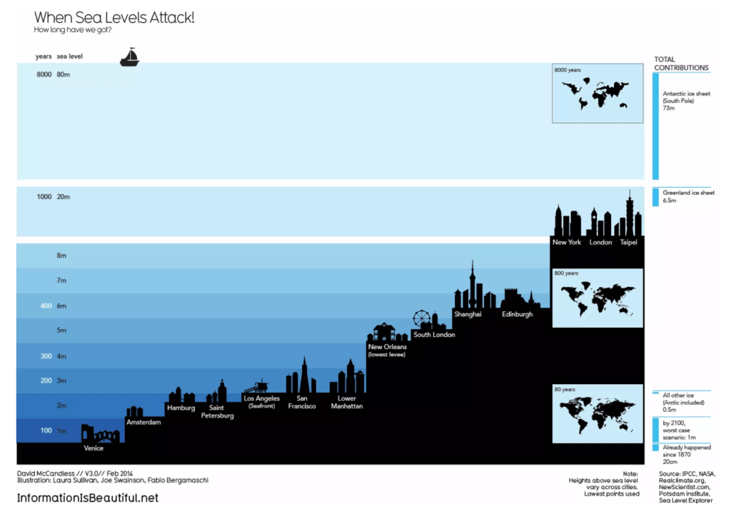
The next image is a graphic depicting just how many years we have before sea levels will engulf all the major cities around the world. It’s a sobering image because some believed cities like Venice and Amsterdam don’t have much projected time. This visual can be defined as a good one if you look at David McCandles’s “What Makes a Good Visualization” chart. It encapsulates good data by showing both the years it will take, the city names, and the meters the ocean will have to rise. It has a great concept and visual form by using a ladder style to show similarities and differences between each city. And it’s function is very clear from the start, the chart is made to show people that rising ocean sea levels isn’t a joke and won’t just raise tides it’s going to destroy cities.
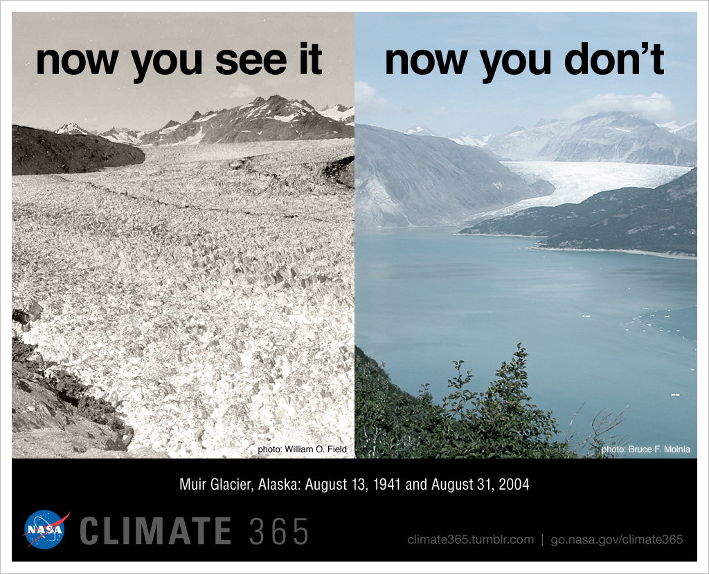
The next one is two pictures stitched together to show just how rapid ice is melting and water is rising. NASA took a photo of Muir Glacier in Alaska in 1941 and then took a photo of the same place in 2004 but instead of seeing a glacier you see a full body of water. Most people use well composed images to tell very important stories for many topics. Even the branding website, Postcron knows that images are sure fire way to get your story noticed. “they are easy to get, highly shared, reinforce the message you want to transmit and help emphasize it.” (Parera).
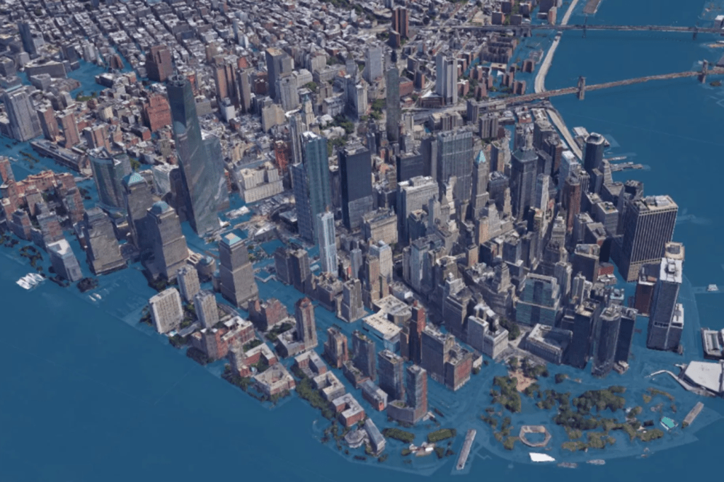
This image is a graphic rendering of what New York will look like if the levels rise by 8ft. It was posted in an article on Curbed New York written in 2017 by Ameena Walker. This visual acts as the perfect physical manifest station of what is going to happen to such a well known city. This image makes the numbers real, and it makes it personal. Rising sea levels isn’t just a 3rd world country issue, it’s an issue for everyone. An article written by UC Davis professors describes the main use of a scientific visual as “the narrative impact in scientific visualization comes from being able to see real data that is normally invisible. At its best, scientific visualization acts as an extension of our senses, allowing us to perceive and manipulate data at otherwise impossible scales and perspectives, such as vector fields in weather systems, iso-surfaces in supernova simulations, and layers of human anatomy rendered semi transparent.” (Ma, Liao, Frazier, Hauser, Kostis). This image is exactly. It’s an extension of the numerical data so our sense of sight can see what it will look like.
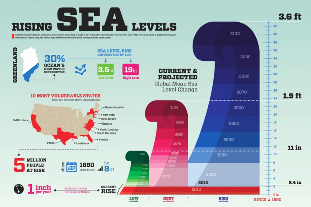
The final graphic on the rising sea levels that I found to be especially informative is an infographic that gives you the main big numbers and not only focuses on just sea level numbers but also what states are vulnerable, and how many people that would affect. It’s a fast facts sheet that gives you a great scope of the issue with bold colors, easy to understand images and big arrows to follow and lead you throughout the graphic. “Infographics have become one of the preferred tools for communicating scientific findings to fellow scientists and nonspecialists. Frankel and DePace suggest some basic tools from the area of graphic design … Composition: used to organize the elements and establish their relationship to each other.. Color: applied to draw attention, to label, to show relationships, or to indicate a visual scale of measurement” (Estrada, Davis). The article suggests other tools to refine a good graphic for scientific visualization but in my opinion the image above uses compositions and color the best to convey large amounts of information in a simple yet effective way.
Overall, the climate crisis of rising sea levels isn’t a topic that should be taken lightly, but many times people just don’t understand the severity because the information is too complex. With the use of well designed scientific visuals that tell the correct story people can begin to understand large abstract scientific issues. Through the use of images, infographics, or charts – high levels of text can be condensed into processable visuals. Just like journalism, PR and marketing, data can also tell a visual story when done correctly.
In Chapter 9 of “Animated Storytelling” by Liz Blazer, Blazer dives deep into the actual act of animation. By the end of the chapter she went over 14 different tips and tricks to make sure your animations are as realistic and fun to watch as can be. The few tips that really stood out to me were “No Shot Left Behind”, “Consider the Blur” and “Mute Your Soundtrack”.
For no shot left behind, it’s obviously no secret that animation takes forever. But Blazer talks about making sure that after all the planning and storyboarding you do make sure you go back over everything one more time with extreme scrutiny to make sure that all frames are extremely necessary and that you won’t be animating any extra useless stuff.
Consider the blur was the one section that stood out the most, because as a film major, I understand depth when filming with a camera. Make sure your focus point is crisp and the background blurs out. But in an animation you have to consciously blur out things and create artificial depth. Blazer describes using tools like vignettes, Gaussian blur and grain. That way different fields in the animation have different textures and shadows and actual realistic feel to it.
The final tip that really stood out was one that I never even thought about, but subconsciously I do it already when I’m editing a video in Premier I mute the dialogue ad any sound effects to make sure the video actually cuts well together from a visual stand point with out the aid of audio cues. In both film and animation sound can really carry a story, but like Blazer said your work still needs to being hitting all of its visual cues with out any sound as well.
UX Inspiration:
This design I find very interesting and surprisingly useful. While your using your app you can get rid of the menu bar at the bottom of the phone. It’s simple pull up and pull down animation, but it really helps the main information fill the entire screen instead of getting cut off at the bottom.
I love the color choice and the sleek drop down menus. I kept this particular design in mind when creating my drop down menu for my search bar. I also like the rounded edges on one side. It’s different and it stands out from other more common applications.
The flow of the animation is super creative on this one. As you scroll through the sneakers they bounce back as if effected by real momentum. It helps the sneakers really jump off the screen and separate from the back ground. I tried to get the boxes that I made to bounce as well so that it didn’t feel super static.
This is another great use of color and the blocks nicely open and close easily. The interface is simple but it’s effective. If all food store apps and shopping list organizers were this fun and easy to move through I would food shop more!
This design is by far the most interesting. As you scroll through the list of seasoning the graphic spins with it to show you a physical representation of all the names. It’s a great visual tool and it gives the user the ability to not only learn the name of something but to also see what it looks like. This design definitely inspired me to make a visual search bar result in my UX interface.
My UX Interface Design:
I posted the one above to youtube because I added sound effects and the gif doesn’t let you export with the sound effects so watch which ever one you choose and I hope you enjoy.
The design definitely took some time to think about and make sense. I didn’t want it to just be a normal search bar I wanted to make it fun and I wanted the search to lead to something. Then once I got to the point of the cactus I needed to get back to the beginning so that’s why I came up with the second button hit to clear everything. Once I finished making my animation I went over to photoshop and created my iPhone mockup because I wanted the background to match the feel of the fake little app.
Overall I found this project to be the most challenging when it came to figuring out what key frames I needed where in After Effects, but in the end it was also one of my favorite modules.
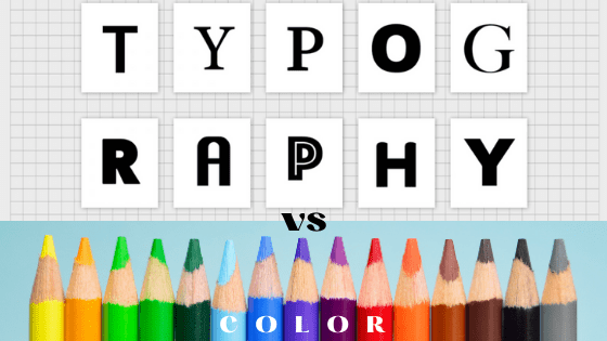
I’ve always found the way that companies are able to use specific color combinations and fonts to make us want to buy and use their products. Below is my Ignite Presentation, showing the importance of type and color when a company is telling its brand’s story. Hope you enjoy and can learn something new.
This week the author of Animated Storytelling, Liz Blazer, talked about different techniques and styles that animation can be done in. Blazer lists and describes 5 different techniques and 6 different styles to utilize when animating.
For techniques, you can hand draw the animation using different still frames and they can drawn with any kind of medium, like pencil, charcoal or even paint. Then of course there is both 2D and 3D stop motion. I examined both types of stop motion in the previous 2 weeks of this course. 2D is when the camera is above a flat surface and objects are moved around on the flat surface like ink or sand or even cut outs like the flower I made. Then 3D is when the camera is on a tripod in a 3D place and puppets or models are moved around. The final 2 techniques Blazer talks about are 2D and 3D CGI. Both of these are when an animation is created in either a flat 2D animated environment using scanning or coloring on a computer and vice versa the 3D one is when an animation is created in a 3D software environment using rigging and modeling.
Then Blazer moves onto the styles that can be utilized for each technique. The first one is fluid transitions. This is where the animation flows from one scene to the next seamlessly. Then Blazer talks about 2D/Vector/Kinetic type. This is highly scalable colors and art work. This style is what I ended up using for my animated logo. Typically uses web design in illustrator. Then Handmade and Collage styles are created by using real materials found in the world and when using the collage style you combine handmade styles with photos and video footage. Both styles give the overall animation a vintage and innocent feeling. The final 2 styles Blazer describes are Film & Type and 3D styling. The first one is your typical video montage with large kinetic typography over top. Lyric music videos often use this type of style. Then 3D styles are typically created with 3D stop motion and 3D CGI. This style includes animating with real shadows, lights and actual laws of gravity.
Of course afterBlazer talks about all the different techniques and styles she goes on to say that conforming and adapting your animation to combine styles and techniques to make it your own is the most important thing.
Logo Animation Inspiration:
This animation showcases both the arch technique and the squash and stretch technique. A bouncing ball is the perfect example of both because when a ball bounces it moves in an arched position and when it lands it has to smoosh and stretch in order to look realistic. In my logo animation I used the squash and stretch technique when the letter T comes in.
This next video showcases the Slow In and Slow Out principle. This youtube series overall goes over the 12 principles. In this specific video it easily explains how it clearly makes sense to add extra frames at the beginning and end of an animation in order to make it look more life like and actually have it obey the laws of physics.
This is another video from that same series I talked about above. It goes over step by step in a very simple way on how over lapping action and making sure to follow through on your action. This video shows the importance of continuing the moment of say a cape after someone jumps through the air because of obviously a cap is lighter than a human body.
Not only this video but almost all of the Looney Toons cartoons depict exaggeration. Their movements are always over the top, when it comes to falling, running, hitting someone over the head. Just looking at this video, it made me realize that most cartoons are exaggerated because normal human movements are underwhelming.
This video takes a deep dive into the brilliant animation principle of anticipation. Spider man as a character over all is a great example of anticipation because every time he swings his body anticipates the landing on his feet. Also Spiderman: Into the Spider verse is just a gorgeously animated video overall and utilized all 12 Principles of Animation.
My Animated Logo:
For my logo, I wanted to keep it simple but also have a lot of fun with it. So first I started simple with one of my favorite colors… blue. Then I knew I wanted my logo to only feature the first letter of my name and not my whole name. So I made a “T” that I thought was cool. After that I made a much of outlines circles and then used trim paths to make them come in at different times and then animated the T so that it used the squash and stretch principle and finally found 2 fun sound effects that brought the whole logo to life.
As a journalism major myself in undergrad, I always hated a story that just had text. I’m a big visual learner so being able to read a graphic, flip through photos or watch a video is always more impactful to me then just reading. Throughout my time in journalism classes and just as someone who skims through a lot of news articles it’s come to my attention that the stories that stick with me longer are the ones that weave their visuals into the story and make it a necessary part of the piece and not an after thought that you could skip over if you wanted to. In an article written by Garcia Media, the author, Mario Garcia notes the advancement in news outlets when planning their visuals before researching and writing a story. “We are talking visual journalism here, which continues to involve the use of photos, videos, infographics, but not as an appendix to the story, but woven into the texture of it.” (Garcia).
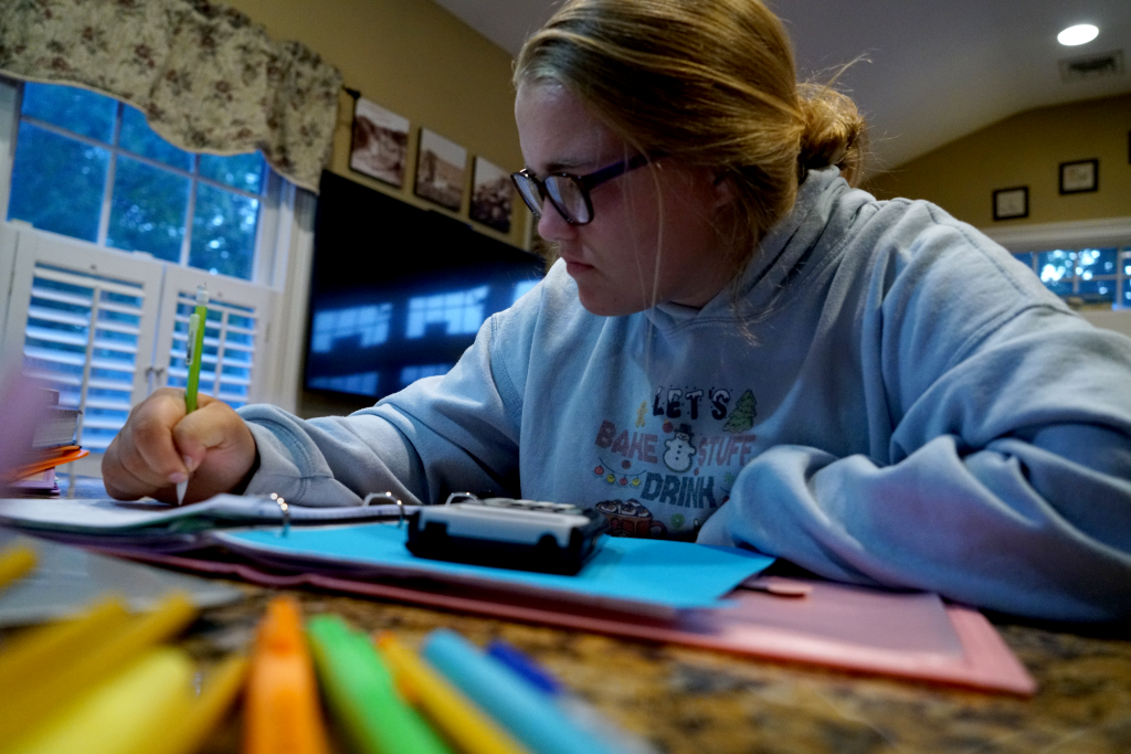
Currently in the world the COVID-19 pandemic is still very much an issue so students who are currently going back to school aren’t actually going back into the building quite yet. They’re stuck at home trying to navigate education, extracurriculars and a social life all while never leaving the couch. And from an outside perspective that might seem easier then waking up early everyday and go into school, but if you look at any average student you’ll seen plain as day on their faces, they’re tired and struggling.
Kelly wakes up in the morning and before even getting out of in the morning. She logs on and just sits. There is no routine anymore. No morning outfit picking. She opens her computer and starts her 6 hours straight of staring at her computer.
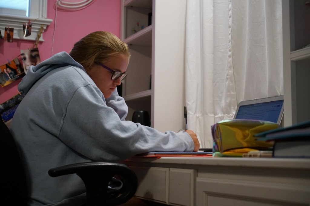
Throughout the day Kelly moves positions between classes so she can still feel like there is some change between classes and that it’s not the same thing over and over again. Most days she starts in her bedroom and slowly migrates through out the house. Kelly is a lucky kid though. She does have her own work area. But many kids through out this process don’t have their own place to work and have been struggling with distractions due to this.
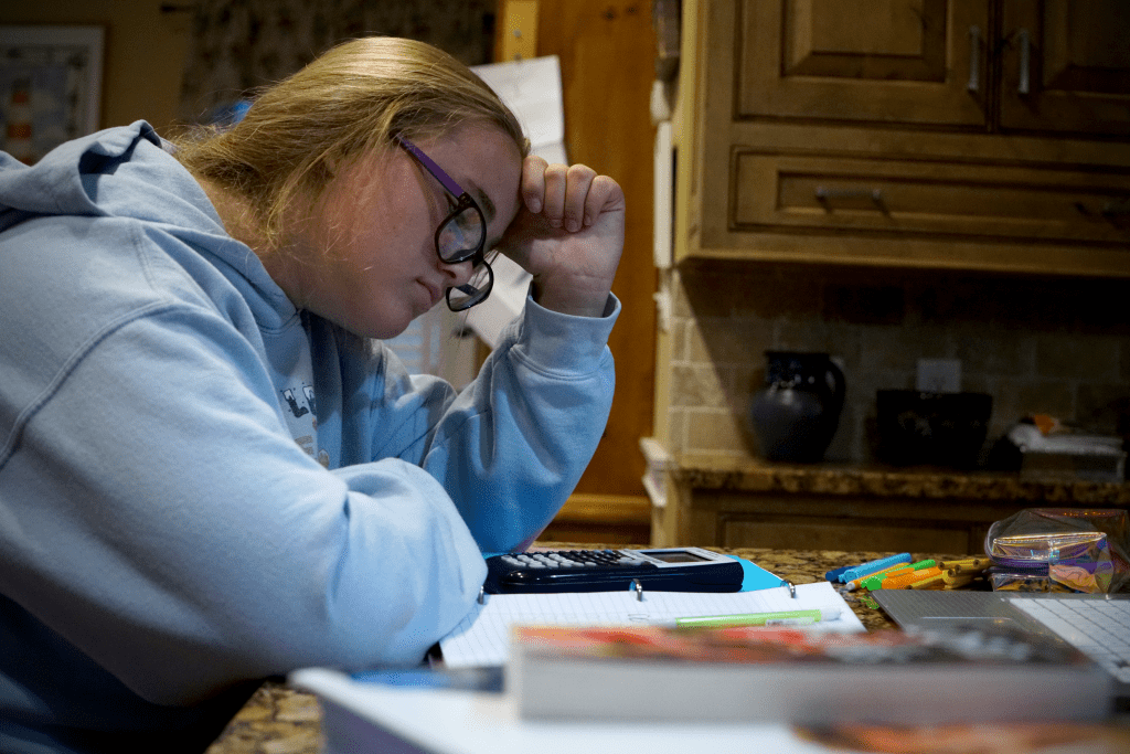
Even while in class, distractions and boredom take over for students. Having easy access to snacks at any time and having the ability to step away from a lesson because there’s no one to tell to you you can’t is hard for a kid. With no structure students tend to stop caring.
The biggest struggle students face is being completely and utterly alone. Yes teachers have been doing their best to answer their emails and try to explain every project and assignment as well as they can, but the students are alone. They sit in their bedrooms or at their counter tops and are just confused and defeated.
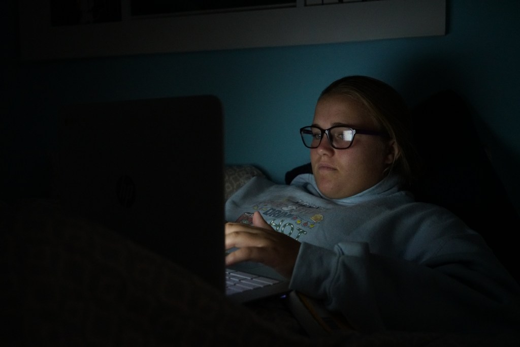
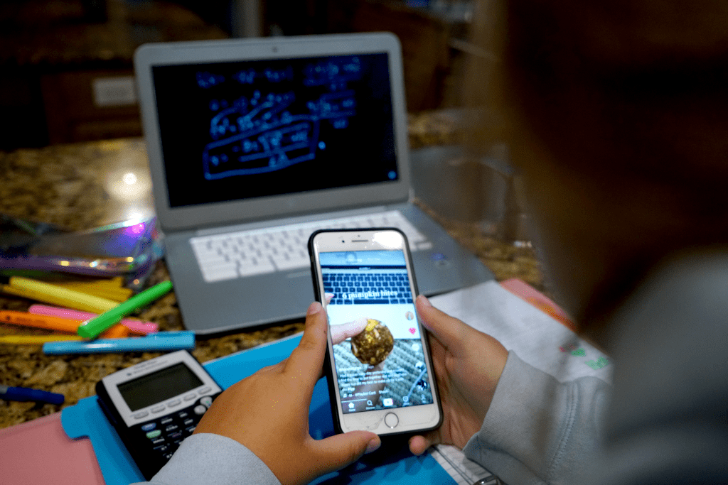
Of course, the biggest distraction is the unlimited use of their phones. At school their phones are either off in their lockers or their book bag and teachers take them away if they see them out, but who’s to say no when no one is around. Both of Kelly’s parents have jobs too. They aren’t home to reprimand her either. She’s on her own and she spaces out often.
Many times Kelly and other students use their phones to look up answers or try to do productive things. But with the unlimited use of phones comes the unlimited use of social media platforms. Kelly is in the middle of math class, her least favorite subject, and instead of listening she’s checked out and is watching baking videos on Tik Tok.
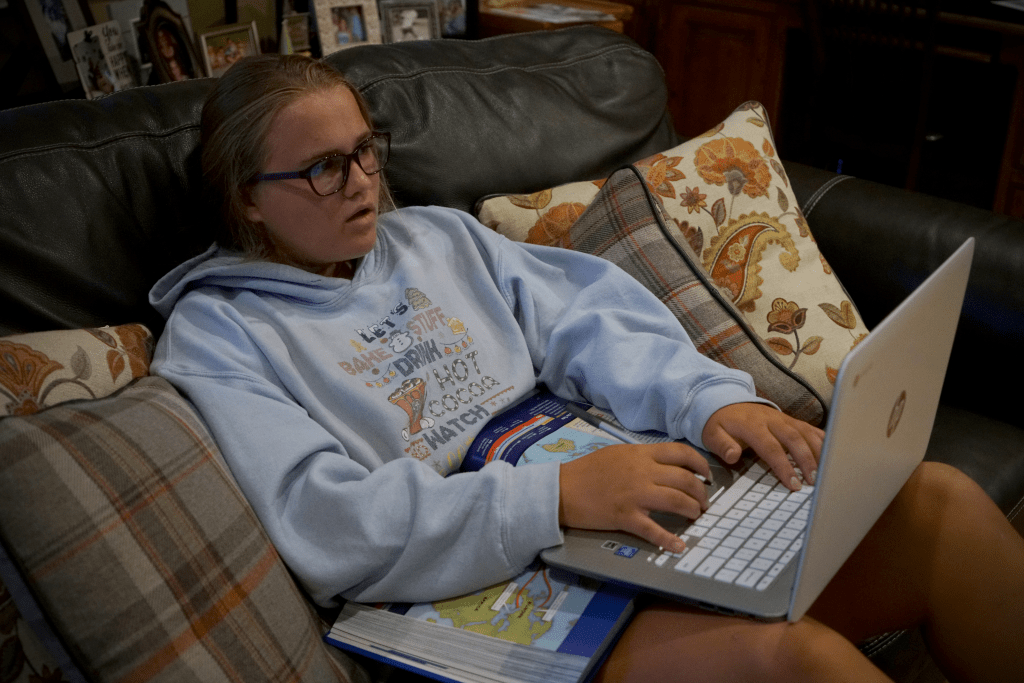
As the day progresses Kelly gets more and more tired of sitting and listening so she migrates to the couch and while sitting on the couch she gets more comfortable and eventually another distraction creeps its way into her education… the TV. Her face says it all. The warm glow of the TV is far more interesting than whatever mindless assignment she was given on her computer.
The other side of the previous photo shows that constant access to any streaming service or channel are far more appealing than SAT Prep. Right now students aren’t thinking about their future or how important their education is. They’re thinking about how their eyes hurt and how they haven’t seen their friends in weeks and they just want to be able to turn their computers off and forget about school.
Students right now are stuck repeating the same day over and over again. They’re not learning as much as they have in the past and frustration and resign are at an all time high.
Project Rationale
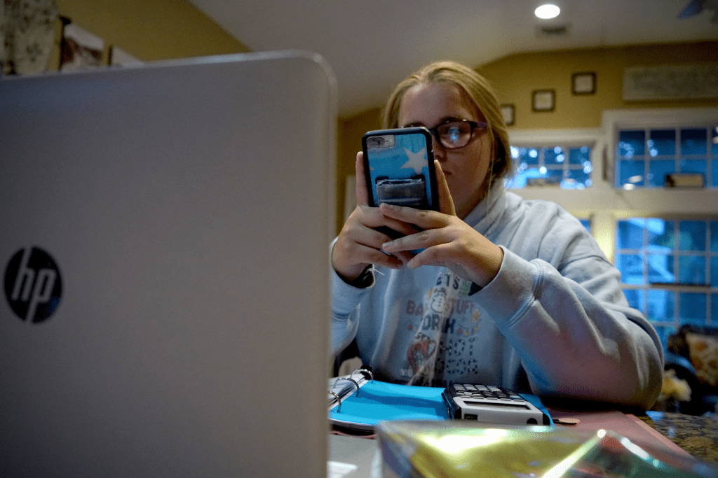
Digital Journalism is still new to the news industry. Incorporating photos, video, graphics and special design into stories and not just throwing them in at the end as an afterthought. For my journalistic storytelling project, I knew I was limited. I work all day for half the week and don’t have any time to actually take any photos at work, but I also wanted to do a story that wasn’t just something in my town or only affecting my life. I wanted to show something that is affecting many people right now but in a personal way. In the 4 Principles of Storytelling they take heavily about making things authentic and relevant and that’s what I did with the topic of at home learning being a subject that can honestly affect most people in the US today.
Living at home this year to complete my final year of school has definitely been a challenge, but it is nowhere near as bad as the younger generation of students who are stuck day in and day out on zoom trying to get through elementary, middle, and high school. With this in mind I was going to show my younger sister’s story. I decided to follow her around all day from the moment she woke up and opened her computer to the moment her last assignment was submitted and she could close her computer. In another article on visual storytelling, the photographer Lynn Johnson described new age photojournalism to be the need to “have the courage to look onward as well as inward”. In this project the goal wasn’t just to take a few photos and get a surface look at Kelly’s day. I wanted to see it all and then pull my story from everything I shot.
After taking hundreds of photos of her for hours, I scrolled through all of them and picked the ones that I kept finding a theme through. That theme being, distractions. That was the story I was trying to tell. Even though schools and teachers are trying to keep class interesting and trying to give students all the resources they need to get through the year no teacher or faculty member can combat with at home distractions, like food, phones and the TV.
Like the author of the article on Medium said, “Photo storytelling is different from a picture portfolio or collection… In a photo narrative, the storyteller is presenting a finite number of pictures around a theme or an event to communicate what happened, define a situation or show details about characters. Photo-driven stories evoke a deeper understanding of scenes and details — the color of a person’s car; the scene of a crime; emotions written on a person’s face.”(Shurbaji). Depicting the struggles and distractions of Zoom school was my story.
My photos were up close and personal with Kelly, they showed her face and her natural emotions throughout the day. In Robert Plutchik’s wheel of emotions, shows the 8 basic emotions humans have. In the photos of Kelly I wanted to capture all of the emotions she feels throughout the day that are depicted on the chart, like anger, distraction, sadness, boredom, and annoyance.
Another component of good journalistic storytelling is making sure that throughout my photo taking I never had Kelly pose or try to do anything specific for me. I needed it to be the most authentic representation of her and her day. The National Public Radio’s rules for journalists talk about ethics, and accuracy, but most importantly excellence, “Our journalism is most valuable when we marry important truths with engaging narrative. We take enormous pride in the craftsmanship of our storytelling and in the quality of the words, sounds and images we use to help illuminate the world. When we edit, it is to add impact and clarity to our journalism — never to slant or distort. We don’t allow what is sensational to obscure what is significant” (NPR).
The project isn’t earth shattering, but it does give a personal glimpse of the life students are facing right now due to the pandemic. It depicts authentic and close up photos that truly do tell a story. The PJ’s Kelly wears all day, the constant distractions and the complete frustration and feeling of loss all show just how different life is this school year compared to years past.
When it comes to creating, people always think about the story, and the pictures/video/designs needed to create it, but when it comes to sound most people only think about dialogue. In reality most times sound ends up being the most important part of a video. If you have terrible sound the video just won’t be good. While reading Animated Storytellingby Liz Blazer. She talks about not only importance of well recorded dialogue, but also layering your sounds with diegetic sound, which is a sound that comes from a source seen on screen, like a pot hitting the ground. And non-diegetic, which is a sound that is not seen on screen or typically associated to what is going on, like background music done by a symphony or a laugh track during a sitcom. Using both types of sound helps the audience feel like they are there with your characters in the moment and helps further convey the emotion of the scene.
Another huge tip that Blazer talked about when it comes to sound is that timing is everything. If you don’t sync your sound effects with the correct actions or the music starts to swell at the young time, the sound no longer helps lead the story, but instead will distract your audience and become a hindrance to it. When your editing sound repeatedly go back and see exactly what moment is most impactful for the audience. In order to see you can usually just nude the audio clip in one direction or the other frame by frame to find the perfect sweet spot.
Design Wonderland:
At this point in the text book we have gotten to the point where you can actually begin to create the world in your story. With this designing freedom Blazer talks about the need to still establish rules. These rules come with any world, like a time and place. Give your world something to ground itself in. Like if it’s a real time and place that has already happened to you have to keep the design relevant to that time period, or does the story take place in the future or on a made up planet in that case you have to design it to have your own specific look, but every object you put in that environment needs to have a purpose.
Another important set of rules would be the worlds physical rules. Like is there gravity and does it effect objects the same as on earth and if it doesn’t then your new laws of gravity need to effect every object the same way, you can’t change it for some things and not all things. For example on earth a brick will fall faster than a feather, but in your new world in might be the opposite, but in that case if lighter things fall faster, then when you push two people out of a car the lighter person should hit the ground first.
The next rules Blazer talks about for your new world would be social laws. In the society that your characters live in, is there a class system? Do the characters even have to follow rules or is it lawless? And you have to think about how these social rules will effect how the characters behave in certain situations.
The final and possibly most important set of rules you have to establish when designing your new world are the visual rules. Blazer talks about these laws being the ones that dictate what the actual world looks like. In the book she talks about a futuristic world being run by cellphones, so the worlds visual rules could be that everything is designed with desaturated colors and harder edges so it feels stiff and lifeless.
Designing can be a lot of fun and it’s extremely creative and freeing, but there still needs to be some sort of form and organization otherwise the extreme and crazy places you create will just feel unrealistic or too far fetched for people to actually buy into them when watching.
Sound Inspiration
The first stop motion influenced my final stop motion a lot when it comes to sound. I liked the way that took creative freedom and made something that usually has a very soft and squishy sound and made it metallic sounding so that object felt more solid vs what it might look like with out the sound effect, which is mushy clay. In my stop motion I tried to use over the top sound effects that wouldn’t necessarily always be the first that came to mind when you think of each object.
The second stop motion is honestly one of my favorites of all time, but with out sound it just wouldn’t have the same impact. Each animal has its own distinct sound and the noises they use to help convey each character emotions is incredible since both characters are actually inanimate objects that have no lines of dialogue. But with the sound you understand exactly what they’re trying to say.
Text Inspiration:
The first text example is really fun to me, but it’s also something that I could see myself learning to make. It’s honestly just a bunch of lines being moved in scale and position and then fading out at the end. It would probably be very time consuming to animate from the ground up but it would be worth it in the end for the cool outcome.
The second text animation is really cool. It’s a flicker effect as if the word was supposed to be a neon sign coming to life. It’s very artistic choice and if utilized for the right project could really make the beginning or end credits stick out to a person.
My Finial Stop Motion:
My final stop motion project, was very interesting to make. I utilize the non-linear version of storytelling a took a puzzle approach for the story. So I didn’t reveal the final goal of the stop motion until the very end.
One of the main challenges of the project was the fact that I wanted to be behind the camera to control everything and make sure it was all captured correctly, because of this though I had to use my younger sibling as the talent and trying to make someone move frame by frame and freeze when you need to move something is very difficult. This is why throughout the video some things shift a little weird since she was never exact on the freezing and holding still part.
Overall this project gave me a new found respect for artists who make extraordinarily long and seamless stop motions. Just this 30 second one took hours and still isn’t even remotely perfect. I honestly want to keep working in stop motion though since the transition possibilities are endless and really fun to come up with.
When you see the word color you must think of kindergarten class learning all the colors of the rainbow and picking out your favorite and getting a bunch of things in that color because it made you happy, but in reality color means so much more. When creating an animation using color or another word for it being hue to enhance the story is very important. In the textbook “Animated Storytelling”, they describe using color as a way to help “express emotion, clarify motivation, and even dictate the entire meaning of the piece” (Blazer).
By starting off your pre-production with a “color script” you can plan out the most majorly used and important colors in each scene and how you might utilize them. Blazer’s big tip when your planning your color script is to make sure the story is still more important. Even if a color looks aesthetically pleasing it needs to make sense with the story that’s already been written and planned out.
Other big tips that Blazer describes when using color are to make sure you limit you pallet so that you don’t ending up using every color that was ever created and muddle your stories meaning. Use the color to support your characters in the scene not upstage them with too vibrant and saturated colors. Similarly to the rule before it, make sure to use saturation mindfully because if the back ground is too saturated then you may loose the subject in all the color. And my favorite tip of hers which is use a surprise color as a way to punctuate something important. If your creating a story with a bunch of animals living happily under the sea the biggest colors in the color pallet are going to be cool tone, blues, greens and purples, so in order to make the bad fish stand out I would make his scales a fiery red and yellow.
Weird Science:
By far this section of the “Animated Storytelling” book has been my favorite. It’s all about the important of experimentation and pushing your limits when creating, whether that’s when filming or animating or even drawing. Blazer’s biggest tip about how werid of a creartive since art is, is that it’s ok to have failed “science experiments” aka she means it ok to make bad art. In fact it’s actually good, it can show you where you need to improve but it can also inspire for a different piece that could end up being fantastic.
Blazer also talks about how important it is to continue to work on personal projects and make work that is what you want to be hired to do. So even if it’s the simplest of projects make it look professional and spectacular so that you always have new and incredible content to share with employers.
Stop Motion Inspiration:
The first video inspired me for my linear story line because it shows motion really well and how to achieve a smooth look while making it seem like something is moving down a corridor when in reality it’s just a bunch of photos.
3. & 4 .all inspire me for my non-linear puzzle piece stop motion because each video is using that very close up and tight camera angle to put something together and have the big reveal at the end. But all 3 videos are still very aesthetically pleasing and keep you interested all the way until the end for the reveal.
5. Overall the 5th stop motion just amazes me. The clean and fluid transitions between the chess pieces becoming solid pieces to them becomes clay balls and rolling across the board is fascinating and I can’t imagine the amount of work that went into such a short and simple seeming video. But also through the use of the music and the different fun movements of each chess piece the whole video kept me tense and on the edge of my seat waiting to see which side was going to win.
Practicing Stop Motion:
This week in order to further prepare for the longer and more complex stop motions I’m going to be making a made a short and simple stop motion that focused more on the craft and fundamentals of making one verses the actual linear or non-linear structure of the story in a stop motion. In the one I made this week and I drew, colored and cut out a pretty little flower and raindrops and had each piece appear one at a time and move the flower into place and in a circle. This helped me practice getting the flow of all the images together and helped me to learn that if there is an aspect with my stop motion that I don’t want to move in all the images then I need to tape it down so that I don’t by accident bump into it and mess the whole thing up. This past week that happened a few times when I didn’t realize my bracelets had hit some of the raindrops as I was moving the flower, so in a few of the shots the raindrops move just a little bit.
Attached below are the two pre-production summaries for my two different stop motions I will be making this coming week. The summaries include, general info on each project, a creative brief detailing the exacts for the project and my storyboarding panels.
We as a society interpret data everyday. Whether it’s while reading a menu, a map or reading an actual chart, an email, a text message, but have you ever realized how much you interpret from looking at an image? The saying a picture is worth a thousand words is absolutely true and many times an image is actually easier for someone to understand versus text. The Interaction Design Foundation called it, “Information visualization, the art of representing data in a way that it is easy to understand and to manipulate, can help us make sense of information and thus make it useful in our lives.”
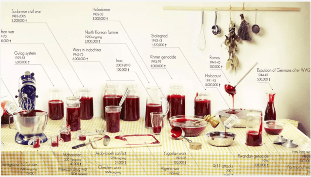
Sarah Illenberger, data visualization example
After learning about data visualization and the need to make data easily interpretable, I wanted to take a data set that I found myself and turn it into an easy to understand visual. During my research to find inspiration I looked at visual artists like Sarah Illenberger, who uses everyday objects to easily depict large statistical facts, but I was truly inspired by Clara Kayser and her depiction of 100 years of death in major wars/genocide using jelly. The picture is so simple yet so profound. In history class we learn about these events and these large death tolls get thrown around and you never actually take a second to compare just how big or small each world event is, but in this photo you can clearly see the comparison and understand just how much bigger for example the Holocaust was versus the Iraq war.
Clara Kayser, “100 Years of World Cuisine”
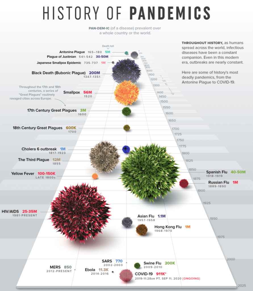
With this photo in mind, I went searching and found another very profound data set. This being the compilation of every pandemic from “Visual Capitalists” and all of the resulting deaths. At first reading the numbers doesn’t really hit home, but when you look at the visual representation of each number you’re shocked by how many more deaths have occurred in past pandemics than the one we are currently in.
Once I had the information and the actual function of the visual plan I moved on to the last 2 parts of David McCandles successful visualization chart. These being the “story/concept” and “visual form/metaphor” of the graphic. It needed to have a nice and pleasing appearance while also having a meaningful and relevant message. Being that we have been trapped in our homes for the past few months due to a pandemic and most people have resorted to using this very specific everyday household item to get through it, I went with alcohol as my visual. Each different volume of alcohol represents a different volume of death.
Created by Taylor Sniffen, a visual representation on deaths due to pandemics.
While looking at the data I could make a lot of comparisons, like 4 of the pandemics had caused about 1 Million deaths which means I needed 4 volumes of alcohol to be identical. Then I also had to process which data piece was the smallest and which was the largest and decided visually what I wanted to represent as the largest volume of alcohol and what would be the smallest. I ended up landing on the fact that a shot glass is the smallest and two large liters of tequila would be the largest.
After taking the photo I brought it into photoshop and began to edit, at this point I began to think of the “3 Elements of Visual Mapping for Information Visualization” from Interactive Design Foundation. The first element they describe is the spatial substrate “the space in which we’re going to create our visualization. The vast majority of information visualization takes place in 2-dimension space – along x and y axes.” However in my 2 dimensional space the background was far too difficult and busy to actually understand any of the quantitative data. This is why I chose to create a plain blue background and add my visual on top.
Overall, I like the way the visual came out and learning to take statistical data and make an aesthetically pleasing visual was fun and challenging all at the same time. In the end I think the visual is very easy to understand and comparing each alcohol next to each other really gives you the perspective on just how many pandemics there have been over time and just how deadly some of them were. On the other hand this visual is also very reassuring to me. You can visually look at the size of the COVID-19 pandemic and while obviously it’s very bad, it’s definitely not the worst one and it makes me confident in the fact that society will pull together and get past it just like it did with the other 20 pandemics shown.