
In previous projects I’ve learned about the importance of composition and how depth and shadow can make all the difference. I’ve also learned about typography and how making sure that the text is readable and fits in with the rest of the design.
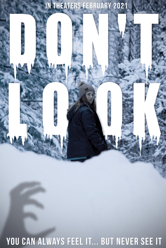
For this poster I happened to have taken a photo of my sister where she just happened to be looking back wards horrified at something so I decided to use that as my base and design a horror movie poster. From there I took a blurry photo of the snow covered woods behind my house, this is so I could add depth to the poster. After taking the photo since it was horizontal, I had to crop and duplicate the top and then blend the two pieces together using the stamp tool and smudge tool. I then took a photo of a random snow bank and comped that onto the photo in order to add a a foreground to the photo.
I then comped a photo of my sisters hand as a shadow with long finger nails on so that it looked more like a monster then just a normal humans hand.
In order to make it seem more like a shadow that she couldn’t see I put the hand low (behind the snow bank) and off to the left side which is opposite the side that her head is turned to.
When it came to the type face, I knew that the rest of the poster would be tinted blue so the font needed to stand out as stark white. I also knew that the bigger and bolder the font the better since the title is supposed to feel like warning. I then added the icicle accents to further do with the snow theme. When adding the icicles, “Graphic Designs Solutions”, described adding things to letters as swashes, but I didn’t think these were the same since they weren’t added to any of the letters descenders or ascenders.
I also originally going to leave the poster after adding the type, but to further make the poster feel 3D I added Kelly over the top the font so show that even though she is in the middle ground of the poster she is still the main center of focus. So after your read the text see the shadow you follow the shadow up to see Kelly’s horrified face. I also added a shadow behind Kelly in order to show that the type was a part of the composition and that she was effecting in some way.
The final piece added to the poster to make sure the type face stood out from all the other white snow was a slight vignette. In the textbook, “The Graphic Design Solutions”, it talks about using value to further the space. “a progressive shift in tone or value, form dark to light or light to dark, can contribute to the illusion of spacial depth or motion” (Landa). In order to for this to work I only added the value change to the comped photos but not the texts. This made the tag line and in theaters line on the top and bottom feel like they were jumping off the page.

Hi Taylor, fantastic job on your poster! One of my favorite parts of this composition is how your sister is centered between the two “o’s” in “look.” It really makes her become the focal point of the image, but I also think it adds to the horror element because they’re sort of closing in around her. It seems to be symbolic of whatever terrible thing is stalking her in this movie. I also love the color scheme in this and how all the whites and blues work together to create a chilly effect. The icicles dripping from the text are a nice touch too, making the composition even colder but also more menacing as well with their sharpness.
A suggestion I would make for improvement would be to fill in some of the white space where the snow bank is. The shadowy hand in the bottom left breaks it up a bit, but I think overall the large expanse of white risks overwhelming the rest of the elements. Perhaps a second shadowy hand in the bottom right corner would fix this issue. Plus, two shadowy hands are scarier than one 😀
Great job on this overall! I would definitely watch it (and be scared by it).
LikeLike