
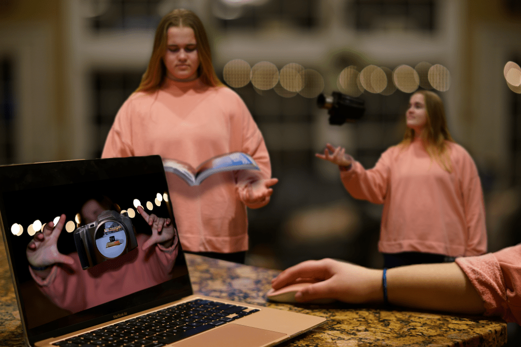
After studying a few Norman Rockwell paintings and seeing how he can tell full stories with just one picture that has a ton of detail, I wanted to try it out myself. I was challenged with taking 10 different/separate photos that I took and composite them together into one picture that told a story.
Since I’ve learning and study the concept of design and the steps that need to be taken to achieve a successful design, I decided to create the design process in a physical photo form, and more specifically the process that I went through in order to complete this project.
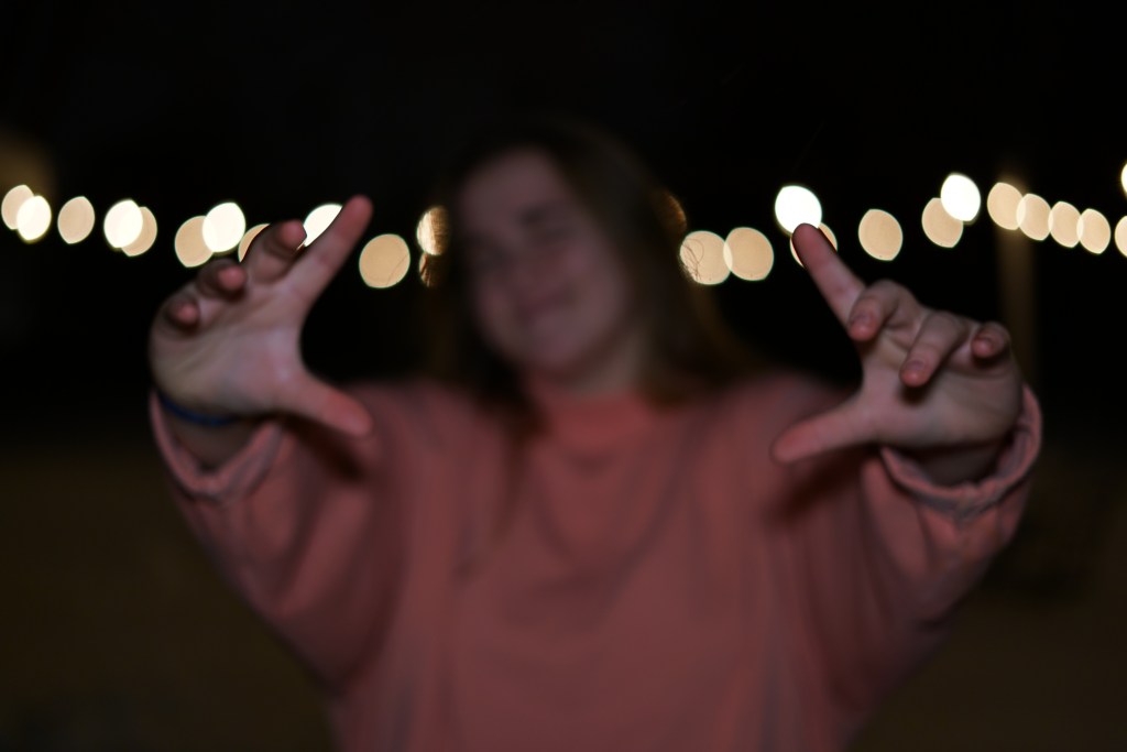
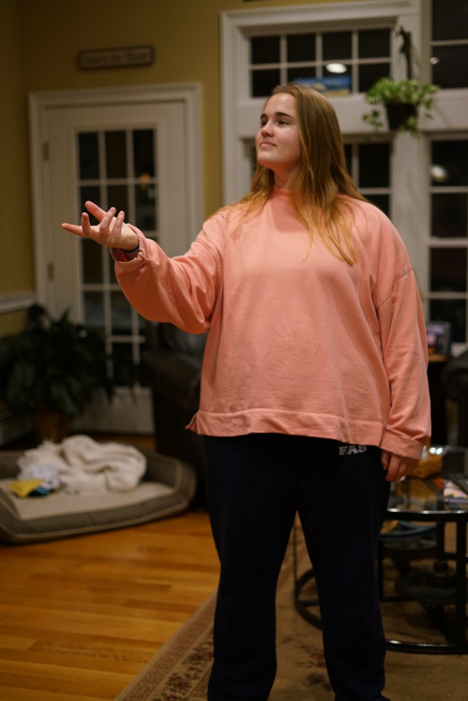
Within the photo you see the model reading, which in the “Graphic Design Solutions” book, author Robin Landa describes step 1 and 2 as the orientation and analysis phases. This includes research and writing. Then slightly farther back in the picture is the model again with a camera, showing the next step in the process which is conceptualizing and starting to complete step 4 which is actually designing. Finally in the foreground you see the model at her computer editing/designing the final project. This is the end of step 4, design and step 5 implementation.


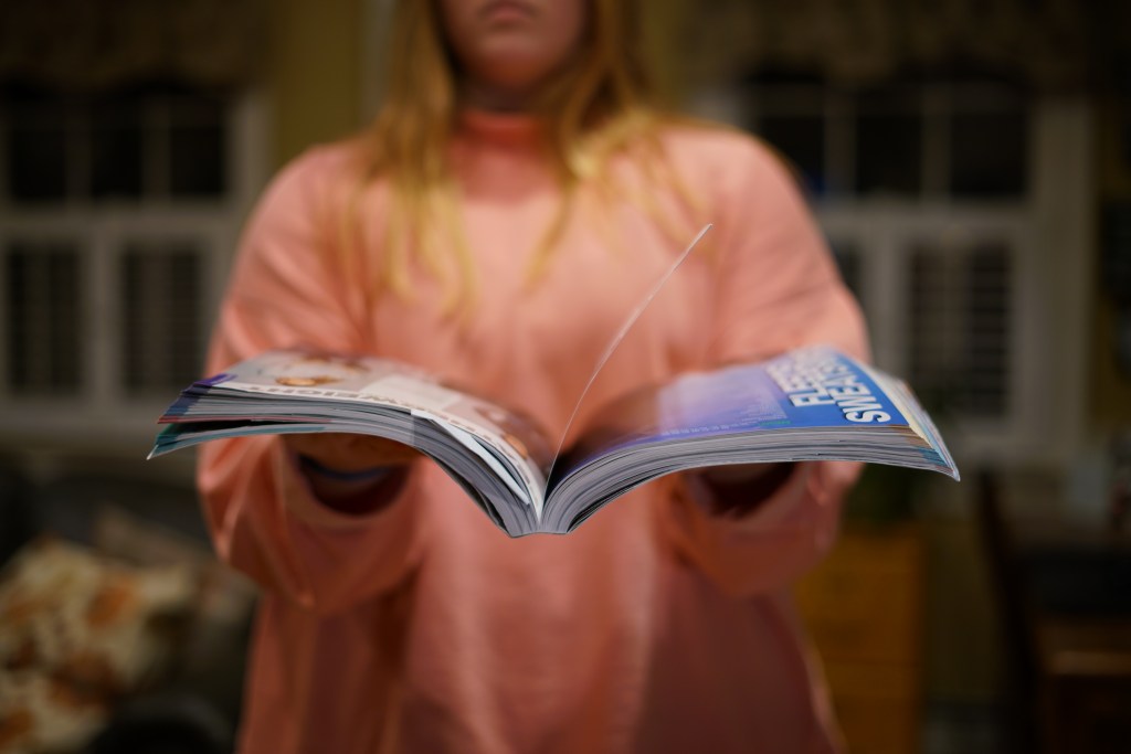
In order to complete this photo I had to use certain fundamentals of composition. In the book “Graphic Design Solutions”, there is a section about “Illusion of Spacial Depth” using principles like contrast, layering, tilted planes and foreground, middle ground and background. I was able to design a photo that had depth and layers.
Contrast, which is used “to compare the dissimilarity of elements” (Landa), is depicted by putting my model in a bright pink. I knew that all the other elements in the photo were going to be darker shades of neutrals since that’s really the entire color palette of the house. By utilizing contrast, I was able to make the model and the small image the model captured on her computer stand against all the other elements.
Layering and the different plains/grounds in the picture are used to create a sense of 3D space in a 2D photo. In this photo the foreground is the largest and clearest part of the picture. The foreground itself also uses a titled plane to help the viewer “understand the longer side of the plane (the computer) to be closer in space and perceives the plane as receding. This titled place helps lead you into the middle ground and foreground which overlap and are slightly blurred to show that they are farther away from the center focus. By the time you get to the background it’s completely blurred out to suggest that all the other elements are very far away from it.
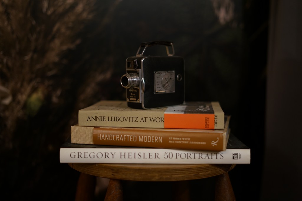
The final fundamental I kept in mind when designing this project was the illusion of volume. All the objects photographed were 3D object so that had shadows and highlights which helps to further allude to a #D space. “a progressive shift in tone or value, form dark to light or light to dark, can contribute to the illusion of spacial depth or motion” (Landa). In this photo the main source of lighting is coming from above ceiling lights, so it’s top lit. This met when composition other elements on top of the model I had to consider where I had to add artificial shadows in order to make layering believable and give the object the correct atmospheric perspective. If you look specifically at the textbook in the photo and the camera on the computer screen you’ll see the shadows underneath that show its real world affect on the model.

Taylor, how cool! I love the way you used images of the different steps all put together to create a story. Your blending and photoshop skills are great. I like the way that in your post you showed all of the different photos so that the reader can see deeper into the process. The blurriness of the background created a great element of depth. Good job using the computer as a plane. Great work!
LikeLike