
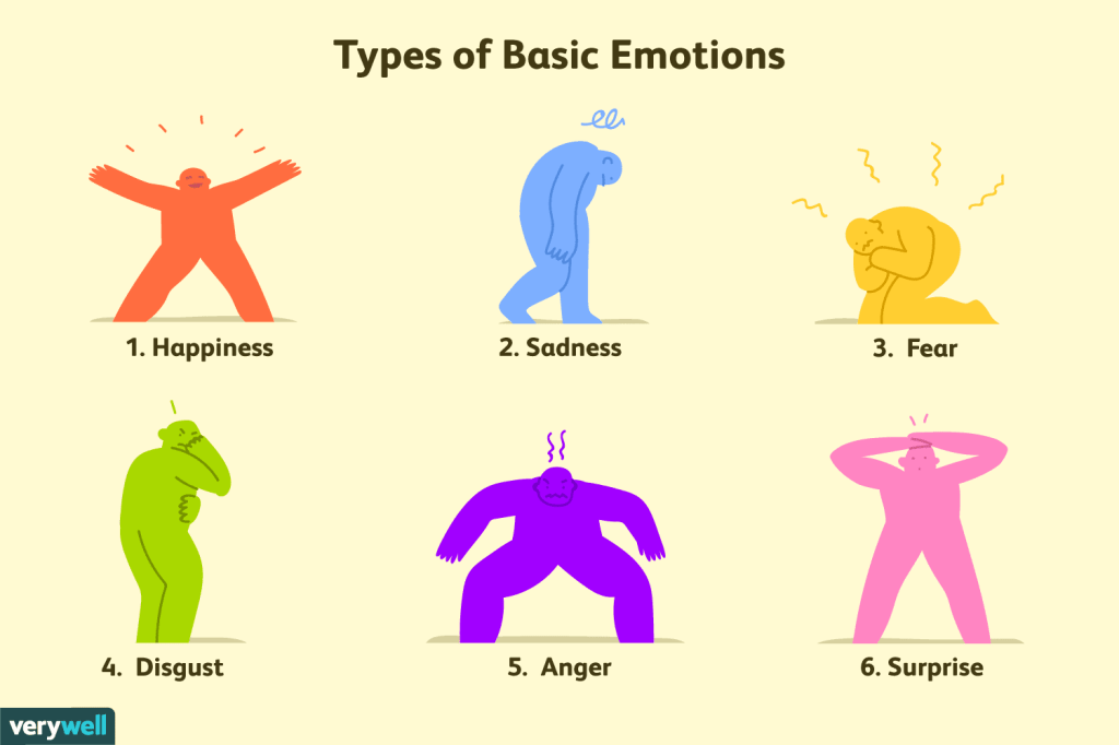
When someone says the word emotion, most people immediately think of happiness, sadness, and anger. It’s our 3 base emotions and it’s the ones we can categorize most of daily lives into. Someone cuts us off in line… anger, someone close to us in life dies… sadness, we get that promotion at work that we’ve wanted for so long… happiness, but have you ever realized that everything you ever story you’ve watched, read or created has also made you feel a very distinct and it’s not random someone put thought into what they were making to evoke that specific from you. Many designers use the Plutchik wheel to base their designs off of the 8 main human emotions. According to the Interaction Design Foundation, this includes anger, disgust, fear, sadness, anticipation, joy, surprise, and trust. The following three photos are artist’s representations of the same emotion, sadness. I chose this specific emotion because in my opinion it’s the most diverse. You can have happy sadness, angry sadness and just plain old depressed sadness.
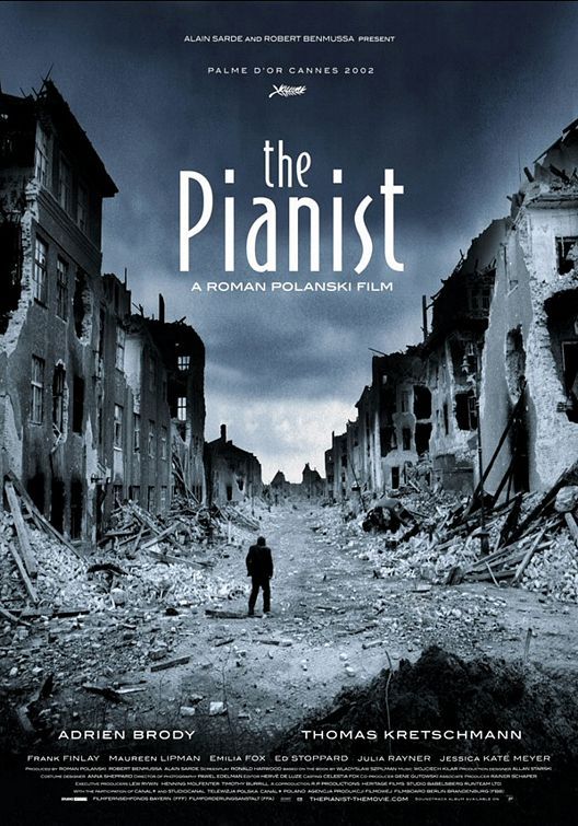
The first photo I have chosen is the poster for the movie The Pianist. It’s a movie all about the holocaust and a surviving jewish piano player. It’s a gut wrenching movie and just the poster itself evokes a sadness inside of you. It’s a gloomy poster with destroyed buildings and a small man all alone standing in the middle of it. Using, The Next Web’s color theory description the use of grays can promote the feeling of melancholiness in people, “in certain situations it can seem brooding or sad,” (Cao). Then mixing it with tints of bluish-grey gives you that dark sad feeling, as most people associate many shades of blue with sadness.
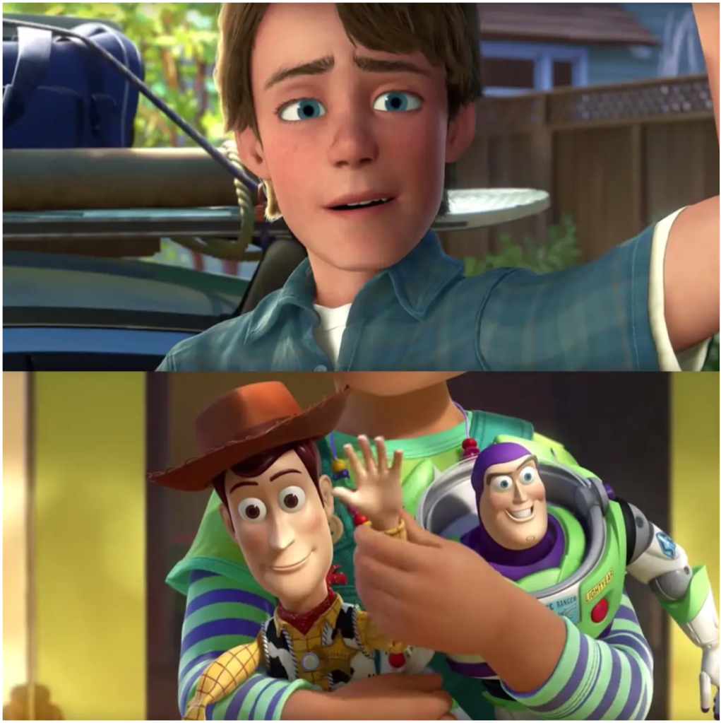
The next still is from the animated movie, Toy Story 3. It’s a still image from the final scene of the movie when Andy says goodbye to Woody and Buzz and goes off to college. It’s one of those sad yet happy moments where the music swells and your eyes water because you’re upset that Andy has to say goodbye, but you’re happy that the toys have found a new and happy home. The animators definitely played off a version of Richard Gregory’s theory of top-down processing which uses our previously learned knowledge and surrounding environment. “Stimulus information from our environment is frequently ambiguous so to interpret it, we require higher cognitive information either from past experiences or stored knowledge in order to make inferences about what we perceive” (McLeod). For this exact moment most teenagers and adults can remember growing up and giving away or getting rid of your favorite toys and the sad feeling you had. The scene is a form of nostalgia for many people and wildly relatable which is why evokes such sadness from within people.
The final photo I chose to use was a photo of a bear sitting all alone on a rainy road. It has a very similar feeling from the previous image in Toy Story, where it’s a child’s toy left all alone and slumped in such a sad way, but instead of having that happy undertone in the sadness this sadness just hurts and leaves you feeling lonely. If we look at the picture again through color theory, the only two colors really used in the photo are grey, melancholy, and beige/tan, and beige is known to take on the traits of the surrounding colors because of its neutrality. “On its own, beige is dull, though this can be used to symbolize humility. However, it will take on the characteristics of the colors around it, making it an interesting design tool. For these reasons, beige is almost always a secondary or background color” (Cao). This is interesting to me because in this photo beige is really the only color and for it to be a dull color goes along with the feeling of just numb sadness you get from it.
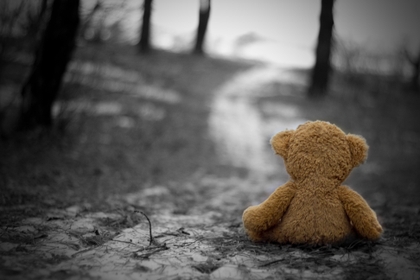
Another theory that can help explain the feeling of sadness is Gestalt’s theory that humans perceive things as a whole and not as individual items. An author from Canva explained the theory as “when we perceive the world there are many different signals coming in at the same time. To organize them, and avoid going crazy, we visualize our surroundings as unitary forms or groups. Just how we go about deciding that some objects “go together” would be the main obsession of Gestalt psychologists and designers for decades to come.” So when we look at this photo we don’t see multiple trees, a winding road, and a bear all separate. Instead we see a gloomy blurred background and lonely bear as the main focal point left all alone, just waiting there for someone to return and claim him. And that’s where the sadness sets in.
Overall, each photo was created differently, used for different mediums and has different elements layered into them, yet they all evoke a sense of sadness. And the theories that I felt could be utilized to understand why the photos evoked such an emotion could be true, but there could also be many other reasons behind it. Design, art and especially storytelling are all subjective forms and people perceive different things all the time. Designers learn these theories and keep them in mind when they’re creating something new but it’s never guaranteed they work because everyone has a different back of shared knowledge and has different past experience they’re pulling from. But personally for me some things just pull at the heart strings so perfectly you can’t help but shed a tear every time you see it.

Hi Taylor. Being a huge Toy Story fan, I am happy to see someone else in the class pull a visual from it other than me. I think you did a superb job of talking about the concept of something being bittersweet. I actually enjoy that you mentioned anger, sadness, and happiness and explained why we might feel all of them yet also found where they intersect. To me, that is sort of the odd complexity and beauty of our emotions, and it is one of the most interesting things to see visualized. I am not sure if you’ve seen Boyhood, but your post’s ideas sort of remind me of the general feeling I had after watching that movie. It’s sort of the notion of taking into account all these different things that happen in life and the feelings that come along with them in the moment while also connecting them to other things that happen throughout the years.
LikeLike
Hi Taylor! I really like this post a lot. While you discussed a very sad emotion (you know, sadness), I didn’t get a sad feeling when reading, and that’s a good thing. You did a really good job explaining how each image you chose connected with the readings. You know I never thought about Toy Story 3 being an example of top-down processing but the way you described it makes perfect sense! Now I know why I cried in the movie theaters!
I guess the only thing I would say is that I wish you specified which image correlated to which intensity of sadness on the Plutchik Wheel. Now I don’t know if that’s what you were aiming towards when making this post, but if it was I would’ve liked to know more about why you chose the image for the specific level of sadness.
But that’s really it, I enjoyed reading through your post!
LikeLike