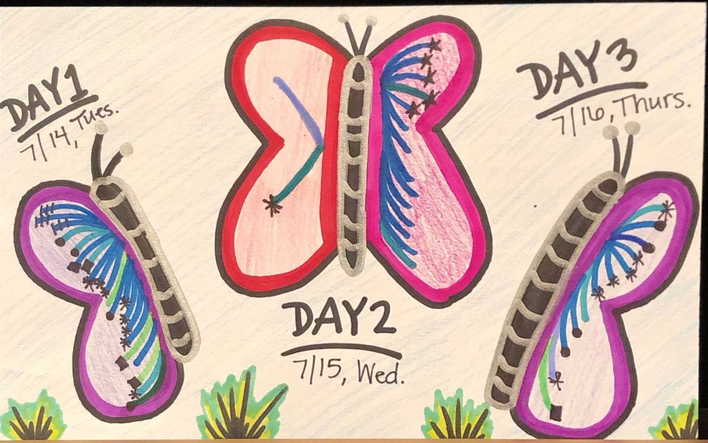
Here is the front side of my postcard. It shows my week laid out and hour much time I spend on creative and artistic projects for both work and my personal life.
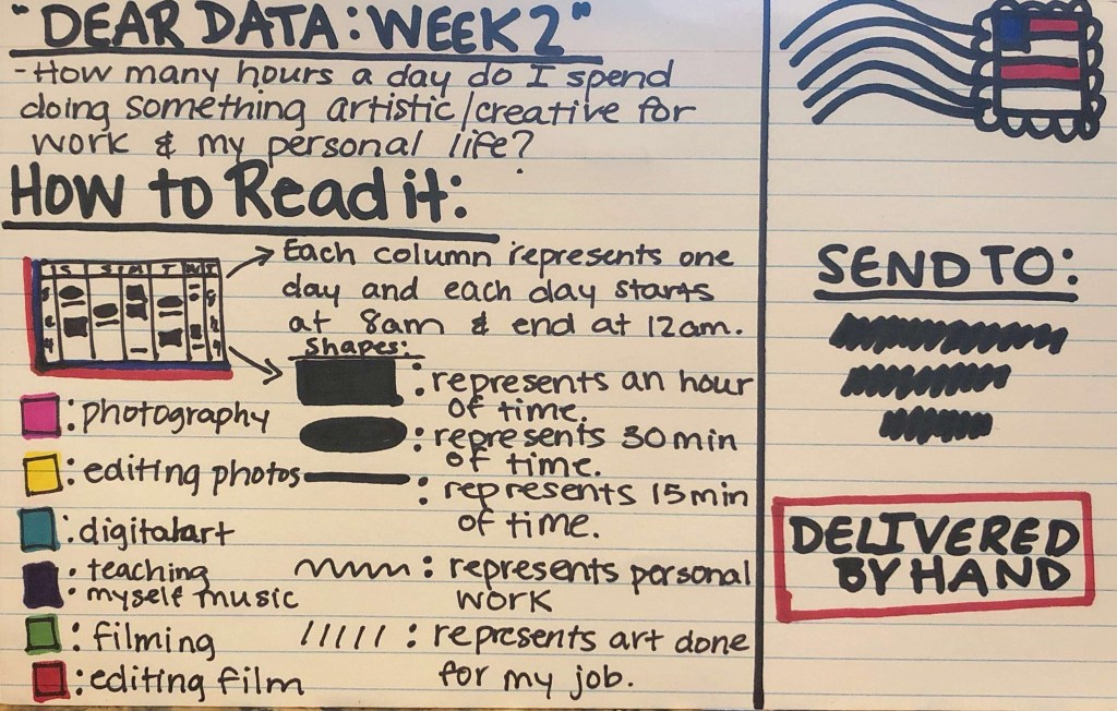
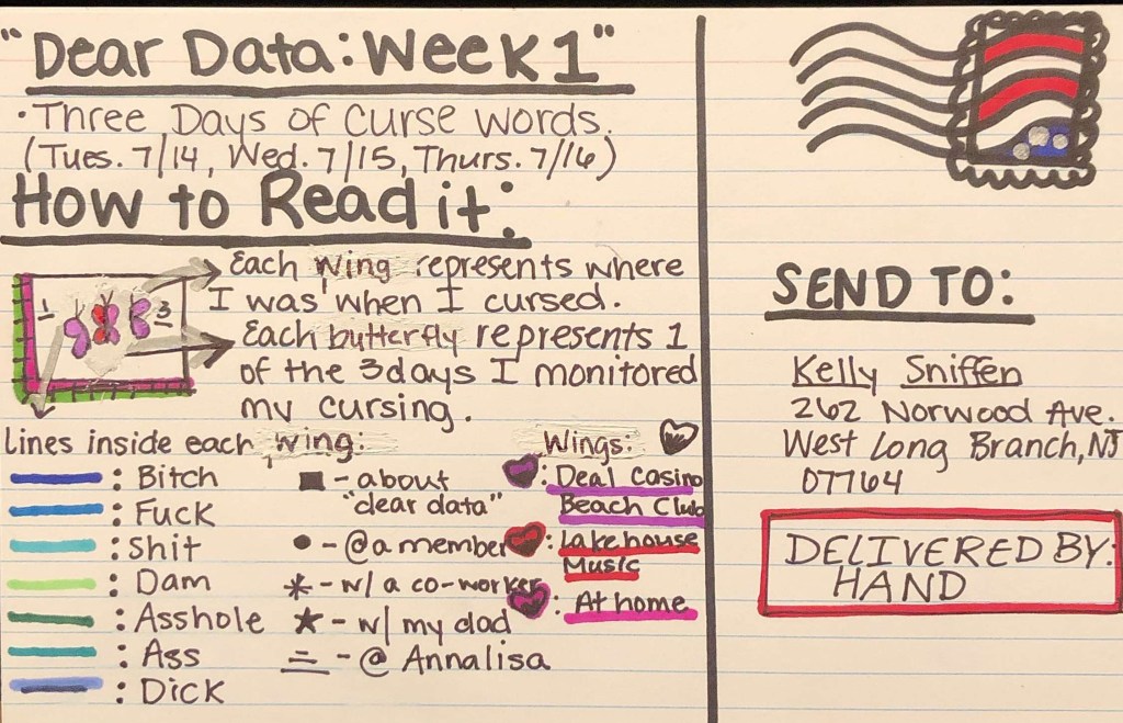
Here is the back side of my postcard which has the question that I am trying to answer with this data visualization and key on how to read the postcard.
After closely tracking my creative work for the week. I have found many a few things very interesting. One thing is that the purple marks on the calendar only occur at night. And looking back that makes sense because while working two jobs and taking grad school classes i don’t really spend much of my time anymore teaching myself music, but anytime that I can’t fall asleep I will. And this past week both Monday and Tuesday I could not fall asleep. So I taught myself a couple of Hamilton songs.
Another pattern I noticed this week and after reflecting on other week s happens very often, is that once I get my assignments for my production job in the second half of the week I kind of stop doing personal art for myself because most of my time is dedicated to either editing for my job or I’m stuck in the office at my other job at the beach. The only personal thing that sometimes breaks up my creative work is when I create stickers or digital art work on procreate and adobe illustrator and honestly I usually go on to my iPad when the videos are exporting on my computer.
One thing that would be considered an outlier for the week is my Saturday and Sunday being spent doing photography. I usually like to go out on adventures and photograph as often as I can, but with how this summer has been going I haven’t had a lot of time. Fortunately this past weekend I was able to drive up to Connecticut and go adventuring with some friends, which was really fun and definitely a nice break from my usual weekend work.
Overall it did shock me to see how much time I spend doing creative projects for the whole week. On the other hand, I feel for this to be a truly comprehensive data visualization I would have to track my hours for an entire month because each week can fluctuate a lot between how much creative work my job gives me and how much of a creative drive I have to create my own personal work.
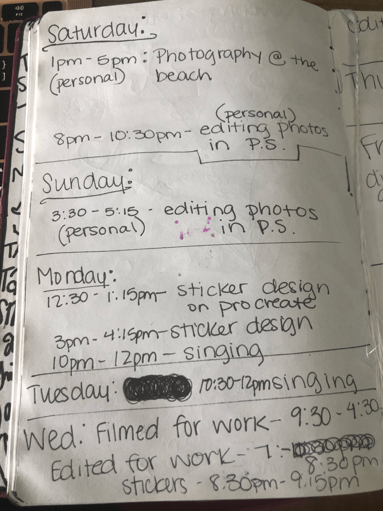
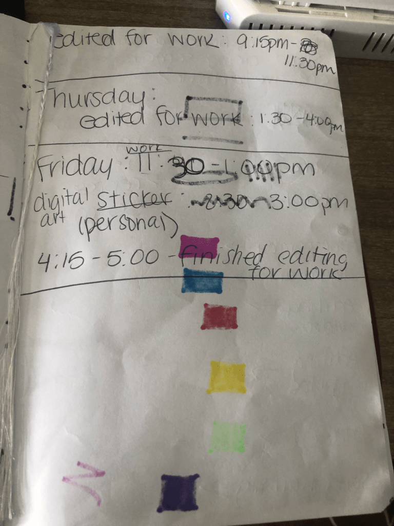
Here are the photos of the data collection I kept through out the week.
This week I have found three sets of data that I’ve combed through and organized in order to properly turn them into visual data wrapper charts.
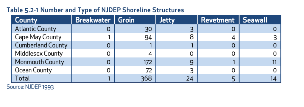
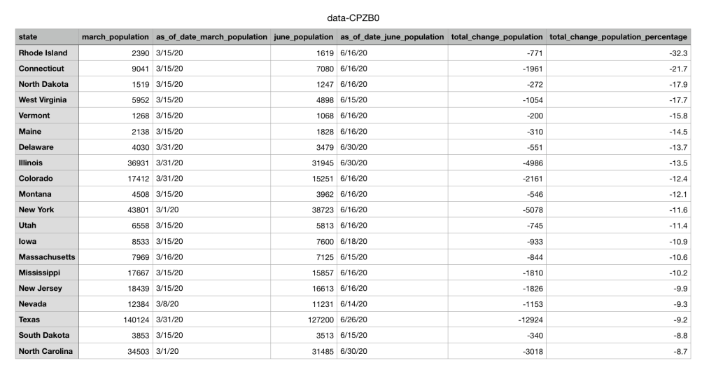
My first set of data is a geographical set taken from the New Jersey Department of Environmental Protection. This is a highly trusted government website and the case study that I found this data set on has been verified by scientists’ multiple times. This dataset highlights the different types of Shoreline Structures each county has and the number of them that each county has.
The second set of data I found was from a public source called NJ.com. It is a trusted website where many local journalists and researches go to find data collections and articles about issues in New Jersey. I chose to look at the data surrounding prisons during the pandemic. The dataset shows that population numbers in prisons across multiple states are going down due to the pandemic.
The final set of data I collected was from the Quinnipiack Valley Health Department page. I chose to search up Hamden and copy over all the restaurants in Hamden and their ratings and made my own excel sheet out of the information. The original information included the address of the restaurants and the dates that they were given their up to date ratings, but after examining what information was needed for the data wrapper chart, I choose to organize the excel sheet without the address and the dates. Instead I only organized the names of the restaurants and their ratings.
The next step in the data visualization process is too look at the data and decide what questions you should ask to get the most out of your data collection. Once you make the questions you have to make sure their answers are attainable. In the textbook, Making Data Visual, they describe it as “The process of breaking down these questions into something that can actually be computed from the data is iterative, exploratory, and sometimes surprising… In many fields, the process is called operationalization, and refers to the process of reducing a complex set of factors to a single metric.” (Fisher, Meyer)
For the geographical set of data, I want to know why there are almost no breakwaters in all 6 shore counties? What makes a groin so popular in the shore counties? Are these numbers increasing or decreasing due to coastal erosion? The next set of data is the prison systems population going down due to COVID. In this case I would ask the question of if crime overall has gone down in these states as well as prison population? Have these prisons seen high rises in COVID cases? Does the population of the prisons and the decrease in that population correlate with the amount of cases in each state? Then for the final set of restaurant data I would ask, How many restaurants are repeat offenders and have repeatedly gotten C’s and B’s? What is the percentage of A’s vs B’s vs C’s in Hamden? Does the location of the restaurant have anything to do with its rating?
After cleaning and organizing the data, I would make it into its visual graph. Looking at the Abela’s Chart Type Hierarchy the best visual to use to make my geographical set of data is a table with embedded charts. These is because there are many categories including all 6 counties and all 5 sets of shoreline structures. Then for the public data set in the prisons I would use a line chart with multiple categories again. This way I can show the change over time in population and each line would represent a different state’s prison. Then for the final Hamden restaurant data set I would use two different kinds of charts depending on what question I was trying to answer. Either a scatter plot on top of a map that shows each restaurant rating and where the restaurant is. Or a pie chart to represent the percentages of A’s vs B’s vs C’s in Hamden.
Overall even after clearing, organizing, and visualizing the data the best way to get people to watch to view your chart is to make sure its trustworthy. In order to achieve this, I would make sure I included all of the different data points make sure each axis is labeled properly and any data keys were clearly readable. This way there is no discrepancies in the data and the viewer can make any of their own conclusions.
After reading and listening all week to the differences in data visualization and the importance each one has. I’ve been surprised again as to A.) how important data visualization is and that’s not just making a pretty graph and B.) how often I subconsciously looking at something data based that was meticulously designed by someone.
One of the best explanations about the importance of data visualization was from David McCandless in his TED Talk. He talked about the value of data and how it genuinely actually has a value, like currency, in today’s ever progressing and advancing climate. “Data is the new oil.” Data is the kind of ubiquitous resource that we can shape to provide new innovations and new insights, and it’s all around us, and it can be mined very easily. It’s not a particularly great metaphor in these times, especially if you live around the Gulf of Mexico, but I would, perhaps, adapt this metaphor slightly, and I would say that data is the new soil. Because for me, it feels like a fertile, creative medium. Over the years, online, we’ve laid down a huge amount of information and data, and we irrigate it with networks and connectivity, and it’s been worked and tilled by unpaid workers and governments.” (McCandless)
The other biggest take away from this week was the four main types of information visuals, conceptual-declarative, conceptual-exploratory, data-driven-declarative, data-driven-exploratory. Each visual is very different from the other. At first glance each title seems confusing and repetitive, but then once each is broken down, they all make a lot of sense and each one has a specific use.
Conceptual – declarative is something that is made to simplify complex concepts. This specific type of graphic is sometimes coined the “consultant’s corner” because consultant’s love to make circle diagrams that explain and over explain everything. It’s used as a great way to depict a framework for an idea and usually swings more towards the editing and design side on the creative spectrum. A great example of a conceptual-declarative visual is the “Building Hopes” AR visual by Accurat. It allows people to walk around their immediate area finding and ranking their hopes and dreams and then it creates a sculpture for you, and you can read data about you. The structure serves as a great metaphor for that person’s life, which is what this visual is. When using conceptual- declarative data design you are just creating one big metaphor.
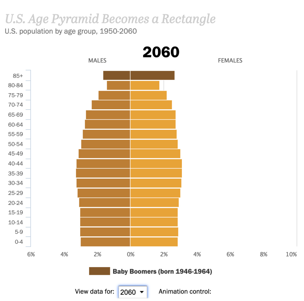
The next data design is conceptual-exploratory. The use of exploratory data is to gives the viewer the “opportunity to explore, allowing the data to reveal its underlying insights freely.” These types of visualizations are usually undefined and complex, but the point is to teach and explore a concept or idea that isn’t set in complete fact yet. A great example is the interactive data about “The Next America”. It a moving graph about the possible upcoming ages and genders of America. These numbers aren’t guaranteed, and every viewer is going to view different years and not walk away with the same realization. Some might see that there is going to be more women in the future and others will see that there are going to be less children in the future.
Moving on to the third information visual is Declarative Data. This version is the simplest and usually contains the lowest volume of data. The point is to clearly depict something, through some sort of easy storytelling and to not overcomplicate well collected data. A good example of this is the visual by Sonja Kuijpers called “A View on Despair”. It’s a simple landscape drawing and each element in the landscape represents a different easy someone committed suicide. The visual is simple, but powerful. The viewer can easily look at the picture and read the legend and understand all of the data.
The final type of information visuals is data-driven exploratory. Personally, this is my favorite type of data visualization. It takes the simple well collected data side of the declarative data graphics and the fun exploration of conceptual- exploratory graphics and puts the two together. So, you get a visual that is based off of concrete facts but has the creative freedom to let viewers explore the data on their own terms and walk away with their own summary. This type of visual is usually unconventional and uses big and complex data. A great example is the Symbolikon by Michela Graziani. It’s an ever-growing compilation of over 800 symbols with over 28 categories from different cultures and times in history. It’s an exorbitant amount of data and when the viewer goes to the website, they can choose whatever categories they would like to explore.
Overall each type of visual has a specific use and helps take both complex and simple data and turn it into some sort of metaphor or graphic that is easier for the mind to comprehend.
After monitoring my cursing for three days at home and at my 2 different jobs, these were my results.
Clearly I need to work on how much I curse at one of my jobs and it also seems that my favorite word is F**k and I curse the most with my fellow co-workers.
After reading the articles I found out so much about the history of data visualization. I had no idea before this that the art of taking a large amount of data and forming into something easily readable and visual has such an expansive timeline. Of course just like all things in this society technology began to progress and evolve and it changed the data visualization game. “One may also see that most of the innovations in data visualization arose from concrete, often practical goals: the need or desire to see phenomena and relationships in new or different ways” (Friendly 30). A lot of the technology that was introduced helped improve how it was done, but some of the newer methods in a way have made things harder to understand with the data presented.
In my opinion the number one pro that came from technology was the ability to link data visualization up with large scale graphic software and more expansive and interactive computing systems. This allows for the data to be viewed in a much deeper way. Viewers can easily navigate through the data and more often now there is more than one way to view the same set of data. In a presentation on the “History of Data Visualization”, the number one pro described about data visualization over all is “that compared to text, it offers more immediate visibility to information so that the audience can understand it easier.” And now with the introduction of this more complex software, the visuals and the graphics have gotten more detailed and even easier to understand and depict patterns between.
On the other hand though, having introduced such advanced technology into this field it can feel at times the information can be a little too detailed and the point of the data becomes muddled. That same presentation on the “History of Data Visualization” also described the biggest weakness in data design and that’s “that they have the potential to be misleading while being trusted by their audience. For better or for worse, information design is always subject to interpretation by you as the creator, but then also the audience on the receiving end too.” When a graph or chart is made to be too interactive the viewer can get lost in the spectacle of the graphic and never actually comprehend the information that was at the base of the design.
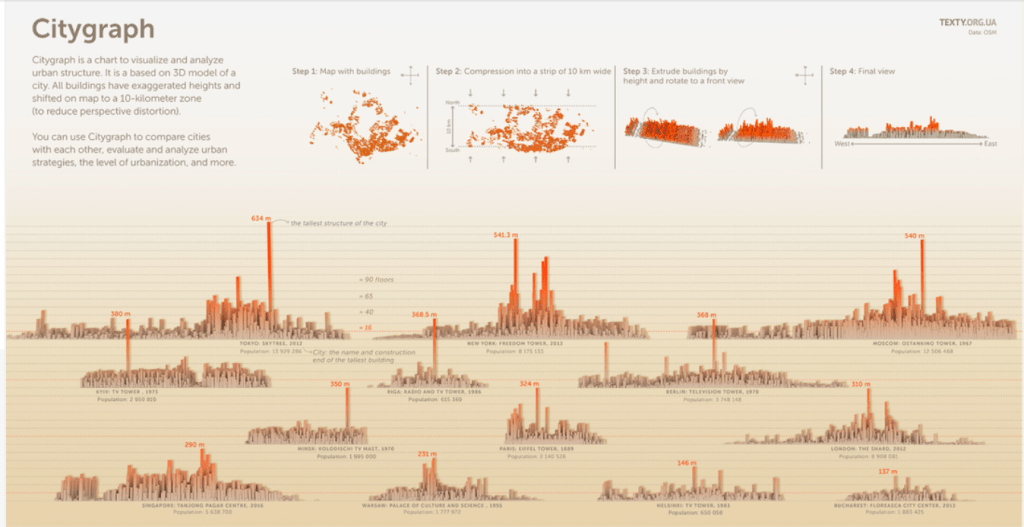
The “Citygraph” graphic from informationisbeautiful.com.
In order to teeter that line of pros and cons with technology you have to be able to boil the whole process down and just make a good chart. A good chart, which is described in the book “Knowledge is Beautiful” starts with a good balance of the information that is being presented, the story that is being told through the use of the information, the goal of the graphic, so that is actually has a proper function and isn’t just there to look pretty and finally the visual form that the data and the story takes. An example of a good chart to me is from informationisbeautifulawards.com and the graphic that I found the most pleasing to look at and to understand was the “Citygraph”. It had the perfect balance of all 4 and didn’t try to get too complicated. The information was all the different cities and the different sizes of their urban structure and in the final graphic it is easy to see all the different sizes and use the visual form they chose to easily compare the different cities to one another.
Even though you need all 4 pieces to a good chart, there are certain aspects of the chart that appeal to me more than others. Personally I respond far more with the “story” and the “visual form”. I am a storyteller and I am a designer. My background is in both journalism and film. I find that almost everything in my life needs to tell some kind of a story, otherwise what’s the point of it” and I also enjoy making things look pleasing to the eye. Both of these sections also come with tasks that I find enjoyable, like, script writing, artwork, rough drafts, design templates. Overall, I am a visual learner so I find data visualization extremely useful, but in order for me to enjoy a “good chart” it has to tell a story and is has to have been done in the correct visual form otherwise I get pulled out of it and won’t be able to fully grasp what the chart was presenting in the first place.
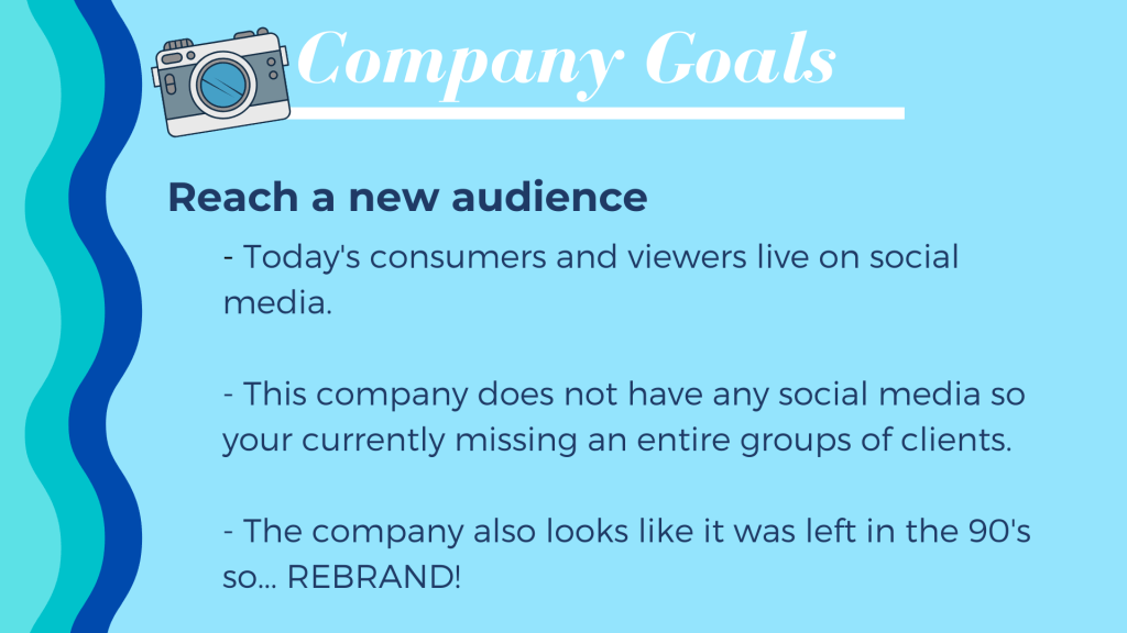
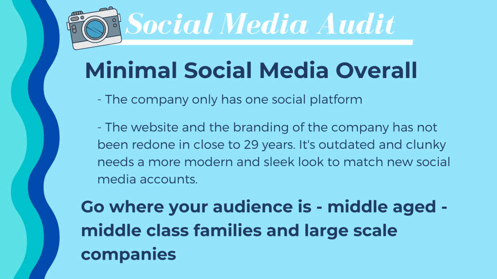
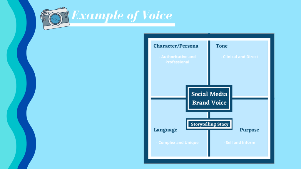
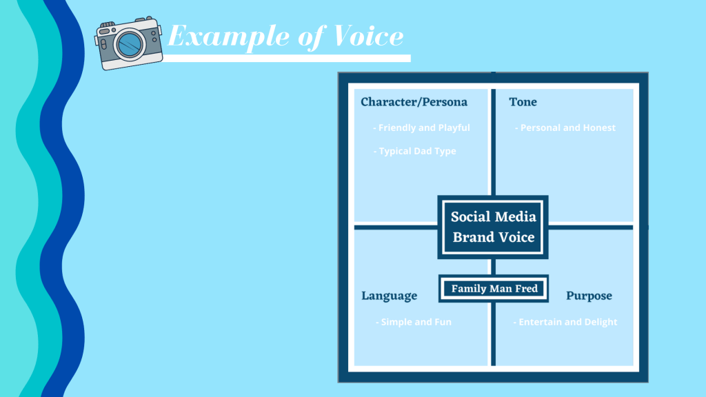
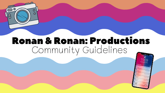
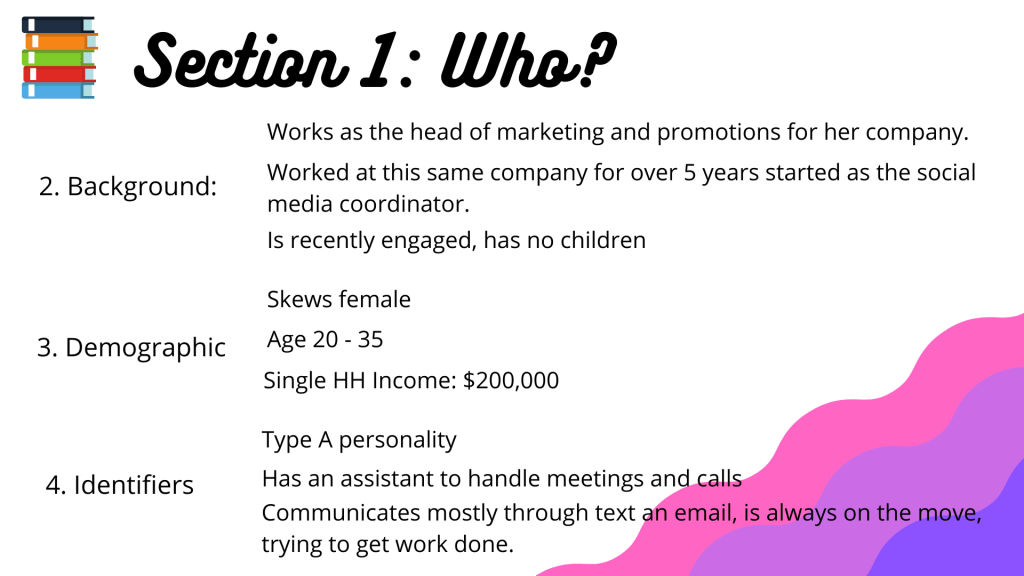
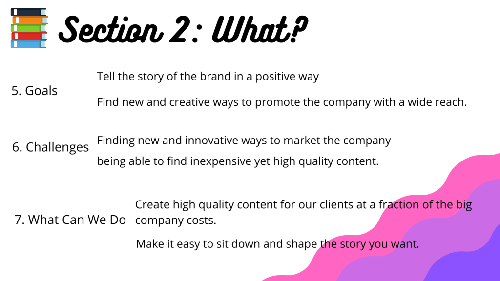
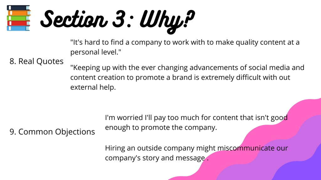
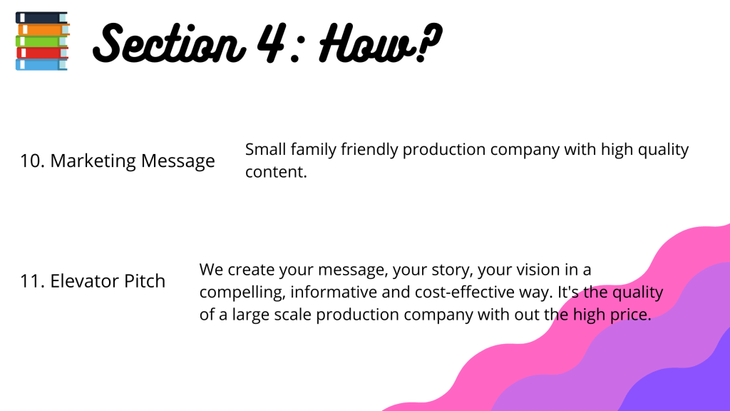
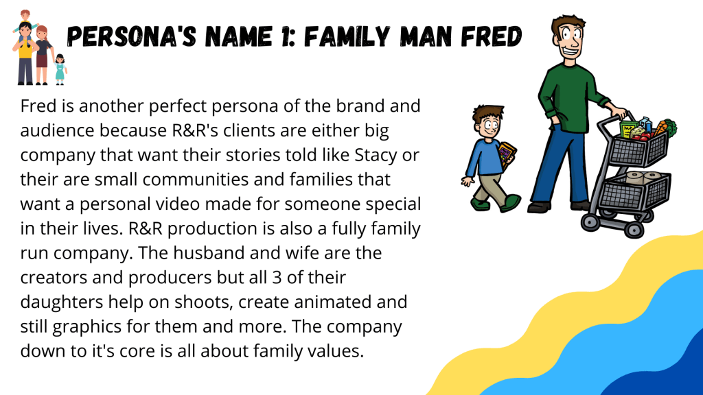
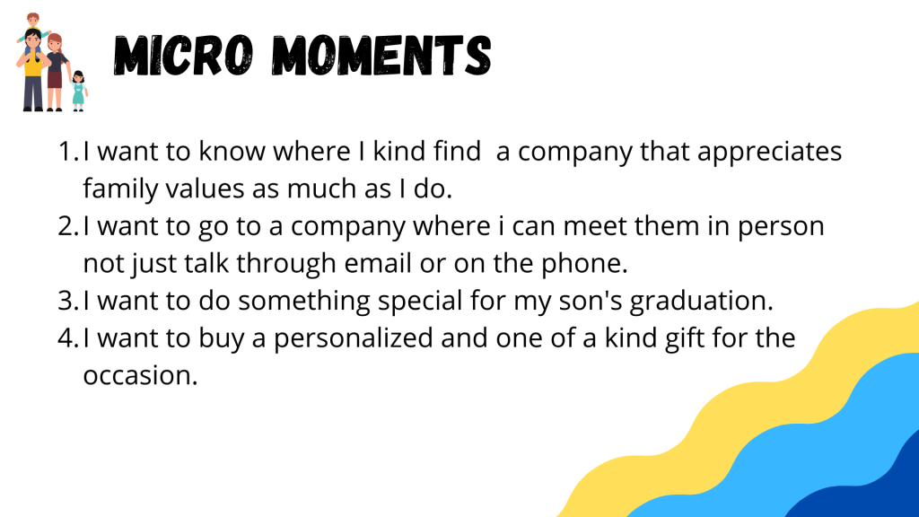
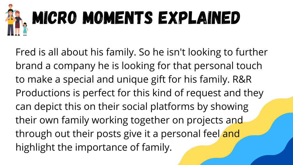
I am presenting to Ronan & Ronan Productions a small family run production company. My presentation is on the importance of social media and how creating fully fleshed out social media accounts will grown the company. This pitch also includes ideas on rebranding the company with a new sleeker logo and creating distinguishable company colors that will help further connect them with their current clients and help the company reach an entirely new audience.
Ronan and Ronan Productions is a family owned and run business and all social platforms run by the company reflect these values. Our social media is used to promote our company’s brand and to showcase the work that our clients hire us to complete. It is also a safe space for people to comment, ask questions and compliment the hard work and dedication that goes into each project.
Our social media is not a place where you will find advertisements, sponsorships or negative attitudes. We ask you kindly to be respectful on all of our platforms and to spread positivity and creativity just like our brand strives to do everyday.
Moderation Policy:
R&R is a private business so we reserve the right to completely delete inappropriate comments and will block users from being able to contribute on our pages.
We will delete and hide comments for any:
Profanities & vulgar language
Hate speech
slander/libel
Copyrighted properties
False information
Expectations for Engagement:
We encourage our audience to comment, question and complement posts they enjoy or don’t enjoy, but we also expect all members to always stay respectful. We also encourage our audience to share with us. Please DM us any requests for work or if you have any work that you wish to share with us. We love to give tricks and tips to people starting in the production industry and we would be happy to critique any work from our followers.
We also expect our followers to call out any of our incorrect or inappropriate posts. We all have the responsibility to keep each other accountable.
Legal Restrictions:
As stated above we are a privately owned family business we do not have an legal issues that we can not talk about but we ask that in order to keep our brands’ message of positivity and creativity from being muddled to not post anything inappropriate or negative.
Also stated earlier in the guidelines, all copyrighted and false comments and posts associated with our company will be blocked and or deleted.
Paid Ads & Sponsorships:
At this moment R&R productions is not sponsored by any other company and our social platforms were not created to make money off of paid advertisements. We wish to use our social media to promote our work and at times if we agree with our clients’ company values we may advertise their work. But we can assure our audience that we will never try to sell things to you on our pages without ample warning and without testing the product extensively ourselves.
Frequently Asked Questions:
How do I contact you for a project?
You can contact us from our website, through email, phone, or DM us on our social platforms.
What is your usual price for just a consulting appointment?
None of our prices are set in stone. All final prices result in the length of the meeting, equipment used and if you are choosing to continue with the creation of the project.
What will it cost for a full professional quality video?
Similar to the consult question, the pricing on each video has to do with equipment used, travel expenses, time spent on the project and length of the final project.
How long does it take to create a finished product?
Depending on the length and content in the video it can take anywhere from a few weeks to a couple months.
What kind of camera do you use?
The company has a few different cameras but our most used is a Sony FS7.
What kind of lights do you use?
The company has multiple different sets of lights that we use for different kinds of projects, but our most versatile and commonly used ones are the temperature changing LED panels.
Do you work for large companies or just families and small businesses?
We work for any and all clients that wish to have their story told in a creative and affordable way.
Are there only two of you working on every project?
Yes, most of our projects are created by the two of us, but we do hire help from our family members and our daughters who have animation and marketing degrees to help with graphics and project details.
Would you take a client that was not on the east coast?
Yes, we will take any client if it is strictly an editing, audio balancing or consulting project. If physical production is required for the project then a client on the opposite is out of our range.
How far are you willing to travel for a project?
We have already traveled across all of the east coast for a project. Travel expenses are included in the final price. But anything involving long flights and long hotel stays are typically turned down.
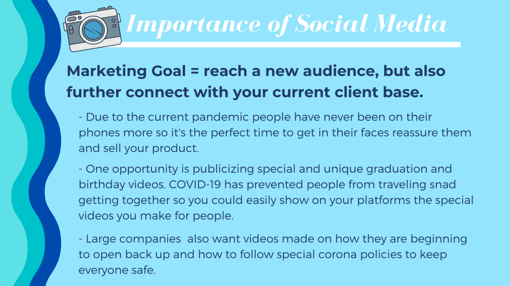
This week’s overarching plan is that the company was just recently hired by the town’s middle school and high school to make graduation videos. So all week they would post to get things sent in for the video and show all the hard work that is going into editing them.
Date
Social Platform
Target Audience
Visuals
Topic/Theme
Actual Text
Outside Links
Results
Mon. 6/15
Instagram
Families with graduating students or who know graduates
graduation
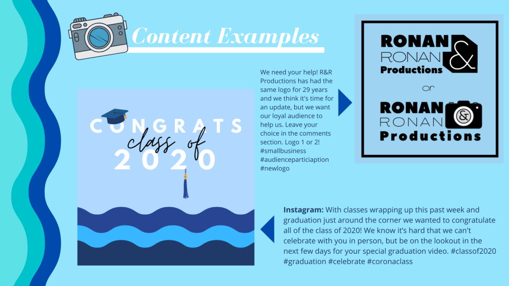
We’d like to welcome 2 more members to the R&R Productions family. Frank Antonidies Middle School and Shore regional high School. We will be creating their very special graduation video for the class of 2020 since they will not be able to have an in person graduation amidst the COVID-19 pandemic. To see all of the other members of our growing family visit our website (linked in our bio)
Families with graduating students or who know graduates
graduation
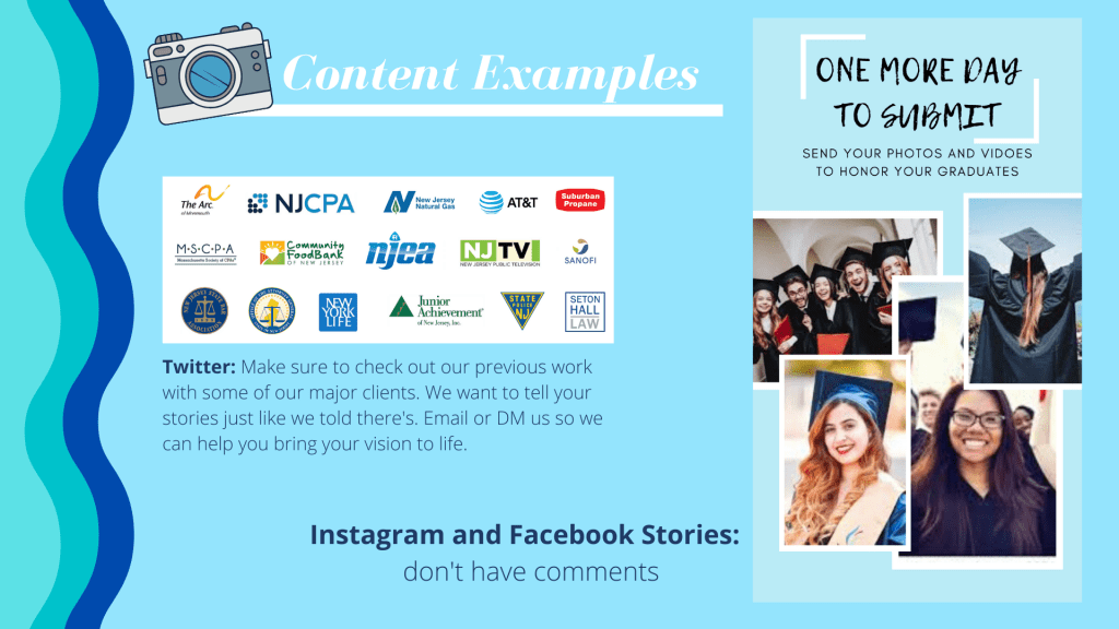
Insta: Submissions are now open for all photos and videos of your graduates. Click the links in our bio to send us emails or DM us with your submissions. Any amount of photos and videos is allowed and please make all pictures into a jpeg or PNG format. Facebook: Submissions are now open for all photos and videos of your graduates. Click the links below to send us emails or DM us with your submissions. Any amount of photos and videos is allowed and please make all pictures into a jpeg or PNG format.
Families with graduating students or who know graduates
Timelapse of them editing the footage together.
graduation
Thank you to everyone for your submissions! We have been working tirelessly to edit all of the wonderful things you’ve sent in. Check out this timelapse of the video’s timeline slowly coming together.
NA
Sat. 6/20
Facebook, Instagram
Graduating Students
graduation
With classes wrapping up this past week and graduation just around the corner we wanted to congratulate all of the class of 2020! We know it’s hard that we can’t celebrate with you in person, but be on the lookout in the next few days for your special graduation video.
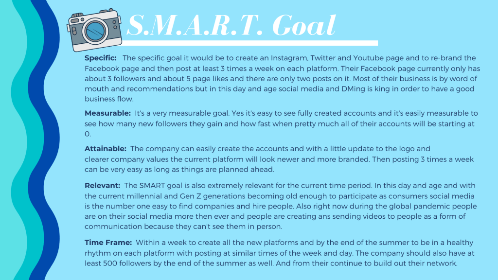
For over the past R&R Productions main clientele are larger organizations usually run by an older group. This would mean that their companies top social networks should be Instagram, Facebook, YouTube. This is due to the fact that all three of these platforms have the best setup to run a business account and look the most professional.
Instagram: Instagram has a very visual culture. Well thought out and compelling videos and pictures are the way to go. So for a production company visually appealing content is not a problem. Using their sizzle reels from their websites, snapshots from different projects and trailers for their larger projects will showcase their fantastic work and give possible clients and audiences a good idea of the type of storytellers they are. Using the Instagram business features like boosting your posts and creating sponsored posts would really help them reach a larger audience. Also things like IGTV would help them showcase the hard work, dedication and long process that goes into their projects.
YouTube: It has always been a great place to share videos, especially long form videos, but now YouTube has made some incredible updates that allow a visual business, like a production company to do some great things to further their brand. This includes that once your business channel is set up and customized to your businesses needs then YouTube can help you begin advertising with skippable and unskippable ads during other popularly searched videos.
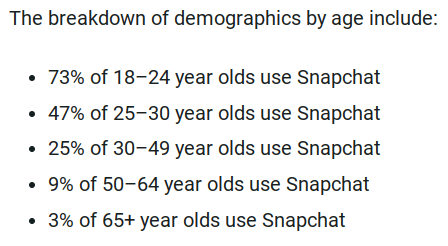
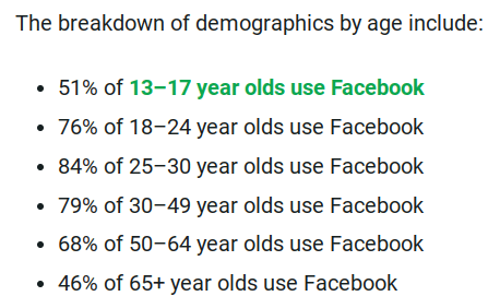
Facebook: This platform is by far the most malleable and customizable social media that a company can use. For R&R productions they not only would be able to post great videos, photos, graphics and even go live to further connect with clients, but they can link to sources and other projects, have their website and contact info easily at hand and really show off the style of the company through the design of the page. Facebook is also becoming more and more a social media platform for the older generations and the young. People go to Facebook for business reviews and R&R’s clientele are typically older so they would probably have the most success here if it was done correctly.
Service Blogs and Forums:
Overall for this company, I think participating in service blogs or creating their own customer forum would be a waste of their time. They are a very small but very personable production company. So yes creating their own blog to further shoe the company’s mom and pop personality would be great, but there are so few of them working on each project that would take far too much of their time to maintain and participate in blogs and forums that I fear it would do more harm than good.
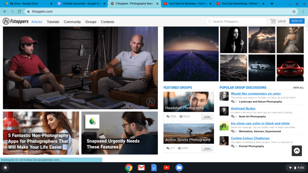
That being said, if they were to participate in already established blogs that would help get their name out in a more widespread manner then I would go with the blog Fstoppers, which is a great place where all photographers and videographers go to get the latest news about the every changing industry and learn some great tips and trickles from seasoned professionals. R&R productions have been around for years and both founders have been long time creators in the industry so I think they would be able to give great information, while also promoting their brand.
Another service blog made especially for more their speed of projects is the New York Public Library service blog on documentary films. R&R productions could comment on other films, giving feedback about how certain aspects could be better and they could also post their documentaries to have people see their projects and to get feedback on how to make their work even better.
Micro-blogging for the Target Audience:
For micro-blogging since it is a type of blogging but in a much more condensed and shorter format the most well known and typical ones are Twitter, Pinterest, Instagram, Facebook and even Tumblr. Earlier in this social plan I talked about the top three platforms that I think would work for their target audience, being Facebook, Instagram and YouTube. I also don’t think it could hurt for the company to have a twitter, but I do think it would be a waste of time for them to have a Pinterest and Tumblr, because Tumblr does not have the clientele they are looking for on it and Pinterest would not show case the company and it’s finished products very well.
Twitter: The most popular things shared on twitter are short and pithy comments about things or tweets that link articles and videos to outside sources, which is exactly what Ronan and Ronan can do to showcase more of their work.
Facebook & Instagram: Quick and easily readable comments under interesting and compelling videos and photos.
And all these platforms, especially YouTube are also the best platforms to share videos and photos. R&R’s clientele are again large companies and corporations or older people that need videos created for events or family members. These people are searching on Vimeo, Reddit, Vevo, Twitch, or Tumblr to find an affordable production to make a video for them.
Branded Content Creation:
Videos:
Sizzle reels
Trailers
Behind the scenes
Tips and Tricks they’ve learned over time
Re-post commercial posts from TV
Timelapses
Interviews with clients and creators
Pictures:
Stills from finished projects
Behind the scenes photos
Pre-production (planning meetings)
Production (different equipment setups)
Post-production (the long process of editing)
Event photos (the team interacting with clients to show the company’s true personality.
Graphics:
Animated opens to introduce new projects
Holiday graphics to further show personality
Animated logo for the company to give it uniform and an actual branding stamp