Mixed Emotions: Evoking vs Expressing our Feelings

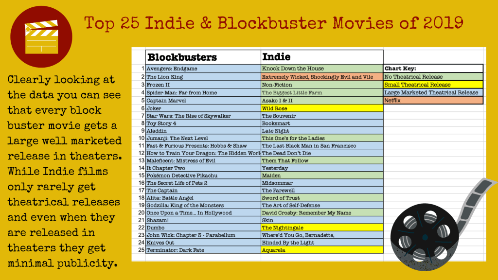
Evoke and Express, two words that both revolve around the topic of emotions and feelings, but have you ever looked at the words closely in the topic of storytelling. Both words are very similar and can sometimes be misused and substituted out for one another, but in reality they both mean very different things. To evoke an emotion is to try and place it into the head of someone else through words or visuals. It’s like trying to force someone to feel a specific way. On the other hand when someone is expressing an emotion this is them physically communication a specific emotional state or attitude. So if you look at it from the most simplistic point of view the expression of emotion is the result of whatever emotion you were trying to evoke, but the kicker is, both emotions don’t always match up. This is the where storytelling and art become mostly subjective. Every single person can look at the same design, but each one can feel a different thing based on their past experiences, their current environment and what morals/values they hold important as a person. 

Using Pultchick’s taxonomy of emotions you can see the base 8 emotions a human has and the different degrees of intensity we can feel. Once a designer or storyteller understands these emotions they can create/design anything to try and evoke specific ones. In the end though, it’s the individual person that will choose to express whichever one over takes them first. The two photos I have chosen to show below are both used to evoke a specific emotion in someone viewing them, but for me once I saw them I expressed completely different ones. 

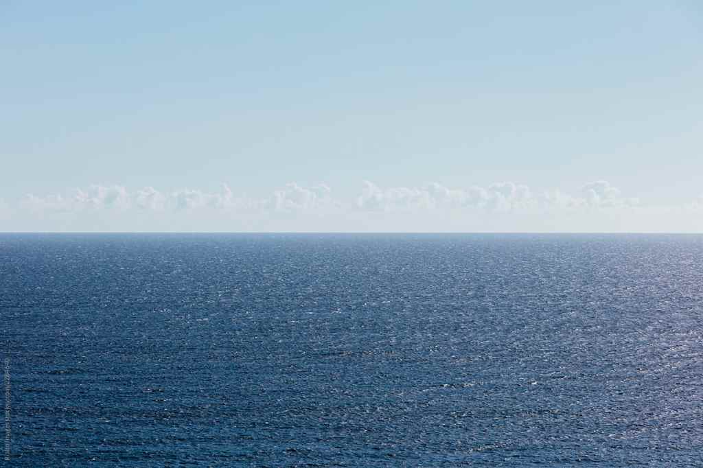
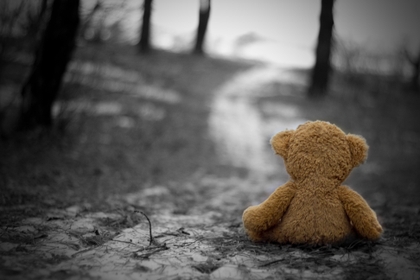
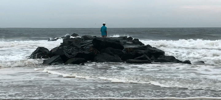
The first photo is of the open ocean. It’s all blue and the water is flat and peaceful. Both the look of the photo and the colors portrayed in the photo suggest that the image is trying to evoke a sense of serenity and calmness. But to me I feel and express a sense of fear and dread because I found the picture to be vast, empty and lonely. Part of Pultchick’s theory was that we express specific emotions in specific situations in order to survive. The Interaction Design Foundation wrote that “He argued that the primary emotions are an evolutionary development and that the response to each such emotion is the one that is likely to deliver the highest level of survival possibility.” So for someone like me who has grown up living next to the ocean and seen first hand just how dangerous the water can be, for my survival I don’t just see the ocean as a beautiful vacation spot, I respect that it’s highly scary out there and that I would never survive being trapped in the middle of it. So looking at this photo and thinking about being trapped in that vast amount of water evokes fear instead of serenity. 

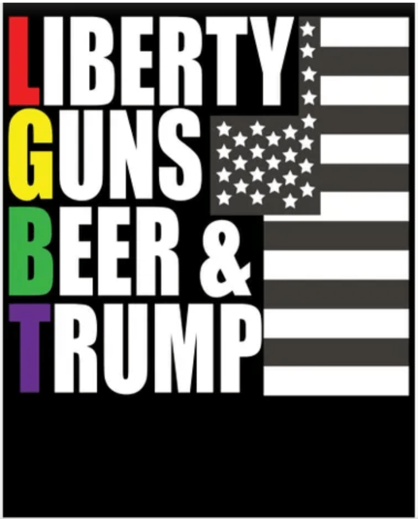
The other photo that I found is a poster/ t-shirt design for Trump supporters. The graphic is a spoof on the LGBT communities acronym but instead it’s substituting the words for things that Trump supporters find important. To the creators and the people who support him, the image can evoke a sense of admiration, but for someone like me who has different views the expression of emotion I make is rage. I think the graphic is widely disrespectful to the LGBTQIA+ community who have been mistreated for so long to take similar colors and the same letters and mock it, absolutely pisses me off. This again comes from the fact that I have different shared experiences then other people and my morals and environment affect the way I perceive things. But one other thing that I find interesting and that is very similar to the other photo is that both changes in emotion were of the same intensity. Rage and admiration are both very strong emotions and serenity and fear are both moderate emotions. After discovering this I have to ask myself if that happens often or was it just a coincidence for these two examples. 

Overall, it is clear using the taxonomy of emotions that designing and creating based on the 8 emotions is very important. If designers continue to hone that skill it will only make relationships between humans and products/stories even stronger. “Products and platforms will change, but our spectrum of emotion will not change. This is the key takeaway — that we have a finite set of emotions, and there will never be a sadness 2.0. It’s actually great that we have that constraint to work within because it’s going to help us design better product relationships for the future” (Kazim). And even though evoking and emotion can be very subjective and doesn’t always mean the same one will be expressed, it’s good to have an idea and direction for the design to go into. So my final question for you guys is, what do you feel? If you look at these photos or any kind of design do your past experiences and subjective feelings dictate what you express?
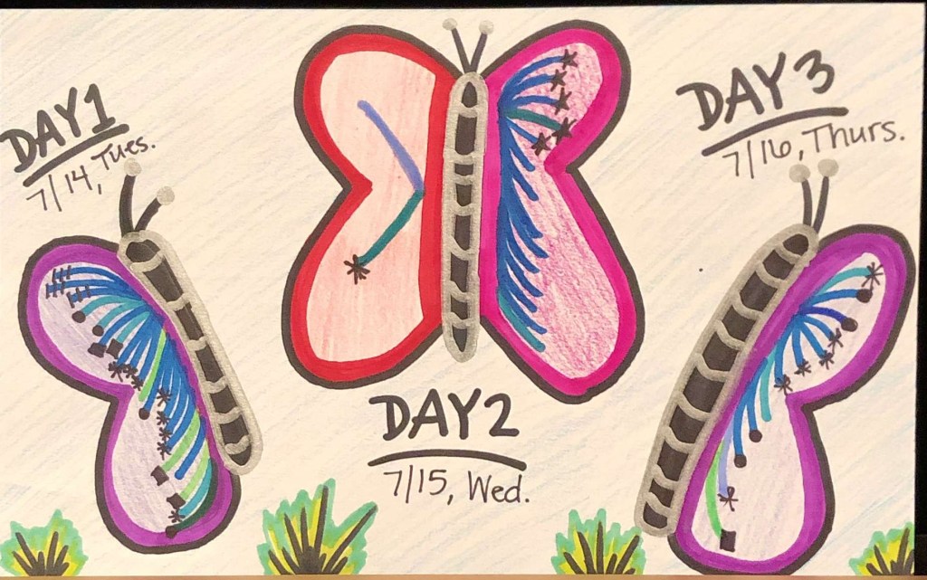
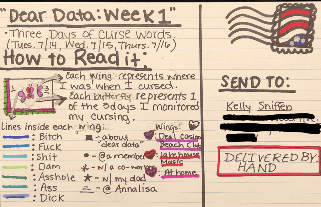
A Visual Representation: Sadness

https://twitter.com/AP_Psychology

When someone says the word emotion, most people immediately think of happiness, sadness, and anger. It’s our 3 base emotions and it’s the ones we can categorize most of daily lives into. Someone cuts us off in line… anger, someone close to us in life dies… sadness, we get that promotion at work that we’ve wanted for so long… happiness, but have you ever realized that everything you ever story you’ve watched, read or created has also made you feel a very distinct and it’s not random someone put thought into what they were making to evoke that specific from you. Many designers use the Plutchik wheel to base their designs off of the 8 main human emotions. According to the Interaction Design Foundation, this includes anger, disgust, fear, sadness, anticipation, joy, surprise, and trust. The following three photos are artist’s representations of the same emotion, sadness. I chose this specific emotion because in my opinion it’s the most diverse. You can have happy sadness, angry sadness and just plain old depressed sadness. 

The first photo I have chosen is the poster for the movie The Pianist. It’s a movie all about the holocaust and a surviving jewish piano player. It’s a gut wrenching movie and just the poster itself evokes a sadness inside of you. It’s a gloomy poster with destroyed buildings and a small man all alone standing in the middle of it. Using, The Next Web’s color theory description the use of grays can promote the feeling of melancholiness in people, “in certain situations it can seem brooding or sad,” (Cao). Then mixing it with tints of bluish-grey gives you that dark sad feeling, as most people associate many shades of blue with sadness. 

The next still is from the animated movie, Toy Story 3. It’s a still image from the final scene of the movie when Andy says goodbye to Woody and Buzz and goes off to college. It’s one of those sad yet happy moments where the music swells and your eyes water because you’re upset that Andy has to say goodbye, but you’re happy that the toys have found a new and happy home. The animators definitely played off a version of Richard Gregory’s theory of top-down processing which uses our previously learned knowledge and surrounding environment. “Stimulus information from our environment is frequently ambiguous so to interpret it, we require higher cognitive information either from past experiences or stored knowledge in order to make inferences about what we perceive” (McLeod).  For this exact moment most teenagers and adults can remember growing up and giving away or getting rid of your favorite toys and the sad feeling you had. The scene is a form of nostalgia for many people and wildly relatable which is why evokes such sadness from within people. 

The final photo I chose to use was a photo of a bear sitting all alone on a rainy road. It has a very similar feeling from the previous image in Toy Story, where it’s a child’s toy left all alone and slumped in such a sad way, but instead of having that happy undertone in the sadness this sadness just hurts and leaves you feeling lonely. If we look at the picture again through color theory, the only two colors really used in the photo are grey, melancholy, and beige/tan, and beige is known to take on the traits of the surrounding colors because of its neutrality. “On its own, beige is dull, though this can be used to symbolize humility. However, it will take on the characteristics of the colors around it, making it an interesting design tool. For these reasons, beige is almost always a secondary or background color” (Cao). This is interesting to me because in this photo beige is really the only color and for it to be a dull color goes along with the feeling of just numb sadness you get from it.

Another theory that can help explain the feeling of sadness is Gestalt’s theory that humans perceive things as a whole and not as individual items. An author from Canva explained the theory as “when we perceive the world there are many different signals coming in at the same time. To organize them, and avoid going crazy, we visualize our surroundings as unitary forms or groups. Just how we go about deciding that some objects “go together” would be the main obsession of Gestalt psychologists and designers for decades to come.” So when we look at this photo we don’t see multiple trees, a winding road, and a bear all separate. Instead we see a gloomy blurred background and lonely bear as the main focal point left all alone, just waiting there for someone to return and claim him. And that’s where the sadness sets in. 

Overall, each photo was created differently, used for different mediums and has different elements layered into them, yet they all evoke a sense of sadness. And the theories that I felt could be utilized to understand why the photos evoked such an emotion could be true, but there could also be many other reasons behind it. Design, art and especially storytelling are all subjective forms and people perceive different things all the time. Designers learn these theories and keep them in mind when they’re creating something new but it’s never guaranteed they work because everyone has a different back of shared knowledge and has different past experience they’re pulling from. But personally for me some things just pull at the heart strings so perfectly you can’t help but shed a tear every time you see it.

Module 2: Mixing Motion

Storytelling & Storyboarding:
Storytelling:

Whether you’re animating something or writing something you’re telling a story. This means you have to think through and plan what you’re putting together. In the Animated Storytelling book, storytelling usually follows a 3 act structure and. Act 1 is where you set up the characters, setting and main conflict, Act 2 is where the main character tries to overcome the problem and ask more questions about the issue, but doesn’t succeed quite yet. Finally in Act 3 it kicks off with the main climax and then the solution and resolution.

There are many other ways to tell a story. Like the difference between a character based animation and an information based animation. Creators also don’t have to follow the 3 act structure and can put their own creative spin on it using nonlinear story structures, like the book ending or the full circle ending, ending where you started. Or my personal favorite is the puzzle, which keeps audiences in the dark until the very end, which warps everything up and reveals everything nicely.

Storyboarding:

Many people feel this step when it comes to animating, filming or any type of storytelling is useless, but in the end, it’s one of the most important parts. It helps you figure out your timing, your shot composition and helps you really hone in on the most interesting part of the shot. After reading the entire section on Storyboarding, I found many things repetitive from being a film major, like the rule of 3rds, directional, spatial and temporal continuity and staging, but the one thing that stuck out was actually timing out the animation. In a film you usually don’t have a cut off time, but for PSAs or short animated stories you might have to fit into a tight commercial space.

Cinemagraph Inspiration:
  1. The soda pouring cinemagraph is what inspired the wine pouring one that I created. I loved the fact that the drink pour seamlessly fades into the frozen pooling of the soda.
  2. The second gif with the military women and the flag inspired me to make the second gif with all 10 flags from my beach club. The idea behind having a flag blowing means there’s wind but I love that nothing else is being effect by it.
  3. The spoon pouring syrup onto the waffles is so pretty and the fade between the full drip back to the start is so seamless that I don’t even pick it up sometimes.
  4. and 5. Both cinemagraphs inspired me to make my final ocean gif. Seeing just the motion of the ocean continuing to loop is so calming and mesmerizing.
My Cinemagraphs:
The never ending glass.

For this first cinemagraph I chose to do it in Photoshop. In the past i have made cinemagraphs in Photoshop so this wasn’t super new to me, but after filming my clip I did struggle matching the pouring of the wine up well enough so that there isn’t a major difference in the loop. After I finished creating the cinemagraph I chose to play with a little bit of coloring and found that the yellow and red were so vibrant that I didn’t want them to be eclipsed by the background color.

For my second cinemagraph I used Adobe After Effects, which I had used the software many times before this but not for this exact reason, and at first I was highly frustrated trying to cut out the sections of the video I wanted to move, and it wasn’t really working because the flags moved so much in the wind, but eventually ZI found the right amount to cut out so you didn’t see anything else move. The only other issue is that even after feathering out the mask and trying to color match you can see a slight difference in the sky color around the flags because of the clouds in the sky. One huge thing I would change about this is I wish there were more people on the pool deck so the photo looked more frozen, but unfortunately the entire week was kind of dark and gloomy so the beach club was never super packed.

For my final cinemagrph I went back to Photoshop because I felt more comfortable with this software and made this cinemagraph with one of my coworkers standing on the jetty. The hardest part on this one was getting the waves to move, but not Sean and then picking what part of the waves should move and what shouldn’t. In the end, I think I should go back and make a reverse of this one and see what it looks like if only the front half of the picture moved and the big wave in the back was frozen.

A Picture’s Worth a Thousand Words

The art of storytelling has been around forever. It’s the easiest ways to pass down traditions, lessons and to just give pure and simple entertainment. Unfortunately, most people think that storytelling has to be written down and have dialogue, like a book, a movie or a television show. In reality anything can tell a story. If you look at it hard enough and keep yourself open minded a simple graphic, still frame or singular photo can tell a whole story.

1. Rocketman Film

This film is all about the tumultuous life and career of Elton John the extremely famous english musician. The movie is semi autobiographical but many parts of the film are created to be overly fantastical so the audience not only gets to see what it was like at the time, but also see what Elton was feeling. This scene and especially this shot tells the entire story of the performance. As he is singing Crocodile Rock for the first time at the Troubadour for a huge crowd him and everyone in the crowd begins to float. In this photo Elton is floating showing us that in real life he wasn’t floating but it sure felt like it at the time. He was on top of the world, living his best life. I also like to think that the sparkly star shirt further shows him reaching for the stars as he floats up into the stratosphere.

2 . 1917 Film

The movie 1917 is the first war movie in a long time that isn’t about the fight, but about stopping the fight. That is why this particular still from the movie gets me every time. It tells the story of the whole movie one shot. The main character is running the opposite direction of the fight, with no weapons and no protection. He clearing isn’t fighting so it makes you ask the question “What is he dong?”, “Where is he going?”. And to someone who hasn’t seen the movie they can predict that he is trying to get to someone or someplace as fast as he can and with great urgency, and that description right there is the whole movie. It gives you the feeling of panic and the want to sit on the edge of your seat wondering if he’s going to make it to his destination in time.

3. Star Wars Poster

The Star Wars movie poster is one those posters that uses the stylized, graphically designed tactic to promote the movie, but favorite part of the poster is that it still tells the story and sets the setting for the movie up perfectly. It tells us that these to male and female characters are the good guys, fighting in the light, as they are the only things fully lit up on the poster. As the bad guy of the story looms in all black and darkness in the background. This poster is the pinnacle of one of the principles in storytelling, which is that it plays off of our knowledge of archetypes, the hero and the villain.

4. The Help Poster

This is another of a poster, going for a more abstract look, but still capturing the story of the movie perfectly. The whole film is about racism and overcoming people’s prejudices and unkind bigotry. Showing the two white women in pretty pink dresses and fancy flats getting to sit on the bench vs the black women who are in maid uniforms and beat up sneakers who are standing shows the problem of segregation and racism at hand. But having the middle women, Emma Stone, sit in the middle and face forwards shows how conflicted she is and shows that she’s not like the other women who’s facing away from everyone else. The pink dresses also help tell the story of what time period it is and what exceptions women have at that time. Women were supposed to be proper and pretty and nothing much else.

5. La La Land Film

Another Emma Stone movie, La La Land is all about relationships and how at certain points in your life choosing between a relationship and your dreams is very crucial and that even thought a certain love might feel great it might not be the right time for it. In this specific shot I see a story that so many people could tell from their own personal experience. Ryan Goslings character, Seb, is showing Stone’s character, Mia, jazz for the first time. It’s his passion and he is so invested and happy talking about his love and she is just lost, but is still listening and to me that is the best description of love. Both parts of the relationship might not like the same things but as long as you support each others dreams and passions then it’s bound to be a healthy and happy relationship. And many times in the relationship the other partner ends up beginning to like the other partners things. Like Mia in this case who eventually fell in love with Jazz just like Seb.

6. Women at a Window

This piece of graphic artwork speaks volumes to me. The relevancy the picture has to me tells the greatest story. How much of our lives to we send staring out the window with our head in the clouds daydreaming. We use our bodies to go from place to place, day in and day out, working, running like a machine and wasting away like a flower in the wind, but our heads are always somewhere else. I personally feel like this is me at least once every day, dreaming about my future or just a fantastical world far away from reality.

7. Distracted on a Train

This photo tells the perfect story of what is happening to today’s society and to the possible death of storytelling. The dichotomy between the couple on the train and the poster behind them is a perfect coincidence. The grandparent telling a story to the younger generation is how stories are passed down, but with the invention of new technology there is less and less verbal communication and human connection and more time spent looking down in our worlds on out devices. The pure authenticity of the photo truly makes you feel the story. The view that this person had on the train is similar to what any of us would see on a train today.

8. From Boys to Men
“The Boys,” oil on canvas, 58 x 46 in.

This painting tells the story of boys growing up. Young boys start their lives out wanting to roll in the mud, play with their buddies and their toys. Create fake battles and pretend they are the protectors of the whole universe, then as they begin to grow up they meet girls and their whole worlds change. And in this picture it’s the story of the “the boys” coming across their first female magazine and becoming memorized and no longer caring about the fake guns and games they were playing before it.

9. War becomes Peace

This painting tells the story of growth and progression in my eyes. Having the little girl swing on the gun of a tank smiling shows that no matter what with time things can change and heal. War can stop and peace and happiness will prevail. At the same time the picture can also tell the other half of the perspective which is that even with time and healing there will always be remains of our past to teach us not to make the same mistakes again. Instead of tearing the tank down and getting rid of it and forgetting the hate and the violence keeping the take up and using for something so fun and happy is a constant reminder to never let that hate get so bad that it starts another war.

10. Lie to Me Music Video

For my final image, it’s a still shot from the music video “Lie to Me” by 5 Seconds of Summer. The song and music video overall is very heavy and dark, but this particular still from the video tells a lot. The song is all about a boy hoping that the next time he sees his ex that if he asks her if she ever actually loved him she’ll just lie to him, because he doesn’t think he can actually handle the truth. In this shot the story is of a the boy sitting in the back seat of a racing car all by himself in the middle of a dark crater, showing that he has no control, no control over his life or his love, and he’s all alone, there’s no one there to help him out. In the back of the photo (even though it’s hard to see) there is another racing car coming full speed towards him and he isn’t even flinching. He’s so consumed by sadness that he doesn’t see his impending doom or “rock bottom” about to hit head on. The whole video is very powerful and when you know the real story behind the actual singers real life, it hits even harder, but this image in particular tells a story of true sadness and the feeling of powerlessness.

After examining countless photos and stills and thinking about the stories they each tell, I can see so much clearer that with enough thought, a story can be anything and come from anything. But I’ve learned that each story and each perception of the pictures are extremely personal. The story that I see in these photos is always going to be different then anyone around me or from the original artist. Some things will remain the same, like the main themes and symbols, but the feeling that I get from it or what I take away from the story will specific to me and my experiences in life. And to me that’s the most interesting part of story. Everyone can see, hear and feel the same story, but the take away will always be different.

Module 1: Animated GIFs

Basic Motion:

Animation is an incredibly versatile art medium. It can be used in all types of movies, television shows, social posts, info graphics and so much more. Unfortunately when someone says animation the first thing people think of is a complex kids movie or out of this world VFX animation. In reality anyone can make a simple animation and even something simple can be extremely creative and entertaining. In Liz Blazer’s book, Animated Storytelling: Simple Steps for Creating Animation & Motion Graphics, Blazer breaks down animation into 10 simple steps.

Concept:

In order to create an animation or a story of any kind you have to know what you want to make. The brainstorming process and creation of the idea is known as “concept development”. Whether you’re working by yourself, in a team or for a client you want to start with a creative brief. This established the who, what, when, where and why of the project and makes sure everyone is starting on the same page.

From their you’ll want to create the big idea or big concept of the project and then once that’s solidified you’ll want to work on hammering out the smaller details. Post-it’s help make this process easier and more free flowing and eventually you want the project to be narrowed down to 3 to 5 main points in the storyline.

Previsualization:

The next step in creating an animated story is figuring out what the big concept you came up with is actually going to look like. This step is where you create the concept art and find what styles are going to look best for your story. The best place to get started is to pull inspiration from other popular works and see what you like. Blazer’s biggest warning though is to make sure you don’t get too close to the original where it almost looks like your just copying it. Another big step in this process is to start formulating a script to go along with what it’s going to look like, but another big tip is to never become attached to the exact script because it’s only natural for things to change.

Assest Building:

The final step in the pre-production part of animating a story is building the pieces or “assets” that are going to be needed in the animation. This includes any characters, objects, text phrases, logos, sound effects, background environments and even just plain colors. One big to thing to keep in mind while building the assets is that you may bot be able to fully finish them until you are animating with them so just like the script don’t become too set in stone with any of them.

GIF Inspiration:

In order to create anything you always need to start with some sort of inspiration so even before this course started I had a Pinterest board with countless, gifs, cinema graphs, stop motions and animations pinned.

  1. The first one inspired by the use of colors and the neon style. But I also liked how even with the simplest of motion I knew exactly what scene from what movie it was portraying.
  2. The pink ice cream dripping was a huge inspiration for my first photoshop gif. I saw how cute this gif was and wanted to see if I could recreate one in my own way.
  3. I like the animation of the line. I want to be able to teach myself how to animate something similar where the gif looks like a line is being drawn.
  4. This gif was one that was also used in class as an example, but was previously pinned in my Pinterest board a while back. I love the cute popsicle idea and taking this one and number 2 together helped me create the concept for my first gif in class.
  5. I love the color choice in this one and it’s seamless match up at the beginning and the end. It’s one of those gifs that you can just get lost in.
  6. I am a camera nerd, which is why the gif interested me right off the bat. In a previous class to this one I had made an animated camera gif. But I like how this one moved the objects in and out of frame and I thought about this look when trying to animate my spaceship.

My GIFs:

My three different gifs that I had to create this week using, photoshop, animate and a software of my own choosing, show how I am as a creator very well. All three incorporate some of my favorite colors, phrases, and even places.

The first one I made was using object shapes and the timeline workspace on photoshop. I created an ice pop that is melting and using different key frames was able to more the melting drops and the words. After over 10 different key frames the words and ice pop meet back up perfectly to continue the seamless gif.

For my second gif I used the software adobe animate. This was my first time using the software so I wasn’t very comfortable creating the background in it. So I drew the back ground and the rocket on procreate and then brought the assets in and tweened the rocket to look like it was flying off into space. After this though I felt the animation was very empty so I bought it into After Effects and added the phrase from my favorite animated movie “Toy Story”.

My final animated gif that I made this week, I chose to challenge myself and draw each individual eye frame of the gif on my iPad in procreate and then put them all together to make a gif. Once I finished the background, I copied it over 5 different times and drew 5 different positions for the umbrella to make it look like it was opening and closing. The hardest part of this one was getting the pole of the umbrella and the shadow underneath to math and look just as seamless and the top section.

Overall, the beach is my favorite place in the world and in the end this gif came out to be my favorite of the 3.

Data Narrative: How Do Indie Films Survive vs Blockbuster Movies?

To get the full immersive chart click the Datawrapper Link here.

To get the full immersive chart click the Datawrapper Link here.

To get the full immersive chart click the Datawrapper Link here.

To get the full immersive chart click the Datawrapper Link here.

If you want to read more about independent films or want to know the best places to find top choices here are a few links to continue your search.

American Film Market

Indie Wire

Vocal Media

Sundance Institute

Mountain Film

A24

Data Visualization Reflection

Dear Data Wrap Up: 

Each week that I created a Dear Data postcard I purposely tried to do different time gaps for the data collection so I could see how much the collection period affected the data set. 

For the first one it was over a period of 3 days, two of the days I was at one of my jobs where it’s very informal so I curse more often than at the other job which is extremely formal and where I barely talk. This gave my data visualization a very different look for each day and made for a more interesting visual. 

For the second dear data I collected data for an entire week but instead of just multiple tally marks like I did for the first and third ones this one was groups of time. The biggest thing I learned from this one was that I had to come up with a specific way to chart the data points and I ended up landing on breaking each group into full hours, 30 minutes and 15 minute increments. This way the data was easily readable and more spread out across the notecard. 

Then the final dear data was only for one day, yet at the same time it was the hardest topic to keep track of collected data points. The question I had asked was such an introspective question about me being a fake person, that between actually doing my job and talking to people I had to have missed plenty of data points. Of course after the day was over the biggest thing I had learned was that I probably should have done a better job at who I was being fake to. This way my graphic could have had even further detail and better symbols.  

Class Reflection: 

After being in this class for 7 weeks, I’ve learned a lot about the differences in data visualization. I’ve also learned that collecting data, cleaning, organizing, and designing is much more in depth and difficult then I previously thought it to be. 

Between the personal data collection for Dear Data and the public data collection for the data narrative and data wrapper I learned that I like to collect and refine the personal data more. But I will say that being cognisant of collecting data over whatever period of time I chose to collect the data for is hard. On the other hand collecting data from public databases can be even harder in my opinion. Searching for it can take forever because you need to double check it’s accuracy and it’s reliability. Then once you’ve confirmed it’s a reliable data set, refining it and cleaning it can take a while and can be confusing. The biggest lesson I learned from data cleaning is that before you can start organizing you have to know what question you would like to have answered by your visualization. This way you know which columns in the data set are unnecessary and can be deleted and you can determine the best way to categorize all of the data to make the simplest and most readable chart. 

Another difference in data charting is the choice between either using a software to help you chart data, like Datawrapper or you can visualize and design it yourself. Personally I find for complex charts that have multiple columns and layers that Datawrapper is the way to go. It spaces things out evenly and creates the simplest and easiest to read chart. On the other hand, I love to have creativity when it comes to anything and Datawrapper limits you a lot with how far you can design a chart. Making your own chart means all the decisions are yours. Especially with the Dear Data projects, figuring out the artwork for the front of the postcard was always my favorite part, but at times that led to the chart looking messy and confusing. 

Seeing now that data is more than just charts and numbers stacked together and when organized and visualized properly it can actually tell a story is extremely interesting. When I first started brainstorming for the data narrative final, I was so confused I didn’t understand how to string charts and information together to make a story out of it. But when you take a step back  and break it down, it’s the same as writing a story for an english class. You start with the large overarching data that shows the whole picture and then you break that down into smaller different charts and visualizations that highlight specific pieces of the story and close it out with data that looks to the future and sums all of your findings up. 

Overall though, at first I had no idea how I would use the information from this class, but now I can see that being able to take complex and large scale data sets and make them into simpler and more visually pleasing graphics can be very helpful in both the news industry and the entertainment industry. And I’m excited to bring this new knowledge into my career with me.  

Dear Data #3

For my final Dear Data I chose to track an entire days worth of my fake responses. Through out my life my friends and family have always called me out for using a very fake voice when I’m talking to people I don’t know and professionals who are usually older than me. So I chose a day this past week where I worked at the beach club in the office. This means I was helping members all day and answering phones. So A LOT of fake responses.

The day starts great I don’t speak in the morning when I get ready for work so there was nothing to mark down until about 8:30am. My first fake response of the day is also my only data mark that doesn’t have symbol attached to it and that’s because it was me talking to the man at the cash register at Dunkin. Then I got to work and a long day of fake responses started.

I now notice looking back that on this particular day I talked to more members in person then over the phone. I also see looking back that literally every single time I spoke to a member either on the phone or in person I put on my fake retail voice and definitely also put on a big fake smile.

I also see that a few of my fake responses were to my co -workers. Usually I don’t use my fake response or behave in a fake matter to any of my co-workers, but a few of my managers and newer co-workers I don’t know very well so they get fake Taylor when I speak to them.

The only other big discrepancy I saw on this dataset was that they only fake responses I made in the day that didn’t involve my fake voice was the two text messages I sent to old high school friends who were asking about hanging out. Typically in a normal school year setting I would be sending many more fake text responses and emails to people and faculty asking me questions that have the time I don’t know the answer or don’t want to answer.

I also want to point out that the dataset ends after 5:00pm because that is when my shift ends and I went and when I’m home there are usually no fake responses with my family because I don’t think through everything I say to them. I pretty much say whatever I want.

Overall this Dear Data was definitely the most interesting. It took a lot to constantly remember to mark down a fake response through out the entire day and I’m sure I missed a bunch, but it was fun to see just how fake I am through out my day at work. It also makes me wonder what it would be like if I just used my deeper natural voice and said everything that I wish I could say to people.

Narrative Data: Storytelling and Aesthetics

This week’s brainstorm was one of the hardest projects I’ve ever had to think about. It took me an extremely long time to figure out 1 topic let alone 2 different ones that I think I could research well enough to make a comprehensive visual data narration. 

After reading Visual and Statistical Thinking, I began to think about the importance of taking a well organized data set and making it something interesting and visually appeasing. The author talked about the need of taking the information and instead of just listing out the data or describing it, to actually show it and make a comparison. 

“Instead of plotting a time-series, which would simply report each day’s bad news, Snow constructed a graphical display that provided direct and powerful testimony about a possible cause-effect relationship. Recasting the original data from their one-dimensional temporal ordering into a two-dimensional spatial comparison,” (Tufte 30).  

With this in mind I thought about a topic that would have a strong comparison. This led me to think about the industry that I want to go into after completing grade school, which is mainly film and entertainment. When thinking about the film industry the biggest comparison is between high budgeted blockbusters versus smaller independent films. After thinking about how strong of a comparison that I would be I began to think about what smaller data visuals and graphs I could create to show the difference between the two types of films. 

This led to me writing down all the different aspects that go into film making, which included the budget, costumes, sets and props, caliber of actors, theatrical or non theatrical release, and marketing/publicity leading up to the release of the film. After thinking about all of this data Tufte’s description of the difficulty of sifting and processing a large quantity of data. 

“It is easy now to sort through thousands of plausible varieties of graphical and statistical aggregations  – and then to select for publication only those findings strongly favorable to the point of view being advocated. Such searches are described as data mining, multiplicity, or specification searching” (Tufte 37). 

For this particular narrative I would have to mine data that was very recent. The entertainment industry makes leaps and bounds in progress everyday so data from many years ago would be useless to the narrative unless it was to show the progress and changes that blockbusters and indie films have made. 

Within this narrative I’m choosing to go for a very old time Hollywood feel. The red curtains the film reels, everything in bold and that black, white, red and yellow color palette. I also think using logos and icons to my advantage in all of the visuals, like movie theater logos, and small graphics from large well known films, will not only serve as great technologies to help tell the story visually but it will also help convey the info and message to my audience. I had explained in my original project breakdown that the audience for this particular project could feasibly be anyone, but if you were to get more specific it would definitely be film enthusiasts and creative story lovers. In the presentation this week on Storytelling and Visual Cues, the general audience views the narrative for the overview will the expert audience, in my case the film buffs, will want to explore more of the data in an in depth way. 

“Expert audience members require less storytelling and will likely want more opportunity for detailed exploration and discovery”. 

The original plan for this narrative is to visualize all the building actions as different pieces of the industry so the viewer can see a comparison not only between blockbusters and indies film’s profits, but also a comparison of every aspect included in them. 

The other idea I had come up with for this narrative project was the increase or decrease of COVID cases in beach towns during the summer. It’s a very hyper specific idea so the data would be a smaller set to mine through, but I also fear that there might not even be enough data to create a well informed visual narrative in the first place. I had spent far more time curating info for the first idea versus this one so it’s not as well planned out, and while I find both very interesting, I think my first idea will captivate more audiences and will make a better story that has a surprising and long lasting takeaway at the end.

Maps & Charts: Learning to Create Visual Datasets

Last week I collected and refined datasets. The first one was from the NJDEP and was all about the number of different shoreline structures in each of the New Jersey Shoreline counties. This chart was by far the easiest to pick and create on Datawrapper because the NJDEP had already spilt everything into its correct columns and had tallied it up at the bottom. My only obstacle in the beginning was choosing what portion I wanted to visualize. Did I want to showcase what shoreline structure had the most amount, or which county had the most shoreline structure or did I want to compare each county with all of their shoreline structure. In the end I chose the 3rd option and made a clustered column chart that has an X axis with the shoreline structures on them and a Y axis with the amount of each and each column represent 1 of the 6 counties.

The only big issue I faced while creating the chart was the original Y-axis numbers were too spread apart to actually make any sense to the naked eye. I also realized that many of the numbers were very small like 0 and 1, but then the one “Groin” section had such high numbers so the chart was sort of smushed. I wanted to make sure I got the scale on it correct, especially after reading the report “How to Lie on Maps” and scale was listed as the first and one of the biggest way to deceive someone.

The next chart I created was for the NJ.com data set about Prison populations decreasing due to COVID-19. This chart was also very simple. The prison data took place over time and so I went with a line chart. After inputing the CSV into Datawrapper I realized one of the columns didn’t aid to the visual and made it far more confusing (it was the percentage change numbers, which were very reactive from the change in number overtime column) so I hid that column and it helped the whole visual overall.

Another huge part of this chart was actually the color theme. Since the March and June lines overlap and cross at certain sections I didn’t want the colors to clash because then it would be too difficult for the viewer to distinguish between them.

Finally the last dataset that I turned into a visual chart on Datawrapper was the QVHD Hamden Restaurant Rating list. This particular set gave me a lot of trouble. It was the first one I tried in Datawrapper and at first I wanted to make a city map to show were all the restaurant were and their ratings using symbols. But I struggled finding a Hamden map. Just like the powerpoint in this weeks lesson showed every map that you search up highlights something different and they all seemed too busy already to go adding more interactive symbols on top of. So the first one I made I used the entire state of CT county map and it was far too large. Again scale played a huge factor and this scale did not work.

Here is my failed attempt.

Then I shifted my thinking and tried answering a different question with the dataset. After the map I deiced to go with a pie chart to show the percentage differences in the 3 different ratings the restaurants could get. So I counted up all 146 Hamden restaurants and then went and counted each A, each B and each C and found their percentages to input into the chart.

I also decided that when designing the chart to put the percentages on the outside because the C rating was so small that the number didn’t fit inside.