
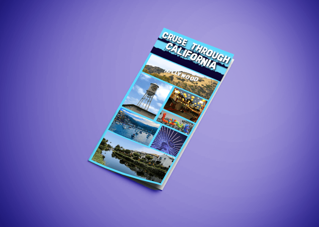
Last week I designed both a webpage and mobile page for a travel agency, this week I took that branding and made it into an atypical and informative brochure. In order to stay with last week’s work I kept all the typography the same and or similar and all the text box and background colors are in the family of blues. The blue is supposed to remind audiences of the abundance of beautiful beaches California has to offer. The front of the brochure has minimal text on it. It’s met to draw people in with the very distinctive Hollywood Sign text and all the bright and vibrant pictures. Then once you open in up you’ll see all the different places and activities the company offers in California.
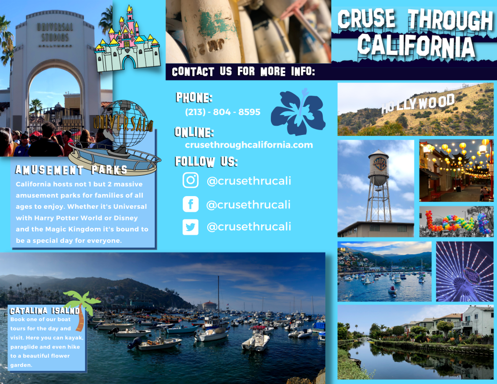
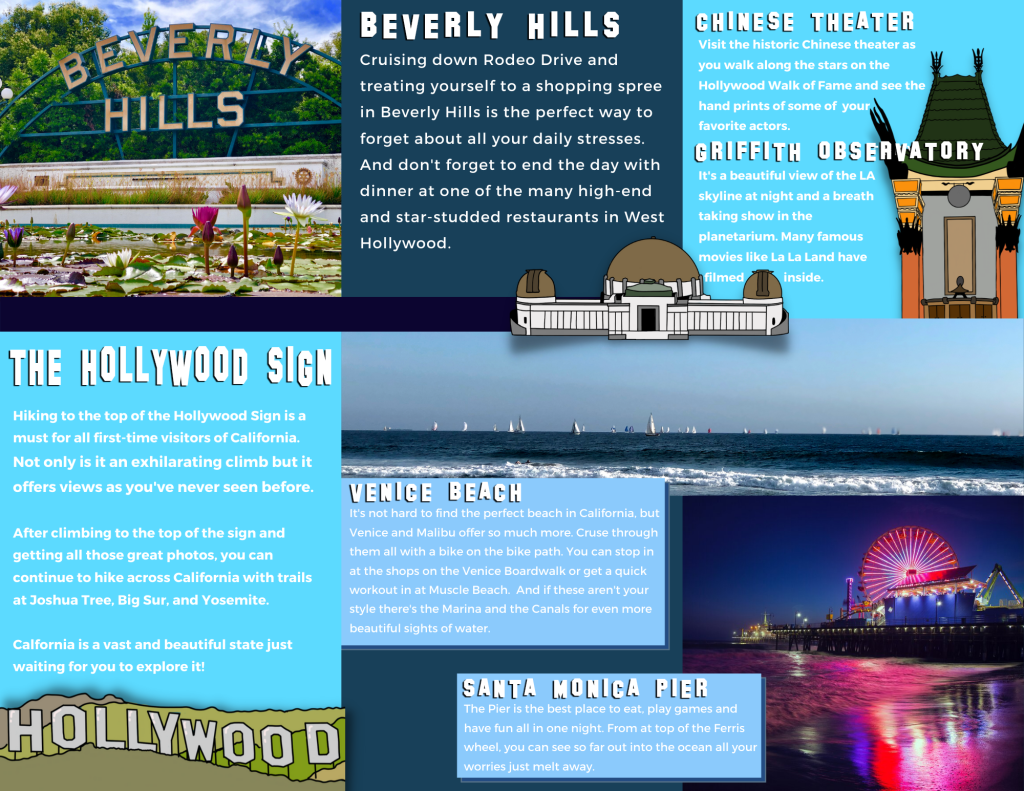
One of the biggest challenges while designing this was making sure it didn’t look a typical brochure where everything is stuck on each singular rectangle and everything fits into a perfect box design. So when I created this layout I wanted to the front panel, the Amusement park panel and the Hollywood Panel could function on their own since many people read brochures one panel at a time and don’t unfold it completely in the beginning. But the other two panels on the inside of the brochure work in tandem because at that point the brochure would be fully unfolded.
A few techniques that I utilized from the 99 designs article “11 techniques for breaking the typographic grid” while designing was overlapping images and text boxes, utilizing the edges of the page by having some of my hand drawn icons get cut off on the page. I used wrapped text in many of the areas so that the text didn’t get lost in the mages that they overlapped.
Another example of a design technique was illustrating areas on the brochure. Like the Hollywood Sign panel. “Using illustrations in web and print design can balance out and overlap rigid grid layouts, giving compositions a playful look.” (Creger). I used the same technique when I was designing the webpages for this company in order to give both designs a fun and family friendly feel.
When first beginning to design the brochure instead of just drawing random things down a piece of paper. I went on to the site Canva and laid a few things out in different arbitrary ways to see what I liked and what I didn’t like then I took all the different assets and moved over to InDesign and designed a more complex version of it.
When formatting the text I already knew that I was going to be using the text “SF Hollywood Capital” for the titles because that’s what the main company name/logo is in, but on the website that I designed last week I used a regular sans serif and I ended up not liking it. So for the brochure in order to make sure everyone would be able to easily read it, even in the smaller parts I used the bold “Montserrat”.
Overall, I prefer this design to the original webpage designs I did. I like that the brochure had unconventional layout and that the background and accent shape colors compliment the vibrant colors of all the photos I had of California and the hand drawn icons that I used to overlap the pictures and text boxes really give it a sense of fun which is what the travel company is trying to sell to families when they book a trip to California.
