
Websites are one of those base platforms that every company needs. It gives you a home base for your clients to go to. They can see your product get a sense of your companies values and see that it’s not an online scam buying from you. But now a days you can’t just through all the info onto the page and make sure it’s spaced out enough for people to read on their computers. Now you have to have an appealing and easy to read layout for computer, mobile device, tablet and even watches.
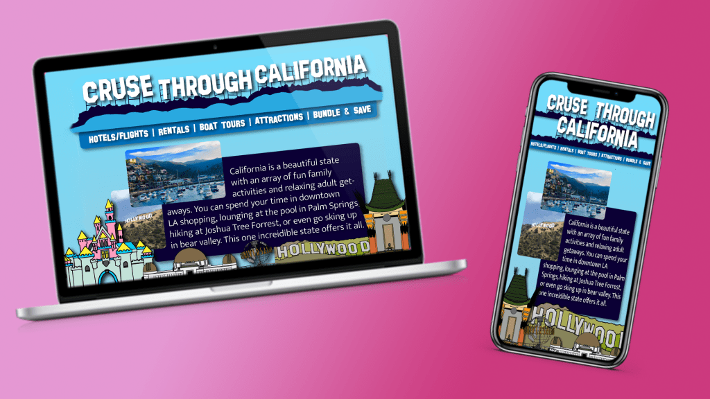
For my website design, I created a webpage and mobile page for a travel agency based in California. Continuing with the importance of identifiable branding for the company, the color and text are bold and made specifically to evoke specific thought by the users. The whole website is designed using different shades of blue. Blue reminds many people of the beach/ocean, which is what California is probably most know for and the type is in the same fashion as the Hollywood sign which is one of the most recognizable symbols from the state.
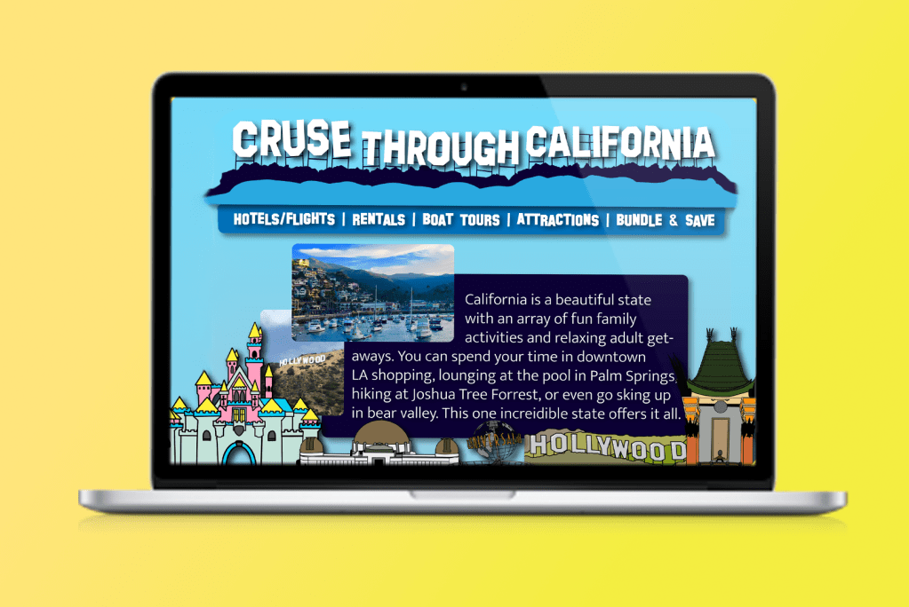
This homepage was designed with the main idea of simplicity but also fun/variety. Following the steps that the “Web Style Guide” lays out in their section on page design. The company is clearly displayed at the top and the navigation bar is directly below, still towards the top of the page, and each tab is written in bold. Under that is a simple blurb about the state and a few pictures that stay with in the blue color scheme of the company. The fun graphics at the bottom of the page show the variety of fun landmarks California has to offer and pull people in and then once on the websites they can navigate to the other pages to get more info. The homepage is not supposed to be the heavy info, overwhelming part of the website.
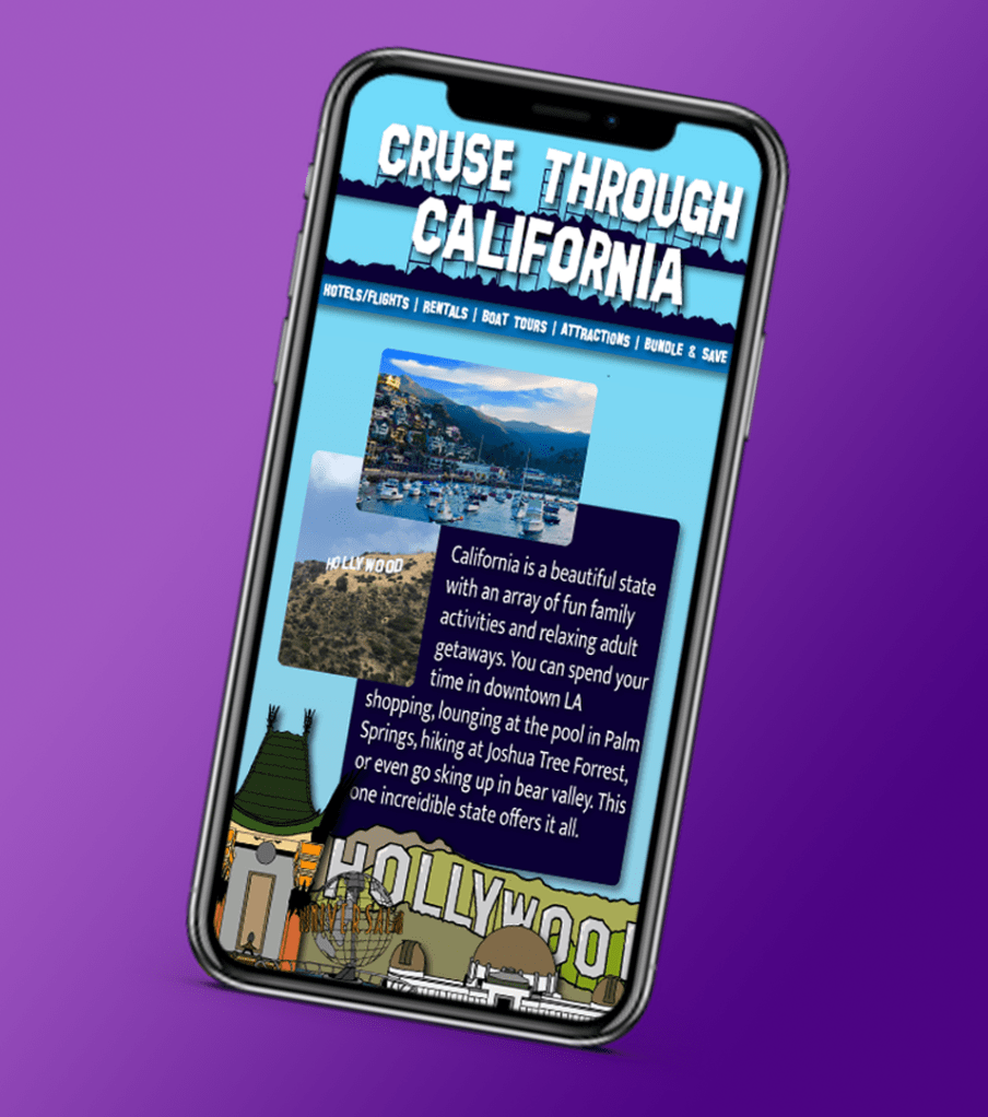
The biggest part of the design from webpage to mobile was to make sure that the same amount info fit on to the page with out the user having to scroll down. Even after booking their trip through the website, they would still want to use the site to find certain maps and descriptions on different interesting places to visit while in California, so the customer would be more likely to use the mobile version of the site verses the desktop version.
Two differences that both versions of the websites don’t have are there’s no logo. This is because the company name itself is very distinct and acts as a logo in itself. The second thing is more specifically for the mobile version. In the article “5 Tips for Creating Great Mobile App User Interfaces” the author describes that the best place to put the navigation buttons at the bottom of the page because that’s where our thumbs are. :Usually, application UI elements are either placed at the bottom of the app (most common) or at the top” (Aarabi). In the case of this website they stayed in the same spot as the computer site in order to keep unity amongst both and not confuse the users. But also because this is a website and not an app, so naturally I would not look at the bottom of the screen on a website, but I would for an app.
 taylorsniffen.com