
Creating a company with a good product or service is hard, but making sure that company has a good marketing strategy and brand identity is even harder. But it’s also extremely necessary. Pretty every company you’ve bought from or service you’ve used has been branded because it’s a way for consumers to differentiate between products. For this weeks assignment we were tasked with creating a logo to a fake product/company. At the time I felt stressed and really has no idea where I was going to even start this idea from so I lit my favorite candle in my room and then it hit me. I’ll make a fake candle company.
It started with trying to come up the name. Very often or not alliterations tend to stick in peoples’ minds more and I also wanted to the name to evoke a feeling. What more do you want out of the look and scent of your candle than to feel all cozy on your couch after you’ve lit it. Thus “Cozy Candle” was born. From there I went into the conceptualizing stage. In the book “Graphic Design Solutions” author Robin Landa talks about your brands visual identity and how it needs to easily identifiable, memorable, distinctive, sustainable and flexible.
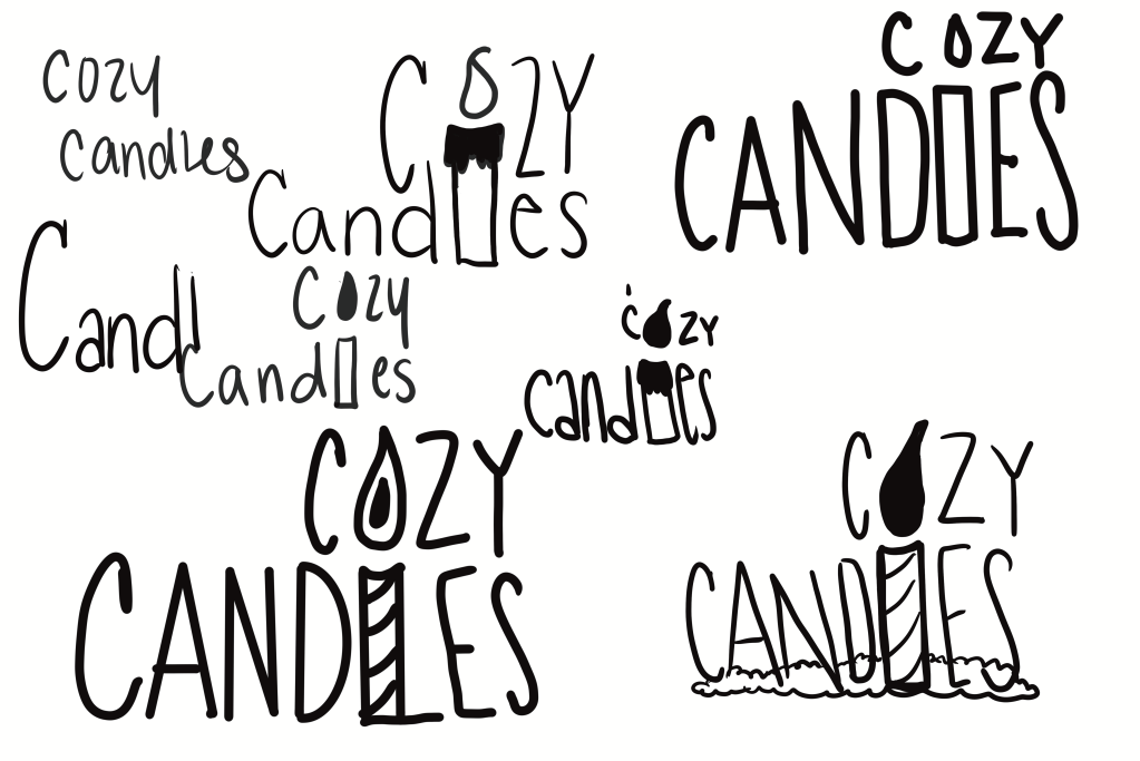
With that in mind I created a simple but fun and easily identifiable logo. When designing you don’t want to have too many over whelming colors since it needs to be unilaterally seen by all types of people, which is why I stuck with simple white and black type. The pink candle in the middle is used as both letters, a symbol for what we sell and the color choice does show the sort of vibe and demographic that the company would be selling to.
When thinking about audience and sales demographic, I made it more for women in their teens and adults. Not to say men can’t buy candles it’s just not typically and this company is trying to brand itself best for the majority of people that would buy it products.

I also created a fully grayscale version of the logo since part of the brand identity is to make the brand/logo flexible and still readable. Since many things the logo might be printed in could be all black and white and because many people are color blind I had to see that the logo held up with out its distinctive pink color. In my opinion it does. The fun yet simple way that the “o” is a flame and the “l” is the candle stick, “sticks” with people even with out color.
Overall the logo is simple but fun. The type is very thin, but it has a light feeling to it which is good to be paired with candles since the scent of them is supposed to make you feel all light and comforted. The type face is also one of a kind since it was drawn by me and that’s a great way to brand one of a kind candles.
