
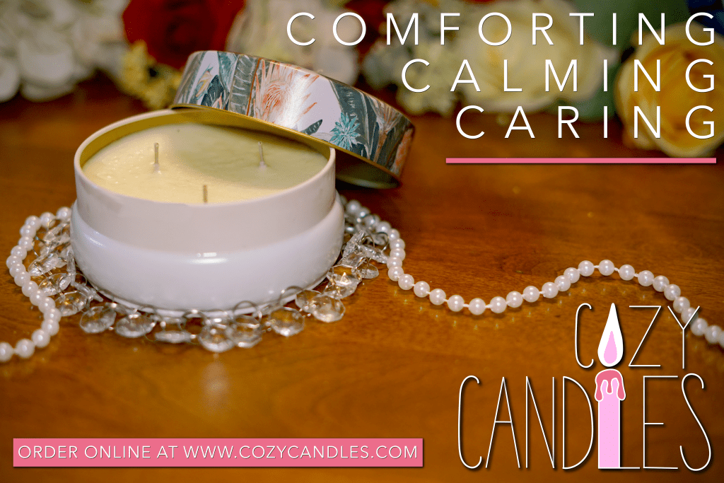
In the blog post before this one I had to make a logo for a fake brand or company of my design. So I created the fun candle company “Cozy Candles”. Its main selling demographic are women in their teens and adulthood, hence the pink color and simple unique typeface. In this part two of the assignment we had to create an advertisement of some sort to promote our brand.
The add created above is what “Graphic Designs Solutions” would call a “consumer ad” since it is directed towards the general public and not a specific business or market. This add is also specifically designed for social media platforms and technological consumption. Most people are buying things based off sponsored ads on their social platforms verses seeing them printed in a magazine or news paper or billboard.
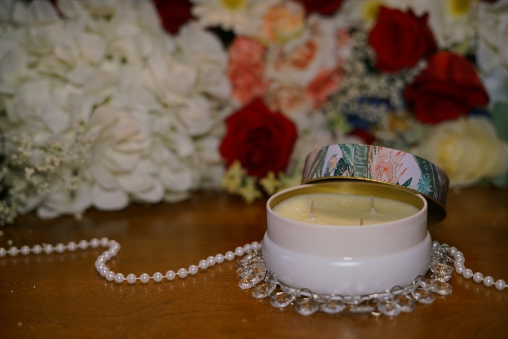
The process started with the physical subject of the ad, which is the candle, and then going from there. I originally had many different types of photos to chose from that I had taken. In the end I think many of these photos could be used in different kinds if ads for the company, but the add that I was going for is one that has the logo and the product dominantly shown and then minimal text on the post since most of the info would be in the comment posted under the photo.


I ended up choosing the one where the candle was justified to the upper left because the logo is justified to the bottom right so the two things would frame the composition well. I also used the simplistic other text to further frame the ad and have the eye easily circle the photo reading all the text and end up landing on our beautiful main product, the candle.
The ad also adheres and depicts the company’s values and brand identity. It used the correct shades of pink. Keeps with simple but all capitalized letters and doesn’t overwhelm anyone when looking at it. It’s supposed to be simple and calming to like just like candles are calming to smell. Another big part of the add is the fact that since you’d be seeing it on social media you’ll already have the company social handle readily available, so the most important info is the website since it is an all online product. That’s also why the website is in a box to further draw attention to it and it’s closest to the logo.
While this is just one ad, it does tell a story and evoke very specific emotions with the other things in the photo adding to it. The fancy gems and pearls make you feel classy and give the candles a sense of luxury and the flowers in the background subconsciously make consumers think about all the wonderful scents the candles can come in. But if I were to continue this ad campaign. I may start using those other photos with multiple candles in it to show consumers that you can’t just have one of our candles – you need them all to be at your peak serenity.
