
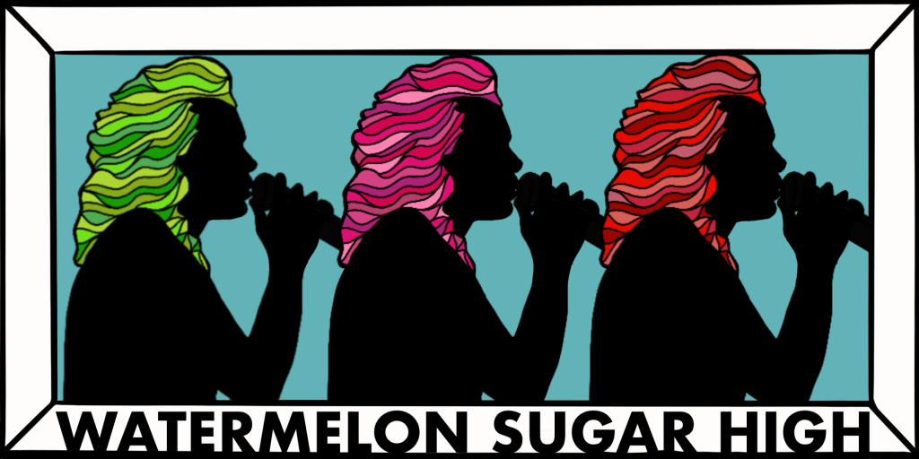
While studying different Milton Glaser color renditions, we were tasked with creating our own version. I chose to use the side profile of Harry Styles (one of my absolute favorite people on earth) and create a design that would be fun and remind people of one of his #1 songs, “Watermelon Sugar”. I also specifically chose a picture of Styles in 2015 when he had longer hair, so that I had more area to work with.
Here are a couple photos I used as inspiration for my Glaser design.
According to “The Ultimate UX Guide to Color Design” by Justin Baker, I chose to use both Analogues ad Complementary colors in order to make this design. Green and red being the complementary colors because they are opposite each other on the color wheel. Red and pink on the other hand are analogues colors because they are next to each other on the color wheel. I also chose to make each silhouette have a base color in each different color space. Red is one of the three primary colors, green is one of the three secondary and pink (magenta) is one of the six tertiary colors. For each individual silhouette I created different shades and tints of each base color. If I was actually painting this I would physically be adding different amounts of white and black to create darker and lighter tones of the base color, but by using a computer software each color is just a different hexadecimal. Which the guide explains as a color “specified with: #RRGGBB, where the RR (red), GG (green) and BB (blue) hexadecimal integers specify the components of the color.” (Baker). By using these colors I felt I had a good representation of all the different subsets of the color wheel and I knew they all went well together.
On the other side of my Glaser rendition is the emotional concept that went into its design. Each color give off its own emotion when it comes to how humans interpret them. This is why a lot of marketing and branding departments in companies use color to manipulate their consumers. We as humans also have preconceived notions about certain color combinations. For example, red and yellow make many people think about McDonalds and make them want those absolute delicious fires and that because the colors red and yellow actually induce hunger. When the colors orange, purple and black are together people usually think of Halloween and I feel that’s the same thing with red, pink and green. When you see those three colors together, especially with a nice light blue background you think of watermelon and fun summer days in the sun.
This is described by “Color Psychology in Marketing” written by Lindsay Kolowich Cox. The color red is known for bringing excitement and energy, pink is all about fun, femininity and creativity and green is very tied to nature and hope. All of that mixed together on a blue background which usually incites a very calming feeling is great mix of color to make the viewer easily view and enjoy the design.
