
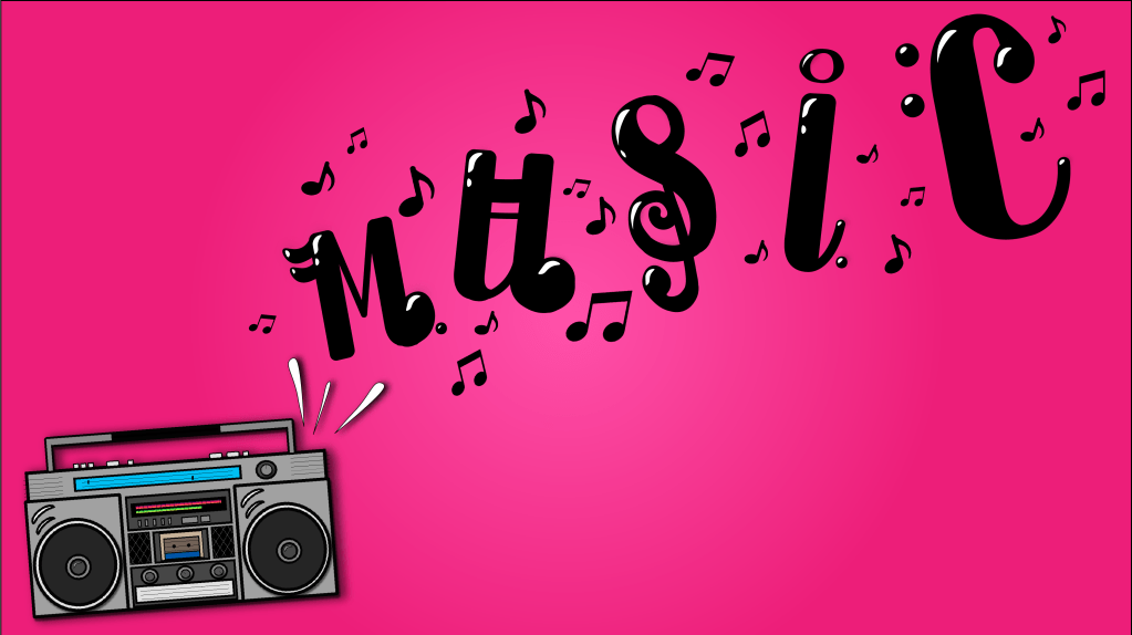
For this project I chose to visual represent the word “music”. Clearly when we think of music we think of the notes that are strung together to make the music and just like music notes, letters get strung together to create words.
After reading about the different parts of a letter and what to do and not to do when designing in the “Graphic Designs Solutions”, I began to create the word in Adobe Illustrator. Obviously I couldn’t just type the word out and pick a font and call it a day. Instead I did start with a base font. I picked something that already had extenuated ascenders and descenders so I had something to work with when I was creating the music notes. Using reference pictures I was able to music certain music symbols that resembled many of the letters in the word.
Technically in order to design each letter I added swashes to most of the ascenders, descenders and terminals.
Another part of type design that I had to take into consideration was when the author Robin Landa, described the importance of integrating or not integrating the type into the other images it accompanies. Some designers would argue that the text is met to serve a purpose and give information so keep it neutral/different. Others believe the type is just as much of an art form as the art it accompanies so why not tie them together. For this particular project I chose to tie them together.
I wanted it to feel like the letters were just bigger and different looking music notes coming out of the boombox. This met that I did have to mess with the vertical and horizontal spacing of the letters. I understand that often times stretching, squishing, or kerning a letter can make it difficult to read and that according to Ellen Lupton in “Thinking With Type” stretching your type can also be a considered a “type crime”. But in this case, humans perception of sound is that it grows in order to fill the space that it’s being released into. So in order ton make the word feel like it was coming out of the boombox I designed in Photoshop, the letters had to gradually get bigger and fill up more of the space.
The final thing that I considered while designing the type was typographic texture/typographic color. When looking at music notes some parts of the note are much darker and denser, and other parts, like the stems, are much thinner and lighter. So when picking the font and then designing over it I kept in mind which parts should be heavier and which parts shouldn’t. In this instance I am also aware again that this type of letter design would be harder to read if were shrunk and put with a bunch of other words, but then again I feel the over design of the word would have to be changed because the entire layout of the piece would be different.
Overall, out of the few project we’ve done so far in this course, this one has been the most fun and the one that I want to explore more. I think the creative choices you can make when designing typography are endless and extremely interesting.

Hi Taylor,
Fabulous work! I love your design and your post was an interesting read. I like that you acknowledged that you are technically breaking design/type rules, but in your case, it works. I would have liked to know what font you started out with, I don’t think you named the actual base font. I also like the design choice you made to put shine on the lettering. I think it helps them stand out amongst the rest of the music notes. Your skills are awesome, I can’t wait to see more!
-Jackie
LikeLike
Hi Taylor,
This is so cool! You basically took a foundational font and created your own, paying close attention to the anatomy of a letter and how you can illustrate music in relation to music notes. Adding in the swatches must have been a lot of work, but it gives your font spatial depth. The placement of the letters also adds to it because it not only looks like it’s “floating” through the air (like sound does) but almost like it’s dancing to the music from the radio. Keeping the background a solid color helps the word pop out more, and does not distract from it.
You should make this an actual font!
-Steph
LikeLike