Creating art isn’t just the use of random lines and shapes of all different kinds of color and size on a random canvas and calling it a day. There’s thought that goes into every little detail. What’s the focal point? What are my leading lines? What do I want in my background that will help spotlight my foreground? All these questions and more come into play not only when creating art, but designing graphics, framing up a shot for film or photography. Composition is key.
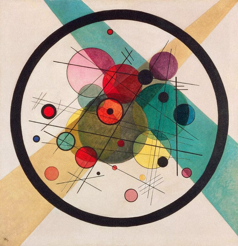
In Wassily Kandinsky’s geometric abstract oil painting “Circles in a Circle” created in 1923 is a prime example of deeper thought and meaning going into the design of something verses just having a bunch of shapes tossed on a canvas.
Kandinsky himself was fascinated by the circle and began a deep study into the shape starting with this painting. He wrote to friend about the painting saying. “it is the first picture of mine to bring the theme of circles to the foreground.”
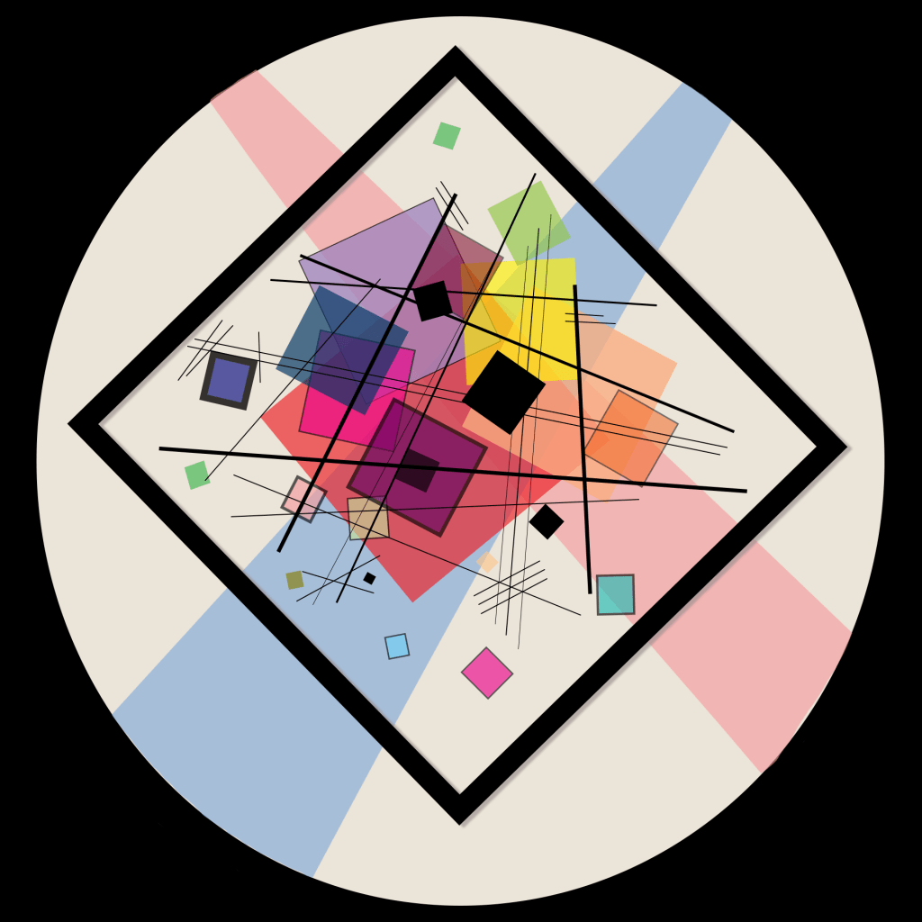
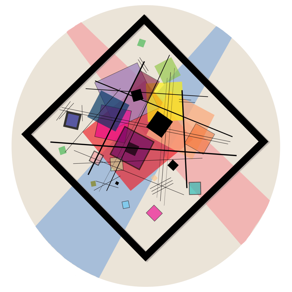
When I first looked at the painting 3 glaring things stood out to me. Everything (due to the way the oil paints were used I’m presuming) was slightly translucent. You could see thought the circles which effect the other circle it over lapped with. This gave it a sense of depth. After following all the lines and circles around the page I came to find that the bright orange circle in the middle with the small black circle inside of it became the final focal point your eyes eventually just end there.
Another thing I noticed when thinking about how I was going to recreate it was that the large black lined circle that encompassed all the other circles acted as a secondary canvas. As Mark Boulton explained in his article titled “Whitespace“, using passive white space to help create a space to breath in the design is important. “Some might argue that passive whitespace is the unconsidered space present within a composition. I disagree: if you don’t consider all your whitespace, that’s just bad design. Passive whitespace creates breathing room and balance. It’s important.”(Boulton) In this painting I feel that Kandinsky helps separate his white space and creates a plain for just the smaller circles to work in. If that larger circle wasn’t present the canvas would feel very empty and the other circles wouldn’t feel like they were anchored down to anything.
The final thing that I took notice of before I began to create my own was that the big circle and all the smaller circles in side of it were not coming from the dead center of the canvas. All the circles are slightly higher up on the square canvas and these gives the feeling that the circle are slightly floating. And the two rectangular bars behind it act almost as spotlights on the smaller circles because they aren’t uniformed sized rectangles and they run off the page, reminding me a lot of light beams.
With these thoughts in mind I began to think about how I was going to continue this piece with similarities but also making it different enough to call it a separate piece and not a recreation. I went into Photoshop and using the different shape tools, color options and opacities I started making something.
Then I thought about Programming Design Systems’s Article about Basic Shapes and Relationships and how a rectangular/square canvas has no sense of direction in just points you to the middle, but if you rotate the square slightly all of a sudden it takes on a more fun and playful look. So I decided to run with the playful abstract look and went with squares. But I also thought about Kandinsky’s deliberate choice to put all the circles on a square canvas which makes the circles feel smaller and lighter. “The circle is smooth, and appears smaller than the rectangle, even though they have equal dimensions.” (Programming Design Systems)
In my design I went with the opposite feel. I made a circle canvas with rotated squares inside. This gives more of a trapped feel since the square appears bigger with its sharpe edges trying to pierce the circle smooth edge of the canvas.
I also went in a different direction with color choices. his were more muted and dark I chose to keep mine more pastel and lighter and seeing that his spotlight rectangles were blue and yellow which lead to more green circles, I made mine red and blue which lead to me creating more purple and pink squares.
Overall, I think this was very interesting to take a very famous and highly executed abstract painting and find ways to create something with many similarities and differences while thinking about composition and the importance of depth, dominance and focal point in a design.
Here’s the side by side comparison: