

These past 2 weeks have really been a great progress time for the series and for me as a creative person with in the project. I was able to fully record my narration and get a handle on the length of each video. Then I went in and designed my 3 separate thumbnails which helped me finally come up with an idea for the intro and outro animations to each video. From there I collected tones of stock photos and videos of each band that I mention and organized into labeled folders so that I can also credit where I got everything correctly in each video. Now with only 2 weeks left all I need to do is finish a few simple graphic animations for each episode and assemble the graphics and stock photos and footage over the already edited and placed narration.

Looking back at my project management plan in Asana I’m still completely on track the only difference is instead of working on each video separately and finishing one before I start the next I decided to start all 3 at the same time, so I can do the same thing 3 times in a row and then move on to the next step. For example I trimmed my intros/outros and synched my audio for each video one after another and now I’m completely done with that task and can move onto adding B-roll.
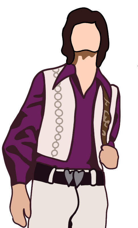
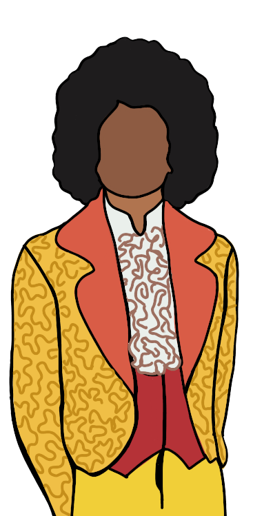
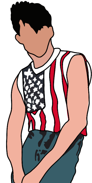
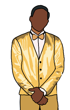
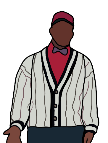
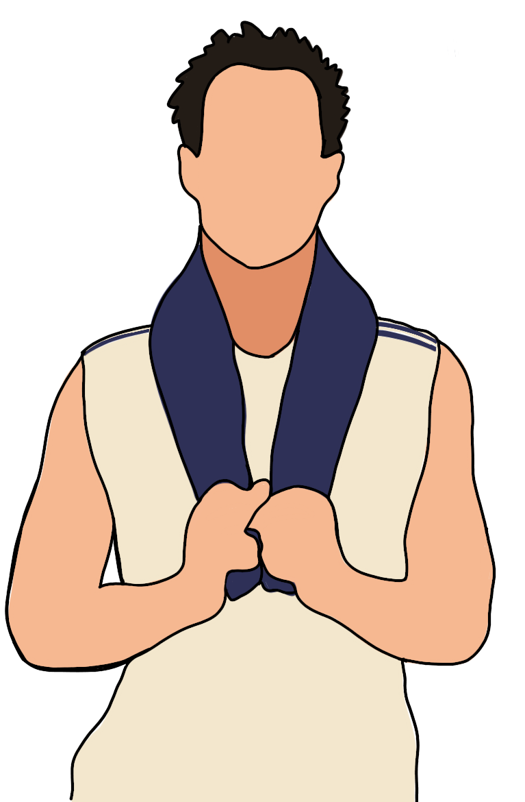
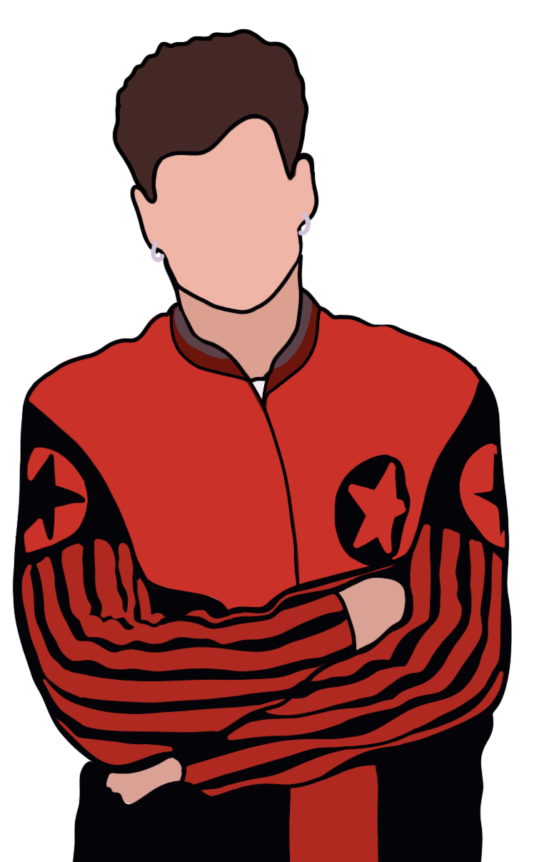
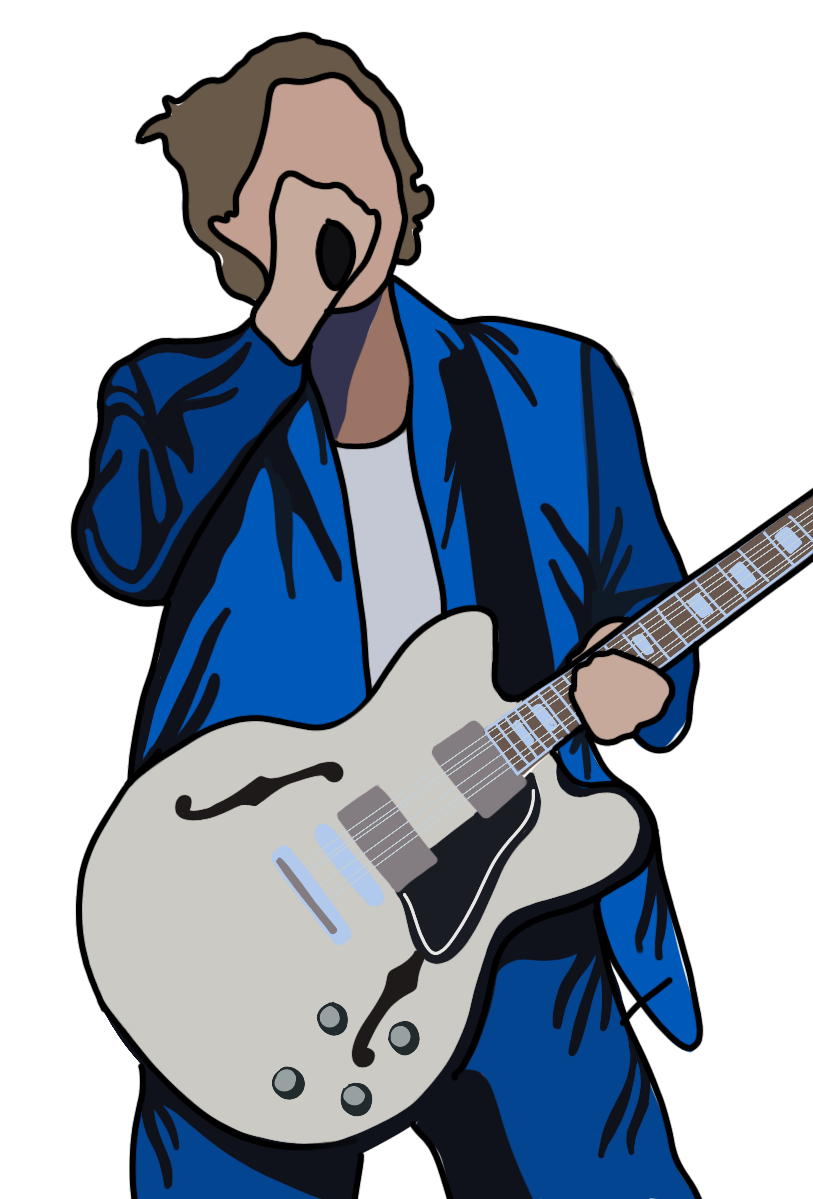
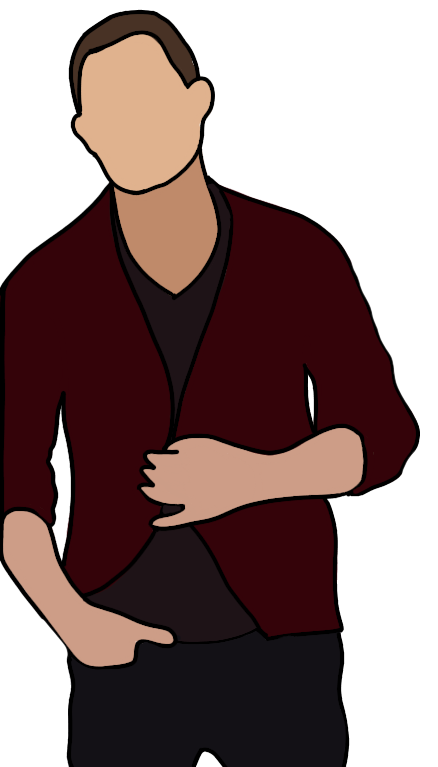
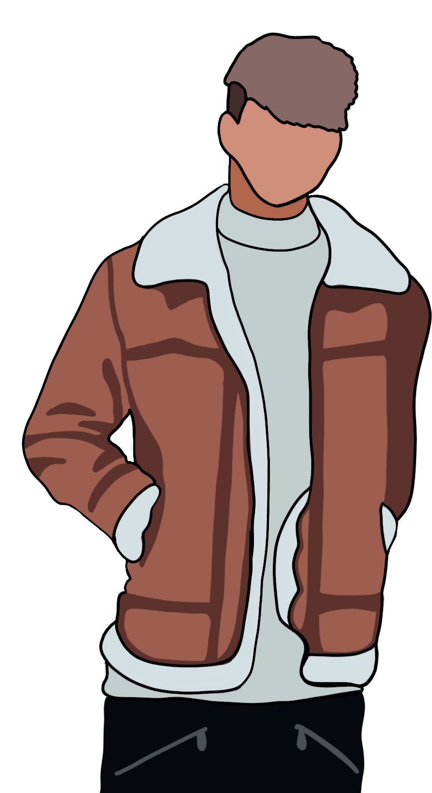
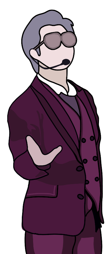
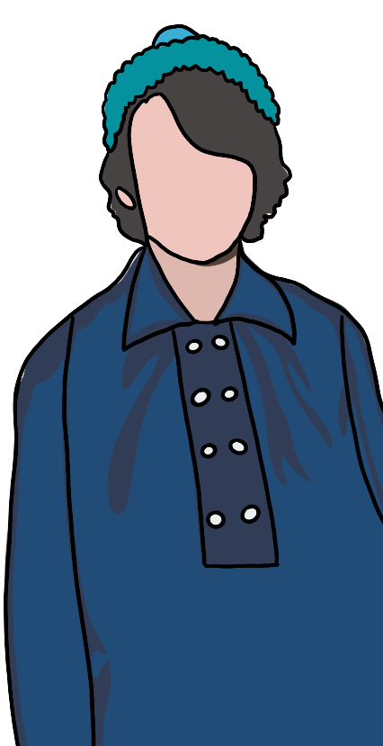
The biggest issue I was facing after I finished all of my production and was moving into post – production was the over all look of each video. I knew I was going to have animated graphics through out the video, I knew I was going to have an animated opening and an animated close and I knew I was going to have three thumbnails also designed by me. Plus I already had designed a logo so I wanted to continue with that theme. So I did a little more research on the importance of color branding and keeping things unified. “Visual perception is the primary sense humans have for exploring and making sense of their environment. Colors trigger a diverse set of responses within the cerebral cortex of the brain and throughout the central nervous system.” (Dawson). With this in mind, I decided to keep running with the pink theme and the abstract illustrated look of all the characters. This way you get a sense of the change in look and over all appearance of boy bands over the decades and not the change in specific faces.
On a side note, I know through out the videos I talk about boy bands not just being made for girls and that they were specifically targeted to be for girls and by branding everything I’m making pink I’m going against all of that, but in reality pink has a fun light hearted connotation. “If you have a pink logo, there’s a good chance that women are your target audience… in any other industry, you are probably trying to convey the message that your company is lively and fun.” (WebFX) And that’s what I want my audience to feel when they find my videos and watch them.
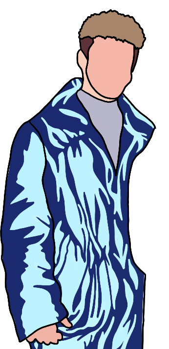
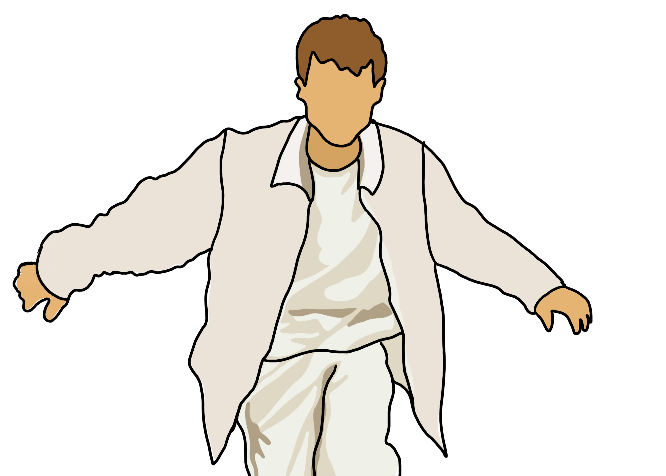
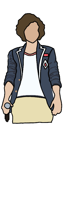
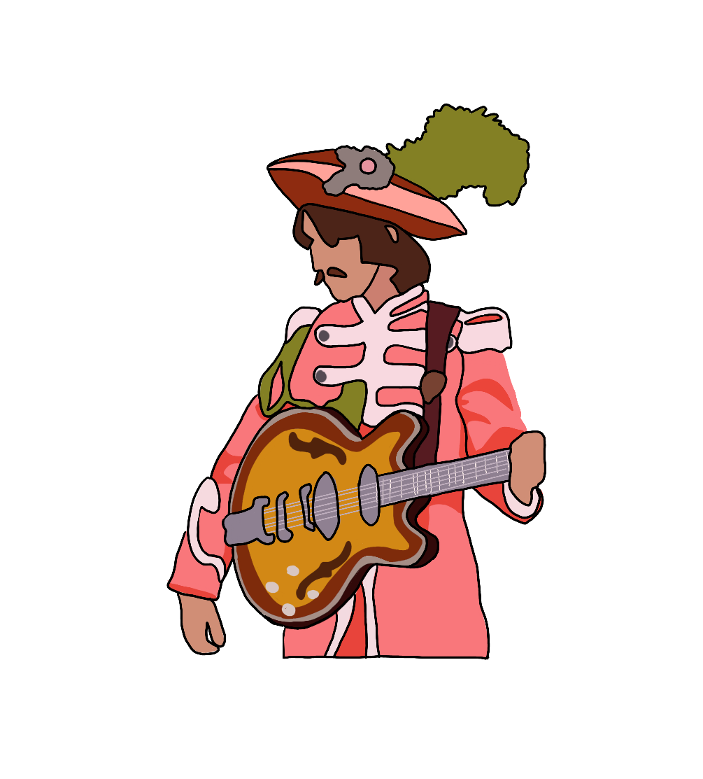
When I first started the logo, I had only made 5 boy band figure illustrations, but because I wanted to do row of the top 5 or 6 band members for each video I ended up have to make 16 different illustrations. Using adobe procreate on my Ipad I was easily able to draw all 17 characters and then import them into photo shop where I designed each thumbnail.

From there the inspiration struck me on how I was going to make my animated open, which was to go into Adobe After Effects and utilize these same 16 characters again and have them pop into screen along with the logo and the episode title.
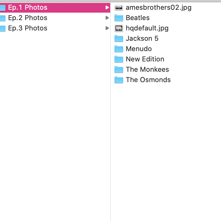
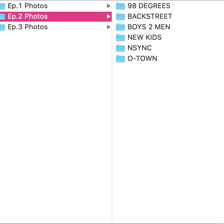
The final major thing that I did this week, was hunting down stock footage and photos of these bands over the years. I knew that whatever photos and video I ended up using I was going to have to credit the source correctly and wasn’t going to be able to use any of the sound off these videos for more than a few seconds. So with that also in mind I pulled stock from only trusted sources like the band’s direct label, Billboard and Getty. This way I know that I wasn’t using some weird photo from a non-trusted source.

Looking forward to the final 2 weeks, I’m going to continue to design and animated the last few graphics that I have through out the videos, with the same type of color, illustration and animation techniques in order keep things cohesive and on brand. Then I’ll just be adding the stock music, photos and videos to the parts of the narration that need them and before you know it, I’ll be exporting the videos and posting them. So keep a look out because they’ll be up soon.
Check out my Production Journal for weeks 5 and 6 below to see how long each specific task and step I completed took.
