
I am not a scientist or a geographer or a doctor. So, when people try to explain to me complex diseases, geographical issues or just a chemical equation I tend to get confused. But through the use of visuals, well known symbols and carefully picked color choices I can begin to understand complex topics in an easier way.
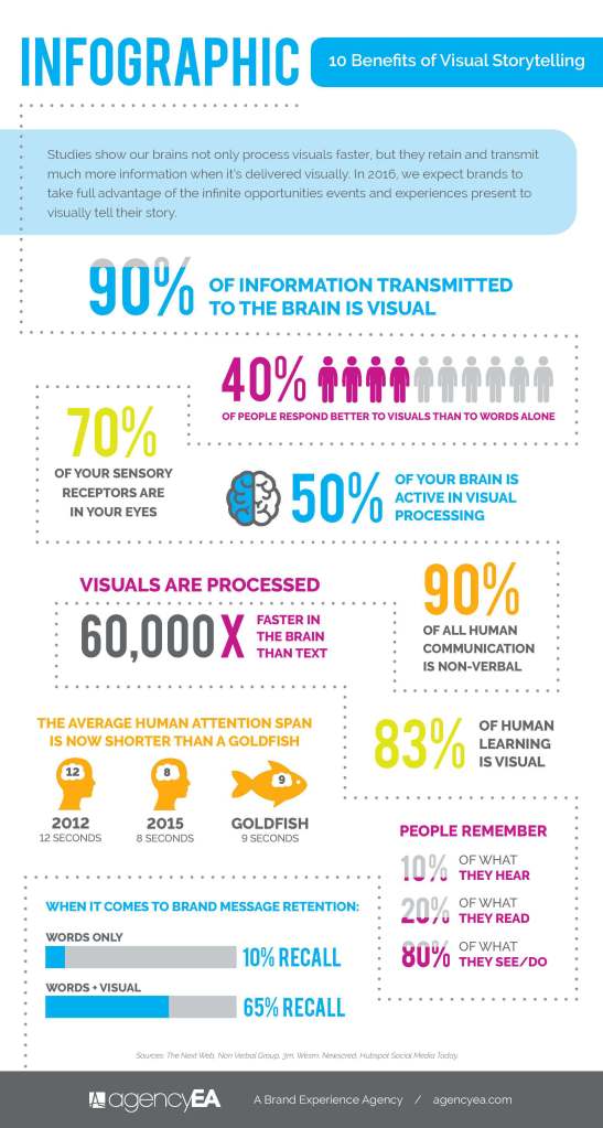
One climate issue that is very near to my heart, but also highly complex is the rapid rising of sea levels. I live in a beach town and the thought that if global warming continues and the glaciers keep melting that my down could be engulfed in water faster than people thought is frightening. At the same time, even after reading a bunch of articles on the topic I don’t always feel like I have a full grip on the situation and that’s when I turn to the visuals. A Brand Experience Agency depicted the way we learn more visually by showing that over “90% of the information sent to our brains is visual” and that “your brain processes visual images 60,000 faster than it does text.” So it just makes sense that in an effort to communicate their findings easier to the public the science community relies heavily on well constructed visuals.
1. Office of Coastal Management: Sea Level Rise Viewer
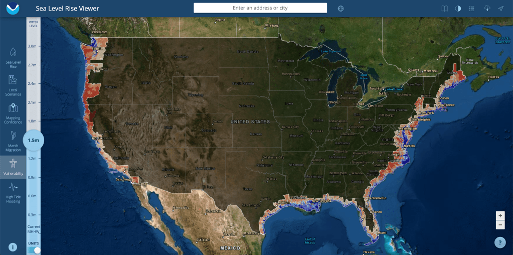
The first graphic is from the Office of Coastal Management and this is a screen grab of their sea level rise viewer and more specifically this map shows exactly what parts of the US are vulnerable as the sea level continues to rise. The Integration and Application Network describes a different practical visual element for scientific communication and one of those of course being maps. “Maps that contain the minimal extraneous information while providing geographical reference points, location insets, scale and orientation information, can be effective. The use of geographical information systems facilitates good map production, but is often insufficient for good communication products without additional editing.” (Dennison) The map clearly shows how many meters worth the ocean would have risen, what cities are where, and the red color is the level of vulnerability, while the blue color indicates that the land is already under water. The visual is a simple but effective depiction of just how much land we can lose across the country to sea level rising.
2. The Verge: When Sea Levels Attack!
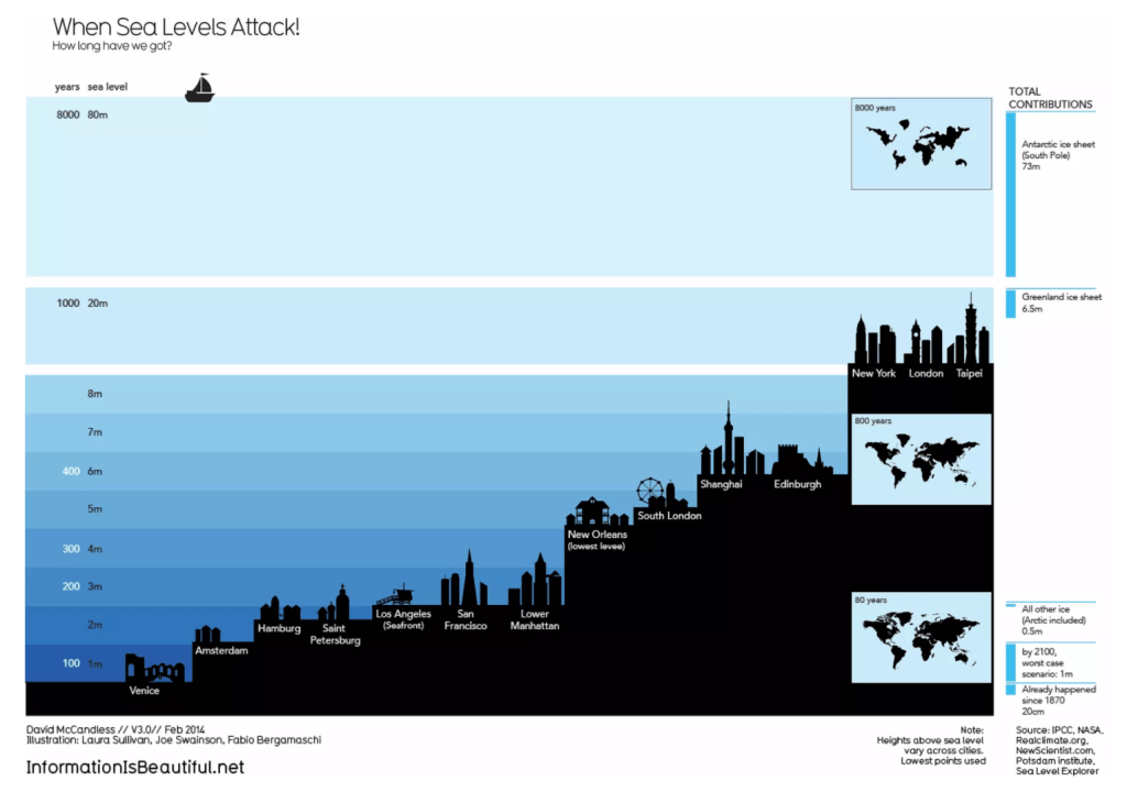
The next image is a graphic depicting just how many years we have before sea levels will engulf all the major cities around the world. It’s a sobering image because some believed cities like Venice and Amsterdam don’t have much projected time. This visual can be defined as a good one if you look at David McCandles’s “What Makes a Good Visualization” chart. It encapsulates good data by showing both the years it will take, the city names, and the meters the ocean will have to rise. It has a great concept and visual form by using a ladder style to show similarities and differences between each city. And it’s function is very clear from the start, the chart is made to show people that rising ocean sea levels isn’t a joke and won’t just raise tides it’s going to destroy cities.
3. NASA: Climate 365 – Muir Glacier
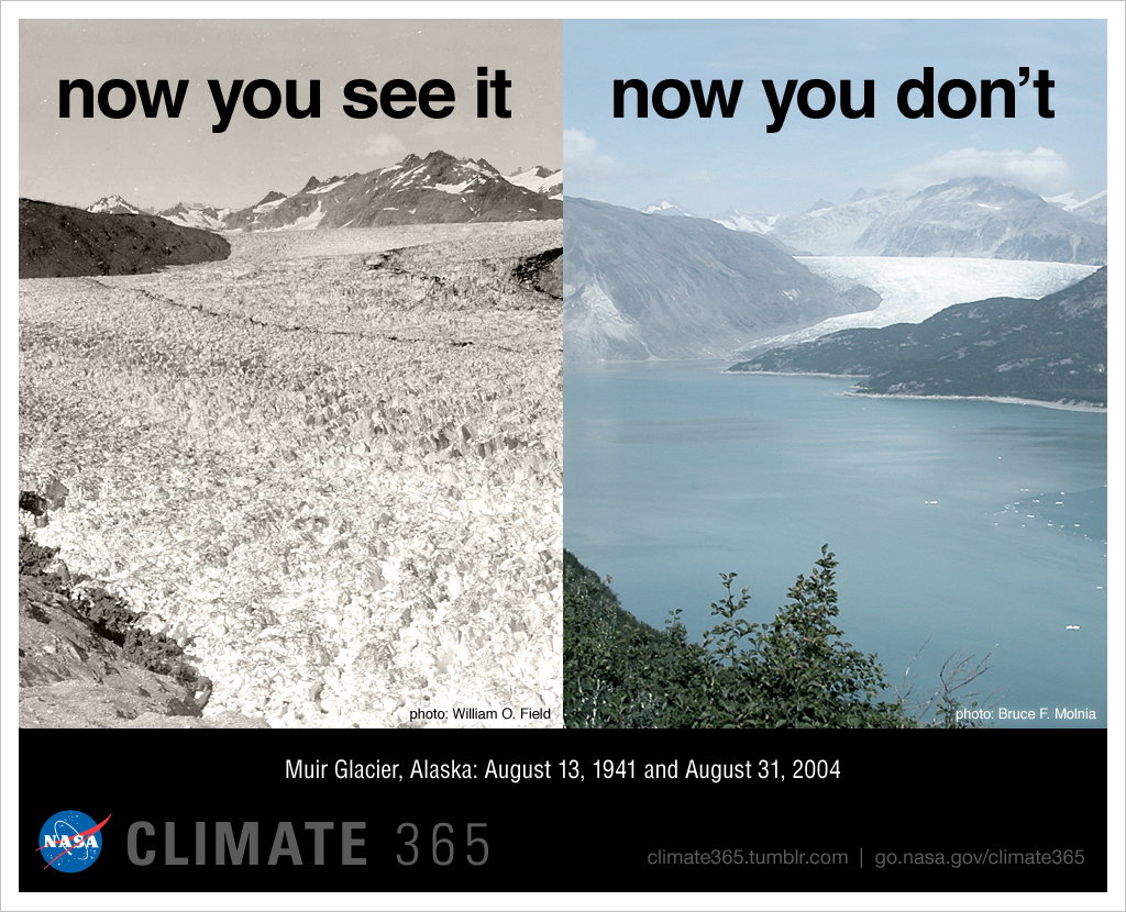
The next one is two pictures stitched together to show just how rapid ice is melting and water is rising. NASA took a photo of Muir Glacier in Alaska in 1941 and then took a photo of the same place in 2004 but instead of seeing a glacier you see a full body of water. Most people use well composed images to tell very important stories for many topics. Even the branding website, Postcron knows that images are sure fire way to get your story noticed. “they are easy to get, highly shared, reinforce the message you want to transmit and help emphasize it.” (Parera).
4. New York Curbed: Lower Manhattan when Sea Levels Rise 8ft
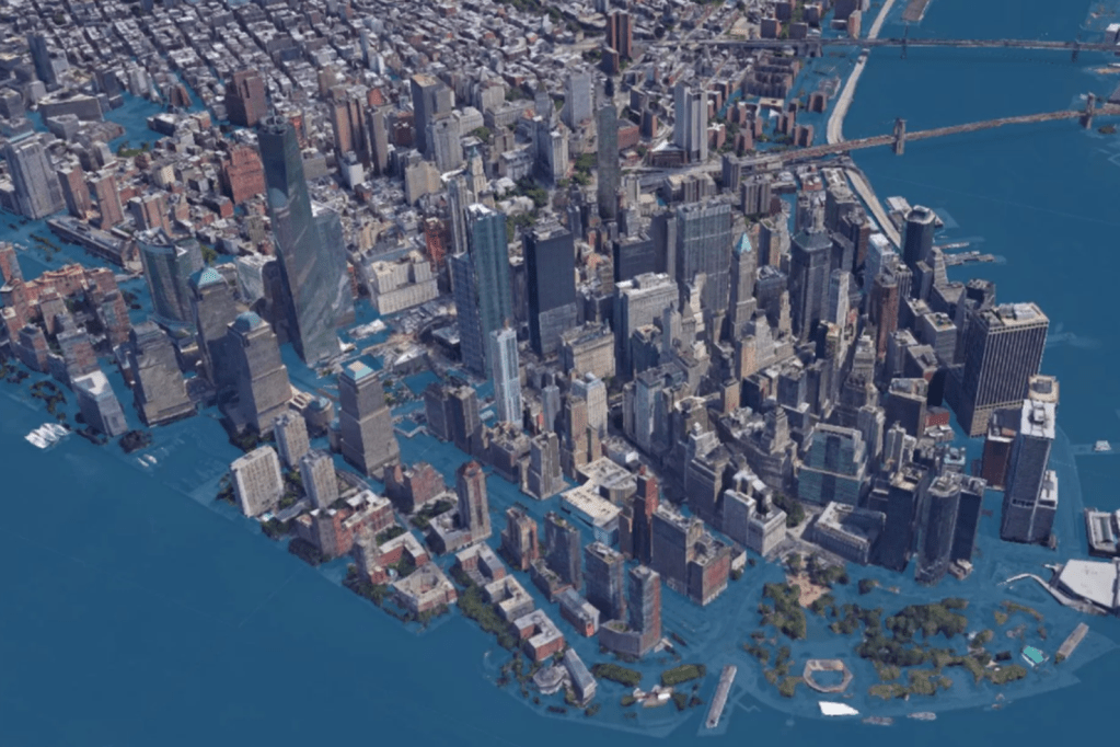
This image is a graphic rendering of what New York will look like if the levels rise by 8ft. It was posted in an article on Curbed New York written in 2017 by Ameena Walker. This visual acts as the perfect physical manifest station of what is going to happen to such a well known city. This image makes the numbers real, and it makes it personal. Rising sea levels isn’t just a 3rd world country issue, it’s an issue for everyone. An article written by UC Davis professors describes the main use of a scientific visual as “the narrative impact in scientific visualization comes from being able to see real data that is normally invisible. At its best, scientific visualization acts as an extension of our senses, allowing us to perceive and manipulate data at otherwise impossible scales and perspectives, such as vector fields in weather systems, iso-surfaces in supernova simulations, and layers of human anatomy rendered semi transparent.” (Ma, Liao, Frazier, Hauser, Kostis). This image is exactly. It’s an extension of the numerical data so our sense of sight can see what it will look like.
5. Polar Seeds: Rising Sea Levels
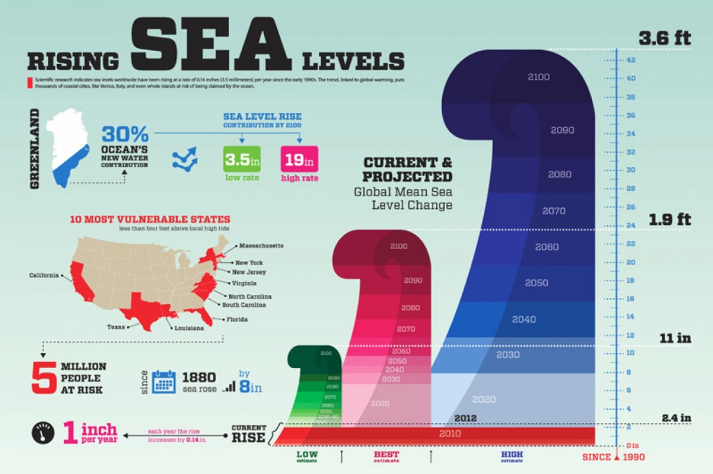
The final graphic on the rising sea levels that I found to be especially informative is an infographic that gives you the main big numbers and not only focuses on just sea level numbers but also what states are vulnerable, and how many people that would affect. It’s a fast facts sheet that gives you a great scope of the issue with bold colors, easy to understand images and big arrows to follow and lead you throughout the graphic. “Infographics have become one of the preferred tools for communicating scientific findings to fellow scientists and nonspecialists. Frankel and DePace suggest some basic tools from the area of graphic design … Composition: used to organize the elements and establish their relationship to each other.. Color: applied to draw attention, to label, to show relationships, or to indicate a visual scale of measurement” (Estrada, Davis). The article suggests other tools to refine a good graphic for scientific visualization but in my opinion the image above uses compositions and color the best to convey large amounts of information in a simple yet effective way.
Overall, the climate crisis of rising sea levels isn’t a topic that should be taken lightly, but many times people just don’t understand the severity because the information is too complex. With the use of well designed scientific visuals that tell the correct story people can begin to understand large abstract scientific issues. Through the use of images, infographics, or charts – high levels of text can be condensed into processable visuals. Just like journalism, PR and marketing, data can also tell a visual story when done correctly.
