
We as a society interpret data everyday. Whether it’s while reading a menu, a map or reading an actual chart, an email, a text message, but have you ever realized how much you interpret from looking at an image? The saying a picture is worth a thousand words is absolutely true and many times an image is actually easier for someone to understand versus text. The Interaction Design Foundation called it, “Information visualization, the art of representing data in a way that it is easy to understand and to manipulate, can help us make sense of information and thus make it useful in our lives.”

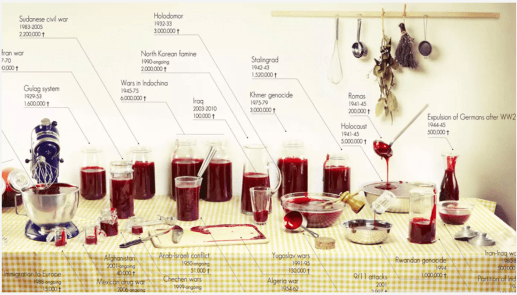
After learning about data visualization and the need to make data easily interpretable, I wanted to take a data set that I found myself and turn it into an easy to understand visual. During my research to find inspiration I looked at visual artists like Sarah Illenberger, who uses everyday objects to easily depict large statistical facts, but I was truly inspired by Clara Kayser and her depiction of 100 years of death in major wars/genocide using jelly. The picture is so simple yet so profound. In history class we learn about these events and these large death tolls get thrown around and you never actually take a second to compare just how big or small each world event is, but in this photo you can clearly see the comparison and understand just how much bigger for example the Holocaust was versus the Iraq war.
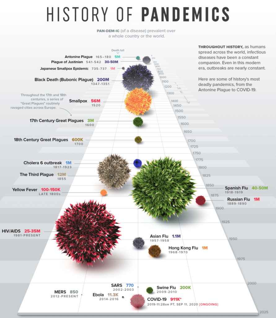
With this photo in mind, I went searching and found another very profound data set. This being the compilation of every pandemic from “Visual Capitalists” and all of the resulting deaths. At first reading the numbers doesn’t really hit home, but when you look at the visual representation of each number you’re shocked by how many more deaths have occurred in past pandemics than the one we are currently in.
Once I had the information and the actual function of the visual plan I moved on to the last 2 parts of David McCandles successful visualization chart. These being the “story/concept” and “visual form/metaphor” of the graphic. It needed to have a nice and pleasing appearance while also having a meaningful and relevant message. Being that we have been trapped in our homes for the past few months due to a pandemic and most people have resorted to using this very specific everyday household item to get through it, I went with alcohol as my visual. Each different volume of alcohol represents a different volume of death.

While looking at the data I could make a lot of comparisons, like 4 of the pandemics had caused about 1 Million deaths which means I needed 4 volumes of alcohol to be identical. Then I also had to process which data piece was the smallest and which was the largest and decided visually what I wanted to represent as the largest volume of alcohol and what would be the smallest. I ended up landing on the fact that a shot glass is the smallest and two large liters of tequila would be the largest.
After taking the photo I brought it into photoshop and began to edit, at this point I began to think of the “3 Elements of Visual Mapping for Information Visualization” from Interactive Design Foundation. The first element they describe is the spatial substrate “the space in which we’re going to create our visualization. The vast majority of information visualization takes place in 2-dimension space – along x and y axes.” However in my 2 dimensional space the background was far too difficult and busy to actually understand any of the quantitative data. This is why I chose to create a plain blue background and add my visual on top.
Overall, I like the way the visual came out and learning to take statistical data and make an aesthetically pleasing visual was fun and challenging all at the same time. In the end I think the visual is very easy to understand and comparing each alcohol next to each other really gives you the perspective on just how many pandemics there have been over time and just how deadly some of them were. On the other hand this visual is also very reassuring to me. You can visually look at the size of the COVID-19 pandemic and while obviously it’s very bad, it’s definitely not the worst one and it makes me confident in the fact that society will pull together and get past it just like it did with the other 20 pandemics shown.
