
Dear Data Wrap Up:
Each week that I created a Dear Data postcard I purposely tried to do different time gaps for the data collection so I could see how much the collection period affected the data set.
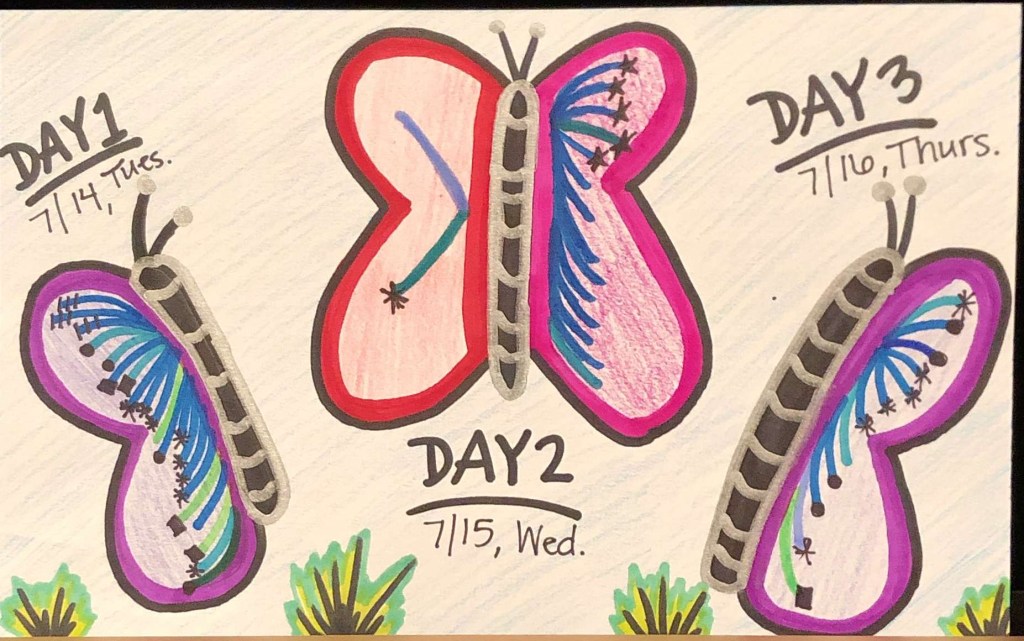
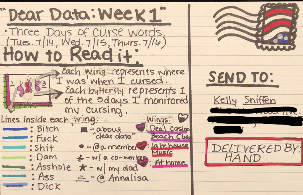
For the first one it was over a period of 3 days, two of the days I was at one of my jobs where it’s very informal so I curse more often than at the other job which is extremely formal and where I barely talk. This gave my data visualization a very different look for each day and made for a more interesting visual.
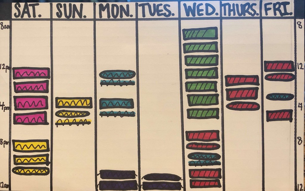
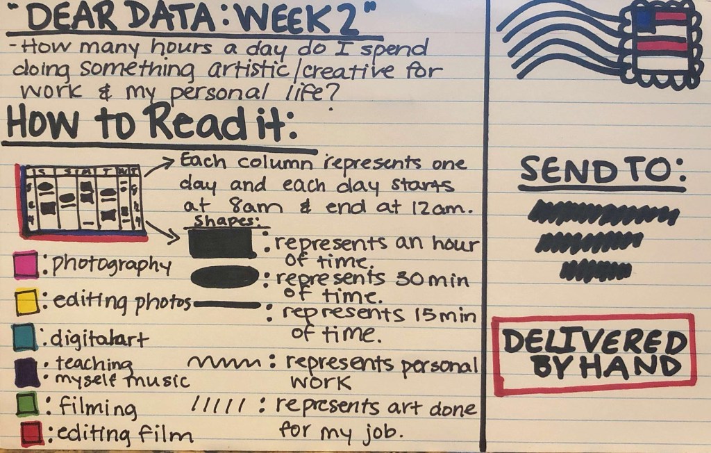
For the second dear data I collected data for an entire week but instead of just multiple tally marks like I did for the first and third ones this one was groups of time. The biggest thing I learned from this one was that I had to come up with a specific way to chart the data points and I ended up landing on breaking each group into full hours, 30 minutes and 15 minute increments. This way the data was easily readable and more spread out across the notecard.
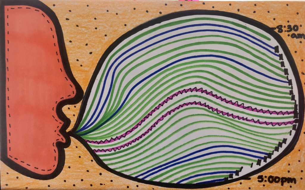
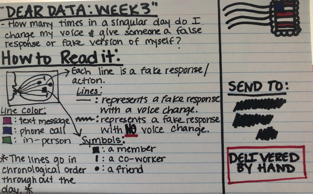
Then the final dear data was only for one day, yet at the same time it was the hardest topic to keep track of collected data points. The question I had asked was such an introspective question about me being a fake person, that between actually doing my job and talking to people I had to have missed plenty of data points. Of course after the day was over the biggest thing I had learned was that I probably should have done a better job at who I was being fake to. This way my graphic could have had even further detail and better symbols.
Class Reflection:
After being in this class for 7 weeks, I’ve learned a lot about the differences in data visualization. I’ve also learned that collecting data, cleaning, organizing, and designing is much more in depth and difficult then I previously thought it to be.
Between the personal data collection for Dear Data and the public data collection for the data narrative and data wrapper I learned that I like to collect and refine the personal data more. But I will say that being cognisant of collecting data over whatever period of time I chose to collect the data for is hard. On the other hand collecting data from public databases can be even harder in my opinion. Searching for it can take forever because you need to double check it’s accuracy and it’s reliability. Then once you’ve confirmed it’s a reliable data set, refining it and cleaning it can take a while and can be confusing. The biggest lesson I learned from data cleaning is that before you can start organizing you have to know what question you would like to have answered by your visualization. This way you know which columns in the data set are unnecessary and can be deleted and you can determine the best way to categorize all of the data to make the simplest and most readable chart.
Another difference in data charting is the choice between either using a software to help you chart data, like Datawrapper or you can visualize and design it yourself. Personally I find for complex charts that have multiple columns and layers that Datawrapper is the way to go. It spaces things out evenly and creates the simplest and easiest to read chart. On the other hand, I love to have creativity when it comes to anything and Datawrapper limits you a lot with how far you can design a chart. Making your own chart means all the decisions are yours. Especially with the Dear Data projects, figuring out the artwork for the front of the postcard was always my favorite part, but at times that led to the chart looking messy and confusing.
Seeing now that data is more than just charts and numbers stacked together and when organized and visualized properly it can actually tell a story is extremely interesting. When I first started brainstorming for the data narrative final, I was so confused I didn’t understand how to string charts and information together to make a story out of it. But when you take a step back and break it down, it’s the same as writing a story for an english class. You start with the large overarching data that shows the whole picture and then you break that down into smaller different charts and visualizations that highlight specific pieces of the story and close it out with data that looks to the future and sums all of your findings up.
Overall though, at first I had no idea how I would use the information from this class, but now I can see that being able to take complex and large scale data sets and make them into simpler and more visually pleasing graphics can be very helpful in both the news industry and the entertainment industry. And I’m excited to bring this new knowledge into my career with me.
