

Last week I collected and refined datasets. The first one was from the NJDEP and was all about the number of different shoreline structures in each of the New Jersey Shoreline counties. This chart was by far the easiest to pick and create on Datawrapper because the NJDEP had already spilt everything into its correct columns and had tallied it up at the bottom. My only obstacle in the beginning was choosing what portion I wanted to visualize. Did I want to showcase what shoreline structure had the most amount, or which county had the most shoreline structure or did I want to compare each county with all of their shoreline structure. In the end I chose the 3rd option and made a clustered column chart that has an X axis with the shoreline structures on them and a Y axis with the amount of each and each column represent 1 of the 6 counties.
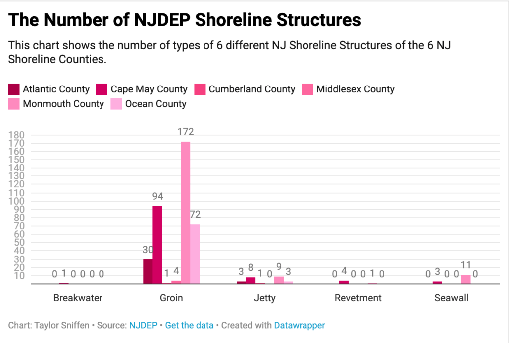
The only big issue I faced while creating the chart was the original Y-axis numbers were too spread apart to actually make any sense to the naked eye. I also realized that many of the numbers were very small like 0 and 1, but then the one “Groin” section had such high numbers so the chart was sort of smushed. I wanted to make sure I got the scale on it correct, especially after reading the report “How to Lie on Maps” and scale was listed as the first and one of the biggest way to deceive someone.
The next chart I created was for the NJ.com data set about Prison populations decreasing due to COVID-19. This chart was also very simple. The prison data took place over time and so I went with a line chart. After inputing the CSV into Datawrapper I realized one of the columns didn’t aid to the visual and made it far more confusing (it was the percentage change numbers, which were very reactive from the change in number overtime column) so I hid that column and it helped the whole visual overall.

Another huge part of this chart was actually the color theme. Since the March and June lines overlap and cross at certain sections I didn’t want the colors to clash because then it would be too difficult for the viewer to distinguish between them.
Finally the last dataset that I turned into a visual chart on Datawrapper was the QVHD Hamden Restaurant Rating list. This particular set gave me a lot of trouble. It was the first one I tried in Datawrapper and at first I wanted to make a city map to show were all the restaurant were and their ratings using symbols. But I struggled finding a Hamden map. Just like the powerpoint in this weeks lesson showed every map that you search up highlights something different and they all seemed too busy already to go adding more interactive symbols on top of. So the first one I made I used the entire state of CT county map and it was far too large. Again scale played a huge factor and this scale did not work.

Then I shifted my thinking and tried answering a different question with the dataset. After the map I deiced to go with a pie chart to show the percentage differences in the 3 different ratings the restaurants could get. So I counted up all 146 Hamden restaurants and then went and counted each A, each B and each C and found their percentages to input into the chart.
I also decided that when designing the chart to put the percentages on the outside because the C rating was so small that the number didn’t fit inside.

