

This week I have found three sets of data that I’ve combed through and organized in order to properly turn them into visual data wrapper charts.
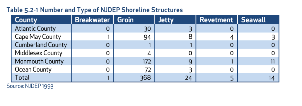
My first set of data is a geographical set taken from the New Jersey Department of Environmental Protection. This is a highly trusted government website and the case study that I found this data set on has been verified by scientists’ multiple times. This dataset highlights the different types of Shoreline Structures each county has and the number of them that each county has.
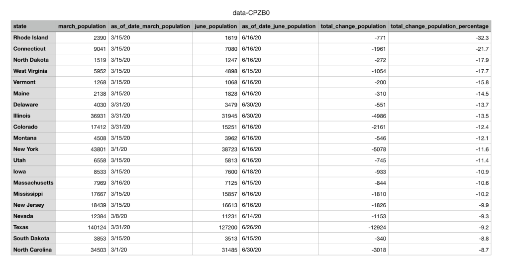
The second set of data I found was from a public source called NJ.com. It is a trusted website where many local journalists and researches go to find data collections and articles about issues in New Jersey. I chose to look at the data surrounding prisons during the pandemic. The dataset shows that population numbers in prisons across multiple states are going down due to the pandemic.
The final set of data I collected was from the Quinnipiack Valley Health Department page. I chose to search up Hamden and copy over all the restaurants in Hamden and their ratings and made my own excel sheet out of the information. The original information included the address of the restaurants and the dates that they were given their up to date ratings, but after examining what information was needed for the data wrapper chart, I choose to organize the excel sheet without the address and the dates. Instead I only organized the names of the restaurants and their ratings.
The next step in the data visualization process is too look at the data and decide what questions you should ask to get the most out of your data collection. Once you make the questions you have to make sure their answers are attainable. In the textbook, Making Data Visual, they describe it as “The process of breaking down these questions into something that can actually be computed from the data is iterative, exploratory, and sometimes surprising… In many fields, the process is called operationalization, and refers to the process of reducing a complex set of factors to a single metric.” (Fisher, Meyer)
For the geographical set of data, I want to know why there are almost no breakwaters in all 6 shore counties? What makes a groin so popular in the shore counties? Are these numbers increasing or decreasing due to coastal erosion? The next set of data is the prison systems population going down due to COVID. In this case I would ask the question of if crime overall has gone down in these states as well as prison population? Have these prisons seen high rises in COVID cases? Does the population of the prisons and the decrease in that population correlate with the amount of cases in each state? Then for the final set of restaurant data I would ask, How many restaurants are repeat offenders and have repeatedly gotten C’s and B’s? What is the percentage of A’s vs B’s vs C’s in Hamden? Does the location of the restaurant have anything to do with its rating?
After cleaning and organizing the data, I would make it into its visual graph. Looking at the Abela’s Chart Type Hierarchy the best visual to use to make my geographical set of data is a table with embedded charts. These is because there are many categories including all 6 counties and all 5 sets of shoreline structures. Then for the public data set in the prisons I would use a line chart with multiple categories again. This way I can show the change over time in population and each line would represent a different state’s prison. Then for the final Hamden restaurant data set I would use two different kinds of charts depending on what question I was trying to answer. Either a scatter plot on top of a map that shows each restaurant rating and where the restaurant is. Or a pie chart to represent the percentages of A’s vs B’s vs C’s in Hamden.
Overall even after clearing, organizing, and visualizing the data the best way to get people to watch to view your chart is to make sure its trustworthy. In order to achieve this, I would make sure I included all of the different data points make sure each axis is labeled properly and any data keys were clearly readable. This way there is no discrepancies in the data and the viewer can make any of their own conclusions.
