

Visual for the “A View on Despair”. 
Visual for “Symbolikon”. 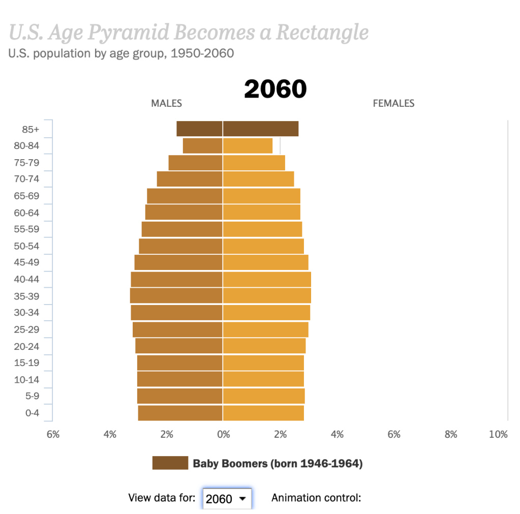
Visual for the “Next America” 
Visual for the “Building Hopes” AR visual.
After reading and listening all week to the differences in data visualization and the importance each one has. I’ve been surprised again as to A.) how important data visualization is and that’s not just making a pretty graph and B.) how often I subconsciously looking at something data based that was meticulously designed by someone.
One of the best explanations about the importance of data visualization was from David McCandless in his TED Talk. He talked about the value of data and how it genuinely actually has a value, like currency, in today’s ever progressing and advancing climate. “Data is the new oil.” Data is the kind of ubiquitous resource that we can shape to provide new innovations and new insights, and it’s all around us, and it can be mined very easily. It’s not a particularly great metaphor in these times, especially if you live around the Gulf of Mexico, but I would, perhaps, adapt this metaphor slightly, and I would say that data is the new soil. Because for me, it feels like a fertile, creative medium. Over the years, online, we’ve laid down a huge amount of information and data, and we irrigate it with networks and connectivity, and it’s been worked and tilled by unpaid workers and governments.” (McCandless)
The other biggest take away from this week was the four main types of information visuals, conceptual-declarative, conceptual-exploratory, data-driven-declarative, data-driven-exploratory. Each visual is very different from the other. At first glance each title seems confusing and repetitive, but then once each is broken down, they all make a lot of sense and each one has a specific use.
Conceptual – declarative is something that is made to simplify complex concepts. This specific type of graphic is sometimes coined the “consultant’s corner” because consultant’s love to make circle diagrams that explain and over explain everything. It’s used as a great way to depict a framework for an idea and usually swings more towards the editing and design side on the creative spectrum. A great example of a conceptual-declarative visual is the “Building Hopes” AR visual by Accurat. It allows people to walk around their immediate area finding and ranking their hopes and dreams and then it creates a sculpture for you, and you can read data about you. The structure serves as a great metaphor for that person’s life, which is what this visual is. When using conceptual- declarative data design you are just creating one big metaphor.
The next data design is conceptual-exploratory. The use of exploratory data is to gives the viewer the “opportunity to explore, allowing the data to reveal its underlying insights freely.” These types of visualizations are usually undefined and complex, but the point is to teach and explore a concept or idea that isn’t set in complete fact yet. A great example is the interactive data about “The Next America”. It a moving graph about the possible upcoming ages and genders of America. These numbers aren’t guaranteed, and every viewer is going to view different years and not walk away with the same realization. Some might see that there is going to be more women in the future and others will see that there are going to be less children in the future.
Moving on to the third information visual is Declarative Data. This version is the simplest and usually contains the lowest volume of data. The point is to clearly depict something, through some sort of easy storytelling and to not overcomplicate well collected data. A good example of this is the visual by Sonja Kuijpers called “A View on Despair”. It’s a simple landscape drawing and each element in the landscape represents a different easy someone committed suicide. The visual is simple, but powerful. The viewer can easily look at the picture and read the legend and understand all of the data.
The final type of information visuals is data-driven exploratory. Personally, this is my favorite type of data visualization. It takes the simple well collected data side of the declarative data graphics and the fun exploration of conceptual- exploratory graphics and puts the two together. So, you get a visual that is based off of concrete facts but has the creative freedom to let viewers explore the data on their own terms and walk away with their own summary. This type of visual is usually unconventional and uses big and complex data. A great example is the Symbolikon by Michela Graziani. It’s an ever-growing compilation of over 800 symbols with over 28 categories from different cultures and times in history. It’s an exorbitant amount of data and when the viewer goes to the website, they can choose whatever categories they would like to explore.
Overall each type of visual has a specific use and helps take both complex and simple data and turn it into some sort of metaphor or graphic that is easier for the mind to comprehend.
