

After reading the articles I found out so much about the history of data visualization. I had no idea before this that the art of taking a large amount of data and forming into something easily readable and visual has such an expansive timeline. Of course just like all things in this society technology began to progress and evolve and it changed the data visualization game. “One may also see that most of the innovations in data visualization arose from concrete, often practical goals: the need or desire to see phenomena and relationships in new or different ways” (Friendly 30). A lot of the technology that was introduced helped improve how it was done, but some of the newer methods in a way have made things harder to understand with the data presented.
In my opinion the number one pro that came from technology was the ability to link data visualization up with large scale graphic software and more expansive and interactive computing systems. This allows for the data to be viewed in a much deeper way. Viewers can easily navigate through the data and more often now there is more than one way to view the same set of data. In a presentation on the “History of Data Visualization”, the number one pro described about data visualization over all is “that compared to text, it offers more immediate visibility to information so that the audience can understand it easier.” And now with the introduction of this more complex software, the visuals and the graphics have gotten more detailed and even easier to understand and depict patterns between.
On the other hand though, having introduced such advanced technology into this field it can feel at times the information can be a little too detailed and the point of the data becomes muddled. That same presentation on the “History of Data Visualization” also described the biggest weakness in data design and that’s “that they have the potential to be misleading while being trusted by their audience. For better or for worse, information design is always subject to interpretation by you as the creator, but then also the audience on the receiving end too.” When a graph or chart is made to be too interactive the viewer can get lost in the spectacle of the graphic and never actually comprehend the information that was at the base of the design.
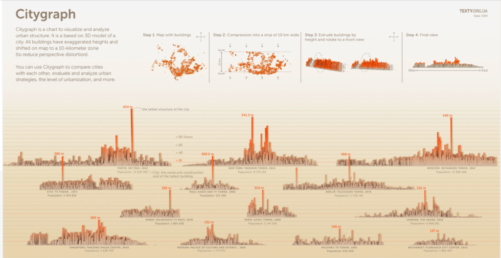
In order to teeter that line of pros and cons with technology you have to be able to boil the whole process down and just make a good chart. A good chart, which is described in the book “Knowledge is Beautiful” starts with a good balance of the information that is being presented, the story that is being told through the use of the information, the goal of the graphic, so that is actually has a proper function and isn’t just there to look pretty and finally the visual form that the data and the story takes. An example of a good chart to me is from informationisbeautifulawards.com and the graphic that I found the most pleasing to look at and to understand was the “Citygraph”. It had the perfect balance of all 4 and didn’t try to get too complicated. The information was all the different cities and the different sizes of their urban structure and in the final graphic it is easy to see all the different sizes and use the visual form they chose to easily compare the different cities to one another.
Even though you need all 4 pieces to a good chart, there are certain aspects of the chart that appeal to me more than others. Personally I respond far more with the “story” and the “visual form”. I am a storyteller and I am a designer. My background is in both journalism and film. I find that almost everything in my life needs to tell some kind of a story, otherwise what’s the point of it” and I also enjoy making things look pleasing to the eye. Both of these sections also come with tasks that I find enjoyable, like, script writing, artwork, rough drafts, design templates. Overall, I am a visual learner so I find data visualization extremely useful, but in order for me to enjoy a “good chart” it has to tell a story and is has to have been done in the correct visual form otherwise I get pulled out of it and won’t be able to fully grasp what the chart was presenting in the first place.
